The Magazine - The Artist’s Problem Solver
Здесь есть возможность читать онлайн «The Magazine - The Artist’s Problem Solver» — ознакомительный отрывок электронной книги совершенно бесплатно, а после прочтения отрывка купить полную версию. В некоторых случаях можно слушать аудио, скачать через торрент в формате fb2 и присутствует краткое содержание. Жанр: unrecognised, на английском языке. Описание произведения, (предисловие) а так же отзывы посетителей доступны на портале библиотеки ЛибКат.
- Название:The Artist’s Problem Solver
- Автор:
- Жанр:
- Год:неизвестен
- ISBN:нет данных
- Рейтинг книги:4 / 5. Голосов: 1
-
Избранное:Добавить в избранное
- Отзывы:
-
Ваша оценка:
The Artist’s Problem Solver: краткое содержание, описание и аннотация
Предлагаем к чтению аннотацию, описание, краткое содержание или предисловие (зависит от того, что написал сам автор книги «The Artist’s Problem Solver»). Если вы не нашли необходимую информацию о книге — напишите в комментариях, мы постараемся отыскать её.
The Artist’s Problem Solver — читать онлайн ознакомительный отрывок
Ниже представлен текст книги, разбитый по страницам. Система сохранения места последней прочитанной страницы, позволяет с удобством читать онлайн бесплатно книгу «The Artist’s Problem Solver», без необходимости каждый раз заново искать на чём Вы остановились. Поставьте закладку, и сможете в любой момент перейти на страницу, на которой закончили чтение.
Интервал:
Закладка:
HOW TO EMPHASIZE THE FOCAL POINT
Deciding where to put the focal point is just the beginning. Although this will help you to begin your picture with confidence, since everything else should slot happily into place around the focal point, sometimes that focal point fails to attract attention. There are several devices you can use to ensure that the focal point commands the viewer’s attention properly:
Strong contrasts of tone : If you place your lightest light area in the picture next to your darkest dark area, this will inevitably command attention, since this will be an area of great visual tension and drama – just what you want.
Strong contrasts of colour: By placing vivid complementary colours next to each other – blue next to orange, red next to green, or yellow next to purple – you will draw the viewer’s eye to this point in the picture. If you use colour contrasts to draw attention to a focal point, the colours you use must be in key with the rest of the picture, so that they do not jump out in isolation, and should be gently echoed in other areas.
Dominant shape: A main, large shape in the picture will command attention – but be sure to integrate this shape with the rest of the composition, by echoing it with less dominant but similar shapes elsewhere, or perhaps by softening edges in places.
Direct the eye with ‘lead-ins’: Directional lines, implied lines, and points with an image can be used to gently lead the viewer to the focal point. For example, a pathway might lead up to a group of figures; the light-touched tops of clouds might bring the eye down to an important tree in the middle distance. In a still life, the edge of a table, or frame of a picture on the wall in the background might direct the eye to the bowls and jugs on the table. Becoming aware of shapes, and edges, within a rectangle, instead of thinking solely about the physicality of the objects featuring in the scene, is a big mental step to take, but a vital one to encourage the development of your sense of design.
Using a viewfinder: You will find it really helpful to use a viewfinder. We tend to ‘see’ our subjects, particularly landscape subjects, landscape shape. Yet a tall focal point may be much better expressed in portrait format. Make thumbnail sketches of the view. Feel free to adjust elements within the scene, to emphasize or echo the focal point – you could shorten a tree, for instance, if it is exactly the same size as the church, your focal point.
SUMMING UP
In his book Composing your Paintings , Bernard Dunstan says: ‘It is dangerous, although tempting, to isolate the different aspects of painting from one another … everything in a picture that looks as if it could be taken out and examined as a subject by itself turns out to be dependant upon, and modified by, many other factors’. So although I have offered you a few basic ideas here about the focal point in relation to the composition of a picture, please be aware that it is only a small, if important, part of the whole painting.
TWO GARDEN CHAIRS
pastel on paper, 51 × 61 cm (20 × 24 in)
It is obvious that the foreground chair is the focal point of the picture. The shadows on the ground lead us in from the bottom edge of the rectangle to the chair, and the light tones of the chair contrast strongly with the dark surroundings. The second chair, repeating the angles of the first, provides an effective pictorial echo.
3
CREATING DEPTH
I have difficulty in creating a sense of depth in my paintings. How can I achieve the effect of depth so that they appear more realistic?
Answered by: John Mitchell
There are several ways in which you can suggest depth: perspective, tone, overlapping, and weight of texture or line. In practice any picture will use a combination of these.
Perspective is probably the most obvious way to suggest depth. Unfortunately, it can become confusing with expressions like ‘vanishing points’ and ‘height lines’. So let us try to keep it simple.
These drawings demonstrate easy approaches to perspective. Practise by drawing matchboxes seen from different angles and follow this up in thumbnail sketches like these. Perspective is the main method of getting depth into paintings.
LINEAR PERSPECTIVE
Objects appear to get smaller as they get further back in the picture space. So a tree in the foreground will appear higher than a similar tree in the background. We all know about the effect of looking along straight railway lines as they run towards the horizon – they appear to come to a point. You can also get this effect by looking along the length of a table with your eyes at table height. Not only, therefore, do objects get shorter in the distance, they also appear to get narrower.
So far so good, but it gets a bit trickier with roof lines – how do we know when the line should run uphill or downhill? A common mistake is to make part of the drawing or painting look as if it has been seen from eye level and the rest from a helicopter. An obvious example is when a chimney top is drawn from above and the roof from below. Try to imagine yourself standing before the building. Draw the nearest corner, then if the roof line is above your eye level it will appear to run downhill away from you and the ground line will appear to run uphill. If you are drawing on site hold your pencil horizontally in front of one eye, against the building as it were – shut the other, and you will be able to see the correct angle very easily. If you are looking straight on at a building, the top and bottom lines will be parallel with the top and bottom of your page.
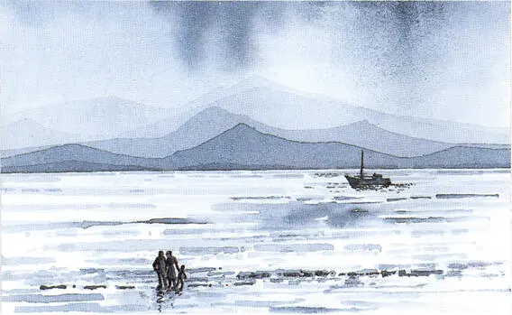
MOUNTAIN AND LOCH,
watercolour on thick cartridge paper, 15 × 23 cm (6 × 9 in)
The mountains were painted in increasingly stronger washes of Indigo. The darker areas appear to advance and the lighter areas to recede. Strong tonal contrasts bring the boat and the people ‘forward’ to give depth.
AERIAL PERSPECTIVE
Aerial perspective means that tones and colours will become fainter in the background. We all know about the ‘blueing’ effect in distant hills where sky and land become almost indistinguishable.
TONE
Try painting a picture using one colour. Allow the nearer tones to become stronger by building up one wash on top of another and you will create depth. Strong tonal contrasts in foreground details will develop it further.
OVERLAPPING
If you draw objects separately across the picture surface, you will struggle to create the effect of depth. On the other hand, if you allow some objects to overlap others you will immediately suggest their spatial positions. Make the ones in front bigger and more tonally developed and depth will be reinforced.
WEIGHT OF LINE
Dark, strong lines drawn against a light background will advance into the foreground. So vary your linear quality to exploit this effect in drawings or paintings. It is really the converse of how white chalk works on a blackboard. The contrast between black and white makes the chalk legible, but try using white chalk on white paper and it becomes difficult to see.
Little exercises like these, using overlapping and tonal contrast can be done quickly. It is possible to create all kinds of depth effects using these elements. Invent your own wonderful landscapes and worlds by playing about with viewpoints and eye levels.
Читать дальшеИнтервал:
Закладка:
Похожие книги на «The Artist’s Problem Solver»
Представляем Вашему вниманию похожие книги на «The Artist’s Problem Solver» списком для выбора. Мы отобрали схожую по названию и смыслу литературу в надежде предоставить читателям больше вариантов отыскать новые, интересные, ещё непрочитанные произведения.

Обсуждение, отзывы о книге «The Artist’s Problem Solver» и просто собственные мнения читателей. Оставьте ваши комментарии, напишите, что Вы думаете о произведении, его смысле или главных героях. Укажите что конкретно понравилось, а что нет, и почему Вы так считаете.