Daniel J. Denis - Applied Univariate, Bivariate, and Multivariate Statistics
Здесь есть возможность читать онлайн «Daniel J. Denis - Applied Univariate, Bivariate, and Multivariate Statistics» — ознакомительный отрывок электронной книги совершенно бесплатно, а после прочтения отрывка купить полную версию. В некоторых случаях можно слушать аудио, скачать через торрент в формате fb2 и присутствует краткое содержание. Жанр: unrecognised, на английском языке. Описание произведения, (предисловие) а так же отзывы посетителей доступны на портале библиотеки ЛибКат.
- Название:Applied Univariate, Bivariate, and Multivariate Statistics
- Автор:
- Жанр:
- Год:неизвестен
- ISBN:нет данных
- Рейтинг книги:5 / 5. Голосов: 1
-
Избранное:Добавить в избранное
- Отзывы:
-
Ваша оценка:
Applied Univariate, Bivariate, and Multivariate Statistics: краткое содержание, описание и аннотация
Предлагаем к чтению аннотацию, описание, краткое содержание или предисловие (зависит от того, что написал сам автор книги «Applied Univariate, Bivariate, and Multivariate Statistics»). Если вы не нашли необходимую информацию о книге — напишите в комментариях, мы постараемся отыскать её.
contains an accessible introduction to statistical modeling techniques commonly used in the social and behavioral sciences. The text offers a blend of statistical theory and methodology and reviews both the technical and theoretical aspects of good data analysis.
Featuring applied resources at various levels, the book includes statistical techniques using software packages such as R and SPSS®. To promote a more in-depth interpretation of statistical techniques across the sciences, the book surveys some of the technical arguments underlying formulas and equations. The thoroughly updated edition includes new chapters on nonparametric statistics and multidimensional scaling, and expanded coverage of time series models. The second edition has been designed to be more approachable by minimizing theoretical or technical jargon and maximizing conceptual understanding with easy-to-apply software examples. This important text:
Offers demonstrations of statistical techniques using software packages such as R and SPSS® Contains examples of hypothetical and real data with statistical analyses Provides historical and philosophical insights into many of the techniques used in modern social science Includes a companion website that includes further instructional details, additional data sets, solutions to selected exercises, and multiple programming options Written for students of social and applied sciences,
offers a text to statistical modeling techniques used in social and behavioral sciences.
Applied Univariate, Bivariate, and Multivariate Statistics — читать онлайн ознакомительный отрывок
Ниже представлен текст книги, разбитый по страницам. Система сохранения места последней прочитанной страницы, позволяет с удобством читать онлайн бесплатно книгу «Applied Univariate, Bivariate, and Multivariate Statistics», без необходимости каждый раз заново искать на чём Вы остановились. Поставьте закладку, и сможете в любой момент перейти на страницу, на которой закончили чтение.
Интервал:
Закладка:
When plotted, the bivariate density resembles a pile of raked leaves in the Autumn. A plot generated in R is given in Figure 2.6.
Empirical bivariate distributions (as opposed to bivariate densities) are those showing the joint occurrence on two variables. For instance, again using Galton's data, we plot parent height by child height, in which we also fit both regression lines (see Chapter 7) using lm:
> plot(parent, child, main = "Bivariate Plot of Parent and Child Height") > abline(lm(parent~child)) > abline(lm(child~parent)) 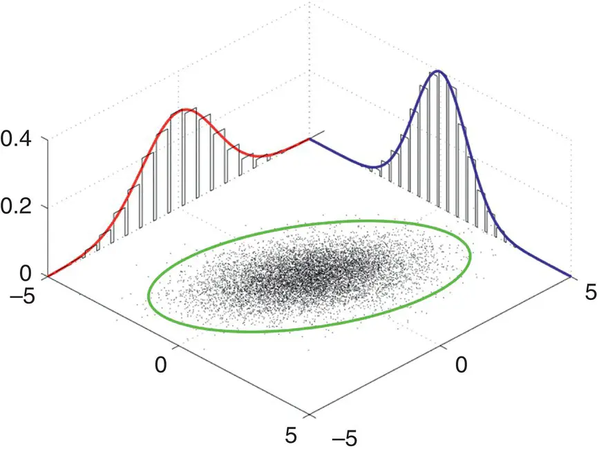
Figure 2.6Bivariate density. Source: Data from Plotting bivariate normal distributions, Mon Sep 1 2003.
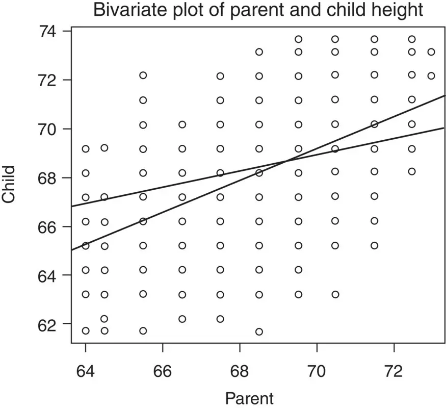
Note the relation between parent height and child height. Recall that a mathematical relation is a subset of the Cartesian product. The Cartesian product in the plot consists of alltheoretically possible parent–child pairings. The fact that shorter than average parents tend to have shorter than average children and taller than average parents tend to have taller than average children reveals the linear form of the mathematical relation. In the plot are regression lines for child height as a function of parent height and parent height as a function of child height. Computing both the mean of child and of parent, we obtain:
> mean(child) [1] 68.08847 > mean(parent) [1] 68.30819
Notice that both regression lines, as they are required to do whatever the empirical data, pass through the means of each variable. The reason for this will become clearer in Chapter 7.
Turning now to multivariate distributions, the multivariate densityis given by:
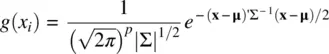
where p is the number of variables and ∣∑∣ is the determinant of the population covariance matrix, which can be taken as a measure of generalized variancesince it incorporates both variances andcovariances. Refer to the Appendix for examples of computing covariance and correlation matrices. Multivariate distributions represent the joint occurrence of three or more variables, and thus are quite difficult to visualize. One way, however, of representing a density in three dimensions is attempted in Figure 2.7.
Most multivariate procedures make some assumption regarding the multivariate normalityof sampling distributions. Evaluating such an assumption is intrinsically difficult due to the high dimensionality of the data. The best researchers can usually do is attempt to verify univariate and bivariate normality through such devices as histograms and scatterplots. Fortunately, as is the case for methods assuming univariate normality, multivariate procedures are relatively robust, in most cases, to modest violations. Though Mardia's test(Mardia, 1970) is favored by some (e.g., Romeu and Ozturk, 1993), no single method for evaluating multivariate normality appears to be fully adequate. Visual inspections of Q–Q plots (to be discussed) are usually sufficient for applied purposes.
In cases where rather severe departures of normality exist, one may also choose to perform data transformations on the “offending” variables to better approximate normal distributions. However, it should be kept in mind that sometimes a severely nonnormal distribution can be evidence more of a scientificproblem than symptomatic of a statistical issue. For example, if we asked individuals in a sample how many car accidents they got into this month, the vast majority of our responses would indicate a count of “0.” Is the distribution skewed? Yes, but this is not a statistical problem alone, it is first and foremost a substantiveone. We likely would not even have sufficient variability in our measurement responses to conduct any meaningful analyses since probably close to 100% of our sample will likely respond with “0.” If virtually everyone in your sample responds with a constant, then one might say the very process of measurementmay have been problematic, or at minimum, not very meaningful for scientific purposes. The difficulties presented in subjecting that data to statistical analyses should be an afterthought, second in priority to the more pressing scientific issue.
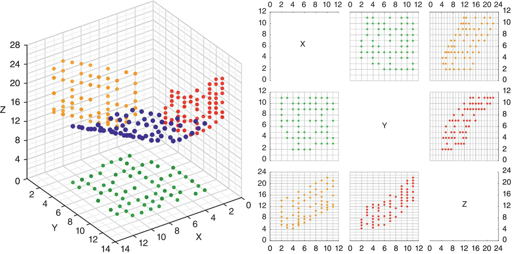
Figure 2.7A 3D scatterplot with density contour and points (Image is taken from http://www.jmp.com/support/help/Scatterplot_3D_Platform_Options.shtml).
Source: Figure taken from JMP 12 Essential Graphing, Copyright © 2015, SAS Institute Inc., USA. All Rights Reserved. Reproduced with permission of SAS Institute Inc, Cary, NC.
2.2 CHI‐SQUARE DISTRIBUTIONS AND GOODNESS‐OF‐FIT TEST
The chi‐square distribution is given by:
for x > 0, where v are degrees of freedom and Γ is the gamma function. 4 The chi‐square distribution of a random variable is also equal to the sum of squares of n independent and normally distributed z ‐scores (Fisher, 1922b). That is,
The chi‐square distribution plays an important role in mathematical statistics and is associated with a number of tests on model coefficients in a variety of statistical methods. The multivariate analog to the chi‐square distribution is that of the Wishart distribution(see Rencher, 1998, p. 53, for details).
The chi‐square goodness‐of‐fit testis one such statistical method that utilizes the chi‐square test statistic to evaluate the tenability of a null hypothesis. Recall that such a test is suitable for categorical data in which counts (i.e., instead of means, medians, etc.) are computed within each cell of the design. The goodness‐of‐fit test is given by
Table 2.1 Contingency Table for 2 × 2 Design
| Condition Present (1) | Condition Absent (0) | Total | |
|---|---|---|---|
| Exposure yes (1) | 20 | 10 | 30 |
| Exposure no (2) | 5 | 15 | 20 |
| Total | 25 | 25 | 50 |
where O iand E irepresent observedand expectedfrequencies, respectively, summed across r rows and c columns.
As a simple example, consider the hypothetical data ( Table 2.1), where the frequencies of those exposed to something adverse are related to whether a condition is present or absent. If you are a clinical psychologist, then you might define exposureas, perhaps, a variable such as combat exposure, and conditionas posttraumatic stress disorder (if you are not a psychologist, see if you can come up with another example).
Читать дальшеИнтервал:
Закладка:
Похожие книги на «Applied Univariate, Bivariate, and Multivariate Statistics»
Представляем Вашему вниманию похожие книги на «Applied Univariate, Bivariate, and Multivariate Statistics» списком для выбора. Мы отобрали схожую по названию и смыслу литературу в надежде предоставить читателям больше вариантов отыскать новые, интересные, ещё непрочитанные произведения.


Обсуждение, отзывы о книге «Applied Univariate, Bivariate, and Multivariate Statistics» и просто собственные мнения читателей. Оставьте ваши комментарии, напишите, что Вы думаете о произведении, его смысле или главных героях. Укажите что конкретно понравилось, а что нет, и почему Вы так считаете.