Paul J. Mitchell - Experimental Design and Statistical Analysis for Pharmacology and the Biomedical Sciences
Здесь есть возможность читать онлайн «Paul J. Mitchell - Experimental Design and Statistical Analysis for Pharmacology and the Biomedical Sciences» — ознакомительный отрывок электронной книги совершенно бесплатно, а после прочтения отрывка купить полную версию. В некоторых случаях можно слушать аудио, скачать через торрент в формате fb2 и присутствует краткое содержание. Жанр: unrecognised, на английском языке. Описание произведения, (предисловие) а так же отзывы посетителей доступны на портале библиотеки ЛибКат.

- Название:Experimental Design and Statistical Analysis for Pharmacology and the Biomedical Sciences
- Автор:
- Жанр:
- Год:неизвестен
- ISBN:нет данных
- Рейтинг книги:5 / 5. Голосов: 1
-
Избранное:Добавить в избранное
- Отзывы:
-
Ваша оценка:
Experimental Design and Statistical Analysis for Pharmacology and the Biomedical Sciences: краткое содержание, описание и аннотация
Предлагаем к чтению аннотацию, описание, краткое содержание или предисловие (зависит от того, что написал сам автор книги «Experimental Design and Statistical Analysis for Pharmacology and the Biomedical Sciences»). Если вы не нашли необходимую информацию о книге — напишите в комментариях, мы постараемся отыскать её.
Experimental Design and Statistical Analysis for Pharmacology and the Biomedical Sciences
in vitro
in vivo
priori
Experimental Design and Statistical Analysis for Pharmacology and the Biomedical Sciences
Experimental Design and Statistical Analysis for Pharmacology and the Biomedical Sciences — читать онлайн ознакомительный отрывок
Ниже представлен текст книги, разбитый по страницам. Система сохранения места последней прочитанной страницы, позволяет с удобством читать онлайн бесплатно книгу «Experimental Design and Statistical Analysis for Pharmacology and the Biomedical Sciences», без необходимости каждый раз заново искать на чём Вы остановились. Поставьте закладку, и сможете в любой момент перейти на страницу, на которой закончили чтение.
Интервал:
Закладка:
The table summarizes the p A 2values (−Log 10of the antagonist concentration, expressed in M values, estimated to double the EC 50concentration of the respective agonist); the magnitude of the p A 2value reflects antagonist potency on the receptor system stimulated by each agonist. The data indicate that atropine is about 1000 × more potent on muscarinic M3 receptor than on histaminic H 1receptors, while mepyramine may be up to 10 000 × times more selective for H 1receptors. This table demonstrates the phenomenon of differential antagonismexpressed by atropine and mepyramine for these two receptor systems, and the relationships between these values are far easier to see in the table compared with when the values are buried in a paragraph of text.
In contrast, Table 2.2summarizes the association of neuropathic pain with various disease states in terms of its classification and aetiology according to NICE clinical guidelines. This table simply shows how a wealth of information may be summarized efficiently; to describe all the relevant clinical studies within the body of a manuscript would be laborious and time‐consuming to prepare and, most likely, extremely boring to read.
Table 2.2 Disease associated with neuropathic pain.
| Disease | Classification | Aetiology |
|---|---|---|
| Painful diabetic neuropathy | Peripheral | Metabolic |
| Cancer pain due to surgery or chemotherapy | Peripheral | Paraneoplastic |
| HIV‐related neuropathy | Peripheral | Infection |
| Post‐herpetic neuralgia | Peripheral | Infection |
| Radiculopathy (nerve compression) | Peripheral | Trauma |
| Spinal cord injury | Central | Trauma |
| Multiple sclerosis | Central | Neurodegeneration |
| Post‐stroke pain | Central | Neurotoxic |
| Phantom limb | Peripheral/central | Trauma |
| Cancer | Peripheral/central | Paraneoplastic |
Classification is based on originating lesion. NICE clinical guideline 173 (2013).
Figures
In most cases, experimental data may be most efficiently communicated by the use of figures.
Line charts are useful to show trends in categories. Care must be taken to ensure that the use of line charts is not confused with scatter plots. While the magnitude of the data (shown on the Y‐axis) may be a continuous variable, the values on the X‐axis in line charts are not, and the data are plotted at set intervals or individual categories along the X‐axis; line charts are therefore wholly inappropriate for plotting information where the X‐axis reflects the magnitude of a continuous variable.
X‐Y Scatter plots should be used when you wish to show the relationship between the magnitude of two sets of continuous variables. Figure 1.3is an example of an X‐Y scatter plot, where Log10 of the molar drug concentration is plotted along the X‐axis and the magnitude of the ensuing response (expressed as % maximal response) is plotted up the Y‐axis. In both cases the sets of values may take any value within the range set along each axis.
Bar charts are typically used to compare values across a few categories. Figure 1.1is an example of a bar chart where the height of each bar represents the magnitude of the parameter measured (i.e. locomotor activity) according to the category of drug treatment combination administered to the animals used in the study. Consequently, bar charts are very similar to line charts and just convey a different visual impression of the data.
Histograms are similar to bar charts where the frequency of continuous data (Y‐axis) is plotted against the pre‐defined ranges of the values (X‐axis).
Box–whisker plots provide a representation of the key features of a univariate sample of data. The whiskers indicate the range while the box indicates the median and upper and lower quartiles.
Pie charts may be used when you wish to express and compare categories of observations as proportions of a whole. So, if you can set your total to 100%, then each category should reflect a proportion of the total and be expressed as a percentage. I have used pie charts in my explanation of the theory behind Analysis of Variance, where the total size of the chart reflects the total sample variance in the data while the size of the segments reflects the relative sizes of the Between and Within sample variances (see Chapter 15).
3 Numbers; counting and measuring, precision, and accuracy
When we obtain data in our experiments, we either count the occurrence of an event or we make measurements of a specific parameter.
A countcan only be a whole number (i.e. an integer), while a measurementmay have any number of decimal places depending on either the accuracy of the instrumentation of the equipment used to make the measurement or any subsequent calculation that uses such measurements. So, if we use a typical home room thermometer to measure temperature, then we should be able to observe whole degree Celsius differences in temperature. If we use a laboratory thermometer then, hopefully, we should achieve an accuracy of half a degree Celsius, and accuracy may be further improved to 0.1 of a degree Celsius by using a reasonably priced digital thermometer. However, if we have access to a high‐quality industrial thermometer for use with thermocouples or resistance thermometer probes to measure temperature, then the accuracy may be improved even further. However, no number of decimal places will yield the true temperature as we will always be unsure of what number lies beyond the last digit. Perhaps the best we can hope for, no matter what we are measuring, is to achieve data with the highest level of precision and accuracy available to us.
Precision and accuracy
The term precisionreflects the consistency of a series of measurements and is therefore the ability to obtain the same value on multiple occasions. So, the measure of precision is related to the spread of the data; the higher the precision of the data, then the less the spread of the values. The measurement of precision is provided by the coefficient of variationwhile accuracyreflects the nearness of the measurement to the true value.
Coefficient of variation is calculated as follows; (see Chapter 5for information regarding calculation of the mean and standard deviation).(3.1)
% Accuracy is calculated by dividing the measured value by the true value and is expressed as a percentage.(3.2)
Consider the following example.
Example 3.1
Two groups of students were asked to make 10 measurements of the p H of a solution (with a known p H of 8.0). The resulting data is shown in the table below.
The respective coefficients of variation show that Group 2 was more precise in their p H measurements compared with the data obtained by Group 1; however, their estimation of the solution's p H was quite poor with a % accuracy of 107.4%. In contrast, Group 1 was 100% accurate in their estimation of the p H, but their measurements were highly variable. Consequently, while Group 2 was very precise, in contrast Group 1 was highly accurate but did not know it due to the inherent variation in their data (see Figure 3.1)!
Table 3.1 Estimation of p H.
| Observation | Group 1 | Group 2 |
|---|---|---|
| 1 | 6.0 | 8.4 |
| 2 | 8.7 | 8.6 |
| 3 | 9.2 | 8.7 |
| 4 | 10.0 | 8.9 |
| 5 | 6.5 | 8.8 |
| 6 | 7.5 | 8.5 |
| 7 | 9.7 | 8.3 |
| 8 | 8.8 | 8.4 |
| 9 | 6.5 | 8.4 |
| 10 | 7.1 | 8.9 |
| Mean | 8.0 | 8.59 |
| St dev | 1.453 | 0.223 |
| Coefficient of variation (%) | 18.2 | 2.6 |
| % Accuracy | 100.0 | 107.4 |
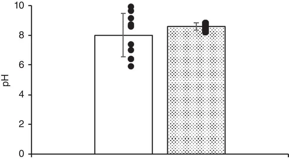
Figure 3.1 Estimation of pH: precision and accuracy.Summary of data from Table 3.1. Group A (open bar) p H = 8.0 ± 1.453 (mean ± St. dev). Group B (shaded bar) p H = 8.59 ± 0.223. Closed circles indicate raw data values for each group.
Читать дальшеИнтервал:
Закладка:
Похожие книги на «Experimental Design and Statistical Analysis for Pharmacology and the Biomedical Sciences»
Представляем Вашему вниманию похожие книги на «Experimental Design and Statistical Analysis for Pharmacology and the Biomedical Sciences» списком для выбора. Мы отобрали схожую по названию и смыслу литературу в надежде предоставить читателям больше вариантов отыскать новые, интересные, ещё непрочитанные произведения.


Обсуждение, отзывы о книге «Experimental Design and Statistical Analysis for Pharmacology and the Biomedical Sciences» и просто собственные мнения читателей. Оставьте ваши комментарии, напишите, что Вы думаете о произведении, его смысле или главных героях. Укажите что конкретно понравилось, а что нет, и почему Вы так считаете.