Ted Kwartler - Sports Analytics in Practice with R
Здесь есть возможность читать онлайн «Ted Kwartler - Sports Analytics in Practice with R» — ознакомительный отрывок электронной книги совершенно бесплатно, а после прочтения отрывка купить полную версию. В некоторых случаях можно слушать аудио, скачать через торрент в формате fb2 и присутствует краткое содержание. Жанр: unrecognised, на английском языке. Описание произведения, (предисловие) а так же отзывы посетителей доступны на портале библиотеки ЛибКат.

- Название:Sports Analytics in Practice with R
- Автор:
- Жанр:
- Год:неизвестен
- ISBN:нет данных
- Рейтинг книги:4 / 5. Голосов: 1
-
Избранное:Добавить в избранное
- Отзывы:
-
Ваша оценка:
Sports Analytics in Practice with R: краткое содержание, описание и аннотация
Предлагаем к чтению аннотацию, описание, краткое содержание или предисловие (зависит от того, что написал сам автор книги «Sports Analytics in Practice with R»). Если вы не нашли необходимую информацию о книге — напишите в комментариях, мы постараемся отыскать её.
A practical guide for those looking to employ the latest and leading analytical software in sport Sports Analytics in Practice with R
Sports Analytics in Practice with R
Sports Analytics in Practice with R
Sports Analytics in Practice with R — читать онлайн ознакомительный отрывок
Ниже представлен текст книги, разбитый по страницам. Система сохранения места последней прочитанной страницы, позволяет с удобством читать онлайн бесплатно книгу «Sports Analytics in Practice with R», без необходимости каждый раз заново искать на чём Вы остановились. Поставьте закладку, и сможете в любой момент перейти на страницу, на которой закончили чтение.
Интервал:
Закладка:
nbaData <- read.csv(text = nbaFile)
Unlike a spreadsheet program where you can scroll to any area of the sheet to look at the contents, R holds the data frame as an object which is an abstraction. As a result, it can be difficult to comprehend the loaded data. Thus, it is a best practice to explore the data to learn about its characteristics. In fact, exploratory data analysis, EDA, in itself is a robust field within analytics. The code below only scratches the surface of what is possible.
To being this basic EDA defines the dimensions of the data using the ` dim` function applied to the ` nbaData` data frame. This will print the total rows and columns for the data frame. Similar to the indexing code, the first number represents the rows and the second the columns.
dim(nbaData)
Since data frames have named columns, you may want to know what the column headers are. The base-R function ` names` accepts a few types of objects and in this case will print the column names of the basketball data.
names(nbaData)
At this point you know the column names and the size of the data loaded in the environment. Another popular way to get familiar with the data is to glimpse at a portion of it. This is preferred to calling the entire object in your console. Data frames can often be tens of thousands of rows or more plus hundreds of columns. If you call a large object directly in console, your system may lag trying to print that much data as an output. Thus, the popular ` head` function accepts a data object along with an integer parameter representing the number of records to print to select. Since this function call is not being assigned an object, the result is printed to console for review. The default behavior selects six though this can be adjusted for more or less observations. When called the ` head` function will print the first ` n` rows of the data frame. This is in contrast to the ` tail` function which will print the last ` n` rows.
head(nbaData, n = 6)
You should notice that the column ` TEAM` shows “Dal” for all results in the `head` function. To ensure this data set only contains players from the Dallas team you can employ the ` table` function specifying the ` TEAM` column either by name or by index position. The ` table` function merely tallies the levels or values of a column. After running the next code chunk, you see that “Dal” appears 19 times in this data set. Had there been another value in this column, additional tallied information would be presented.
table(nbaData$TEAM) table(nbaData[,2])
Lastly, another basic EDA function is ` summary`. The ` summary` function can be applied to any object and will return some information determined by the type of object it receives. In the case of a data frame, the ` summary` function will examine each column individually. It will denote character columns and, when declared as factor, will tally the different factor levels. Perhaps most important is how ` summary` treats numeric columns. For each numeric column, the minimum, first quartile, median, mean, third quartile, and maximum are returned. If missing values are stored as “NA” in a particular column, the function will also tally that. This allows the practitioner to understand each columns range, distribution, averages, and how much of the column contains NA values.
summary(nbaData)
Now that you have a rudimentary understanding of the player level Dallas basketball data set, you can visualize aspects of it. For example, one would expect that the more minutes a player averages per game, the more points the player averages per game. To confirm this assumption, a simple scatter plot may help identify the correlation. Of course, you can calculate correlation, with the ` cor` function, but often visualizing data can be a powerful tool in a sports analyst’s toolkit. The ` ggplot2` library contains a convenience function called ` qplot` for quick plotting. This function accepts the name of a column for the x -axis, followed by another column name to plot on the y -axis. The last parameter is the data itself. The ` data` parameter requires a data frame so that the specific columns can be plotted. Additionally, an optional aesthetic is added declaring the ` size` for each dot in the scatterplot. The code below adds another aspect to the ` qplot` to improve the overall look. Specifically, another “layer” is added from the ` ggthemes` library to adjust many parameters within a single function call. Here, the empty function ` theme_hc` emulates the popular “Highcharts” JavaScript theme. As is standard with ` ggplot2` objects, additional parameters such as aesthetics are added in layers using the ` +` sign. This is not the arithmetic addition sign merely an operator to append layers to ` ggplot` objects. Figure 1.8 is the result of the ` qplot` and ` theme_hc` adjustment using the Dallas basketball data to explore the relationship between average minutes per game and average points per game.
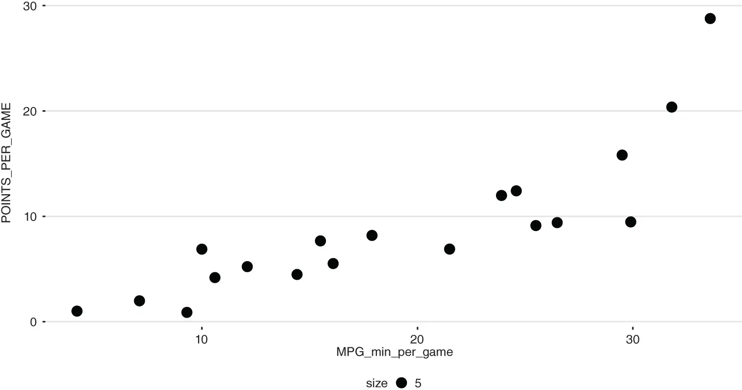
Figure 1.8 As expected the more minutes a player averages the higher the average points.
qplot(x = MPG_min_per_game, y = POINTS_PER_GAME, size = 5, data = nbaData) + theme_hc()
Let’s add a bit more complexity to the visualization by creating a heatmap. The heatmap chart has x and y axes but represents data amounts as color intensity. A heatmap allows the audience to comprehend complex data quickly and concisely. To begin, let’s use the `data.frame` function to create a smaller data set. Here, the column names are being renamed and each individual column from the `nbaData` object is explicitly selected. The new object has the same number of rows but a subset of the columns. There are additional functions to perform this operation but this is straightforward. As the book continues, more concise though complex examples will perform the same operation.
smallerStats <- data.frame(player = nbaData$ï.PLAYER, FTA = nbaData$FTA_free_throws_attempted, TWO_PA = nbaData$TWO_PA, THREE_PA = nbaData$THREE_PA)
In order to construct a heatmap with ` ggplot2`, the ` smallerStats` data frame must be rearranged into a “tidy” format. This type of data organization can be difficult to comprehend for novice R programmers, but the main point is that the data is not being changed, merely rearranged. The ` tidyr` library function ` pivot_longer` accepts the data frame first. Next, the ` cols` parameter is defined. In this case, the column to pivot upon is the ` player` column. This will result in each player’s name being repeated and two new columns being created. These columns are defined in the function as ` names_to` and ` values_to`, respectively. In the end, each player and corresponding statistic name and value are captured as a row. Whereas the ` smallerStats` data frame had 19 observations with 4 columns, now the ` nbaDataLong` object which has been pivoted by the ` player` column has 57 rows and 3 columns. After the pivot the ` head` function is executed to demonstrate the difference.
nbaDataLong <- pivot_longer(data = smallerStats, cols = -c(player), names_to = "stat", values_to = "value") head(nbaDataLong)
Читать дальшеИнтервал:
Закладка:
Похожие книги на «Sports Analytics in Practice with R»
Представляем Вашему вниманию похожие книги на «Sports Analytics in Practice with R» списком для выбора. Мы отобрали схожую по названию и смыслу литературу в надежде предоставить читателям больше вариантов отыскать новые, интересные, ещё непрочитанные произведения.


Обсуждение, отзывы о книге «Sports Analytics in Practice with R» и просто собственные мнения читателей. Оставьте ваши комментарии, напишите, что Вы думаете о произведении, его смысле или главных героях. Укажите что конкретно понравилось, а что нет, и почему Вы так считаете.