Mark Murphy - Beginning Android
Здесь есть возможность читать онлайн «Mark Murphy - Beginning Android» весь текст электронной книги совершенно бесплатно (целиком полную версию без сокращений). В некоторых случаях можно слушать аудио, скачать через торрент в формате fb2 и присутствует краткое содержание. Город: New York, Год выпуска: 2009, ISBN: 2009, Издательство: Apress, Жанр: Программирование, на английском языке. Описание произведения, (предисловие) а так же отзывы посетителей доступны на портале библиотеки ЛибКат.
- Название:Beginning Android
- Автор:
- Издательство:Apress
- Жанр:
- Год:2009
- Город:New York
- ISBN:978-1-4302-2420-4
- Рейтинг книги:3 / 5. Голосов: 1
-
Избранное:Добавить в избранное
- Отзывы:
-
Ваша оценка:
Beginning Android: краткое содержание, описание и аннотация
Предлагаем к чтению аннотацию, описание, краткое содержание или предисловие (зависит от того, что написал сам автор книги «Beginning Android»). Если вы не нашли необходимую информацию о книге — напишите в комментариях, мы постараемся отыскать её.
Dear Reader,
First, welcome to the world of Android! We’re entering a new era of mobile application development, one marked by open platforms and open source, to take ‘walled gardens’ and make them green houses for any and all to participate in. Android is relatively easy for developers, and I believe that this innovation will help generate a large ecosystem of developers and consumers within a very short time. This means that budding developers such as yourself will have many opportunities to design and build your own applications and you’ll have a huge and hungry customer base.
Second, welcome to the book! Its purpose is to start you on your way with building Android applications, and to help you master the learning curve. Android is already a rich framework, comparable in many ways to the richness Android of desktop Java environments. This means that there is a lot of cool stuff for you to pick up along your journey in order to create the slickest, most useful apps Android you can imagine.
The source code for the code samples in this book is all available from the Apress site, so you can stay as hands-on and practical as you like while I introduce you to the core of Android, and invite you to experiment with the various classes and APIs we’ll be looking at. By the time you’ve finished this book, you’ll be creating your own Android applications and asking yourself what your next great application will be…!
Enjoy! Mark Murphy
Beginning Android — читать онлайн бесплатно полную книгу (весь текст) целиком
Ниже представлен текст книги, разбитый по страницам. Система сохранения места последней прочитанной страницы, позволяет с удобством читать онлайн бесплатно книгу «Beginning Android», без необходимости каждый раз заново искать на чём Вы остановились. Поставьте закладку, и сможете в любой момент перейти на страницу, на которой закончили чтение.
Интервал:
Закладка:
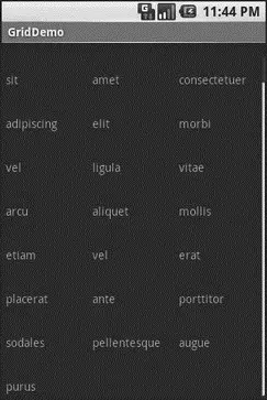
Figure 8-5. The same application, scrolled to the bottom of the grid
Fields: Now with 35% Less Typing!
The AutoCompleteTextViewis sort of a hybrid between the EditText(field) and the Spinner. With auto-completion, as the user types, the text is treated as a prefix filter, comparing the entered text as a prefix against a list of candidates. Matches are shown in a selection list that, like with Spinner, folds down from the field. The user can either type out an entry (e.g., something not in the list) or choose an entry from the list to be the value of the field.
AutoCompleteTextViewsubclasses EditText, so you can configure all the standard look-and-feel aspects, such as font face and color.
In addition, AutoCompleteTextViewhas a android:completionThresholdproperty, to indicate the minimum number of characters a user must enter before the list filtering begins.
You can give AutoCompleteTextViewan adapter containing the list of candidate values via setAdapter(). However, since the user could type something not in the list, AutoCompleteTextViewdoes not support selection listeners. Instead, you can register a TextWatcher, like you can with any EditText, to be notified when the text changes. These events will occur either because of manual typing or from a selection from the drop-down list.
The following is a familiar-looking XML layout, this time containing an AutoCompleteTextView(pulled from the Selection/AutoCompletesample application):
xmlns:android="http://schemas.android.com/apk/res/android"
android:orientation="vertical"
android:layout_width="fill_parent"
android:layout_height="fill_parent">
android:id="@+id/selection"
android:layout_width="fill_parent"
android:layout_height="wrap_content"
/>
android:layout_width="fill_parent"
android:layout_height="wrap_content"
android:completionThreshold="3"/>
The corresponding Java code is:
public classAutoCompleteDemo extendsActivity
implementsTextWatcher {
TextView selection;
AutoCompleteTextView edit;
String[] items={"lorem", "ipsum", "dolor", "sit", "amet",
"consectetuer", "adipiscing", "elit", "morbi", "vel",
"ligula", "vitae", "arcu", "aliquet", "mollis",
"etiam", "vel", "erat", "placerat", "ante",
"porttitor", "sodales", "pellentesque", "augue", "purus"};
@Override
publicvoid onCreate(Bundle icicle) {
super. onCreate(icicle);
setContentView(R.layout.main);
selection = (TextView) findViewById(R.id.selection);
edit = (AutoCompleteTextView) findViewById(R.id.edit);
edit. addTextChangedListener( this);
edit. setAdapter( newArrayAdapter( this,
android.R.layout.simple_dropdown_item_1line, items));
}
publicvoid onTextChanged(CharSequence s, int start, int before,
int count) {
selection. setText(edit. getText());
}
publicvoid beforeTextChanged(CharSequence s, int start,
int count, int after) {
// needed for interface, but not used
}
publicvoid afterTextChanged(Editable s) {
// needed for interface, but not used
}
}
This time, our activity implements TextWatcher, which means our callbacks are onTextChanged()and beforeTextChanged(). In this case, we are only interested in the former, and we update the selection label to match the AutoCompleteTextView’s current contents.
Figures 8-6, 8-7, and 8-8 show the application results.
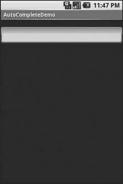
Figure 8-6. The AutoCompleteDemo sample application, as initially launched
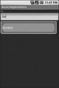
Figure 8-7. The same application, after a few matching letters were entered, showing the auto-complete drop-down
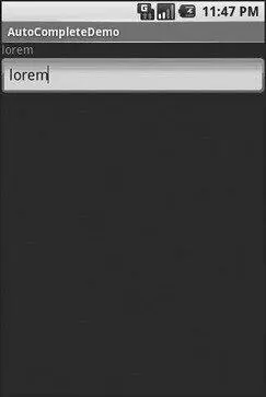
Figure 8-8. The same application, after the auto-complete value was selected
Galleries, Give or Take the Art
The Gallerywidget is not one ordinarily found in GUI toolkits. It is, in effect, a horizontally-laid-out listbox. One choice follows the next across the horizontal plane, with the currently-selected item highlighted. On an Android device, one rotates through the options through the left and right D-pad buttons.
Compared to the ListView, the Gallerytakes up less screen space while still showing multiple choices at one time (assuming they are short enough). Compared to the Spinner, the Galleryalways shows more than one choice at a time.
The quintessential example use for the Galleryis image preview — given a collection of photos or icons, the Gallerylets people preview the pictures in the process of choosing one.
Code-wise, the Galleryworks much like a Spinneror GridView. In your XML layout, you have a few properties at your disposal:
• android:spacingcontrols the number of pixels between entries in the list.
• android:spinnerSelectorcontrols what is used to indicate a selection — this can either be a reference to a Drawable(see the resources chapter) or an RGB value in #AARRGGBBor similar notation.
• android:drawSelectorOnTopindicates if the selection bar (or Drawable) should be drawn before (false) or after (true) drawing the selected child — if you choose true, be sure that your selector has sufficient transparency to show the child through the selector, otherwise users will not be able to read the selection.
CHAPTER 9
Getting Fancy with Lists
The humble ListViewis one of the most important widgets in all of Android, simply because it is used so frequently. Whether choosing a contact to call or an email message to forward or an ebook to read, ListViewwidgets are employed in a wide range of activities. Of course, it would be nice if they were more than just plain text.
Интервал:
Закладка:
Похожие книги на «Beginning Android»
Представляем Вашему вниманию похожие книги на «Beginning Android» списком для выбора. Мы отобрали схожую по названию и смыслу литературу в надежде предоставить читателям больше вариантов отыскать новые, интересные, ещё непрочитанные произведения.


Обсуждение, отзывы о книге «Beginning Android» и просто собственные мнения читателей. Оставьте ваши комментарии, напишите, что Вы думаете о произведении, его смысле или главных героях. Укажите что конкретно понравилось, а что нет, и почему Вы так считаете.