Pedro Domingos - The Master Algorithm - How the Quest for the Ultimate Learning Machine Will Remake Our World
Здесь есть возможность читать онлайн «Pedro Domingos - The Master Algorithm - How the Quest for the Ultimate Learning Machine Will Remake Our World» весь текст электронной книги совершенно бесплатно (целиком полную версию без сокращений). В некоторых случаях можно слушать аудио, скачать через торрент в формате fb2 и присутствует краткое содержание. Жанр: Прочая околокомпьтерная литература, на английском языке. Описание произведения, (предисловие) а так же отзывы посетителей доступны на портале библиотеки ЛибКат.
- Название:The Master Algorithm: How the Quest for the Ultimate Learning Machine Will Remake Our World
- Автор:
- Жанр:
- Год:неизвестен
- ISBN:нет данных
- Рейтинг книги:4 / 5. Голосов: 1
-
Избранное:Добавить в избранное
- Отзывы:
-
Ваша оценка:
The Master Algorithm: How the Quest for the Ultimate Learning Machine Will Remake Our World: краткое содержание, описание и аннотация
Предлагаем к чтению аннотацию, описание, краткое содержание или предисловие (зависит от того, что написал сам автор книги «The Master Algorithm: How the Quest for the Ultimate Learning Machine Will Remake Our World»). Если вы не нашли необходимую информацию о книге — напишите в комментариях, мы постараемся отыскать её.
Machine learning is the automation of discovery-the scientific method on steroids-that enables intelligent robots and computers to program themselves. No field of science today is more important yet more shrouded in mystery. Pedro Domingos, one of the field’s leading lights, lifts the veil for the first time to give us a peek inside the learning machines that power Google, Amazon, and your smartphone. He charts a course through machine learning’s five major schools of thought, showing how they turn ideas from neuroscience, evolution, psychology, physics, and statistics into algorithms ready to serve you. Step by step, he assembles a blueprint for the future universal learner-the Master Algorithm-and discusses what it means for you, and for the future of business, science, and society.
If data-ism is today’s rising philosophy, this book will be its bible. The quest for universal learning is one of the most significant, fascinating, and revolutionary intellectual developments of all time. A groundbreaking book, The Master Algorithm is the essential guide for anyone and everyone wanting to understand not just how the revolution will happen, but how to be at its forefront.
The Master Algorithm: How the Quest for the Ultimate Learning Machine Will Remake Our World — читать онлайн бесплатно полную книгу (весь текст) целиком
Ниже представлен текст книги, разбитый по страницам. Система сохранения места последней прочитанной страницы, позволяет с удобством читать онлайн бесплатно книгу «The Master Algorithm: How the Quest for the Ultimate Learning Machine Will Remake Our World», без необходимости каждый раз заново искать на чём Вы остановились. Поставьте закладку, и сможете в любой момент перейти на страницу, на которой закончили чтение.
Интервал:
Закладка:
If you plot more shops, you’ll probably notice that some are on cross streets, a little bit off University Avenue, and a few are elsewhere entirely:
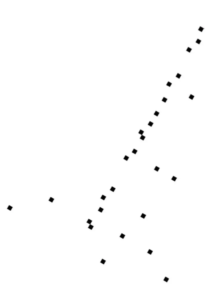
Nevertheless, it’s still the case that most shops are pretty close to University Avenue, and if you were allowed only one number to locate a shop, its distance from the Caltrain station along the avenue would be a pretty good choice: after walking that distance, looking around is probably enough to find the shop. So you’ve just reduced the dimensionality of “shop locations in Palo Alto” from two to one.
Robby doesn’t have the benefit of your highly evolved visual system, though, so if you want him to go fetch your dry cleaning from Elite Cleaners and you only allow his map of Palo Alto to have one coordinate, he needs an algorithm to “discover” University Avenue from the GPS coordinates of the shops. The key to this is to notice that, if you put the origin of the x,y plane at the average of the shops’ locations and slowly rotate the axes, the shops are closest to the x axis when you’ve turned it by about 60 degrees, that is, when it lines up with University Avenue:
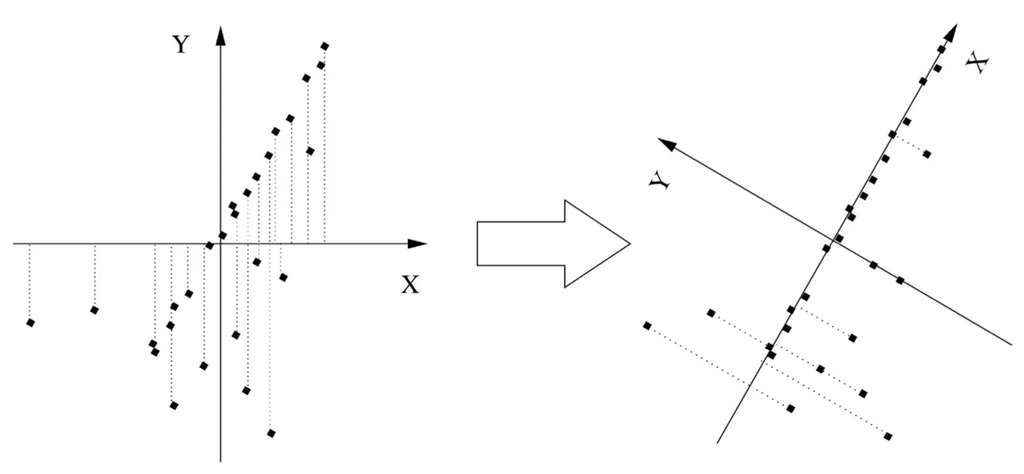
This direction-known as the first principal component of the data-is also the direction along which the spread of the data is greatest. (Notice how, if you project the shops onto the x axis, they’re farther apart in the right figure than in the left one.) After you’ve found the first principal component, you can look for the second one, which in this case is the direction of greatest variation at right angles to University Avenue. On a map, there’s only one possible direction left (the direction of the cross streets). But if Palo Alto was on a hillside, one or both of the two first principal components would be partly uphill, and the third and last one would be up into the air. We can apply the same idea to data in thousands or millions of dimensions, like face images, successively looking for the directions of greatest variation until the remaining variability is small, at which point we can stop. For example, after rotating the axes in the figure above, most shops have y = 0, so the average y is very small, and we don’t lose too much information by ignoring the y coordinate altogether. And if we decide to keep y , surely z (up into the air) is insignificant. As it turns out, the whole process of finding the principal components can all be accomplished in one shot with a bit of linear algebra. Best of all, a few dimensions often account for the bulk of the variation in even very high-dimensional data. Even if that’s not the case, eyeballing the data in the top two or three dimensions often yields a lot of insight because it takes advantage of your visual system’s amazing powers of perception.
Principal-component analysis (PCA), as this process is known, is one of the key tools in the scientist’s toolkit. You could say PCA is to unsupervised learning what linear regression is to the supervised variety. The famous hockey-stick curve of global warming, for example, is the result of finding the principal component of various temperature-related data series (tree rings, ice cores, etc.) and assuming it’s the temperature. Biologists use PCA to summarize the expression levels of thousands of different genes into a few pathways. Psychologists have found that personality boils down to five dimensions-extroversion, agreeableness, conscientiousness, neuroticism, and openness to experience-which they can infer from your tweets and blog posts. (Chimps supposedly have one more dimension-reactivity-but Twitter data for them is not available.) Applying PCA to congressional votes and poll data shows that, contrary to popular belief, politics is not mainly about liberals versus conservatives. Rather, people differ along two main dimensions: one for economic issues and one for social ones. Collapsing these into a single axis mixes together populists and libertarians, who are polar opposites, and creates the illusion of lots of moderates in the middle. Trying to appeal to them is an unlikely winning strategy. On the other hand, if liberals and libertarians overcame their mutual aversion, they could ally themselves on social issues, where both favor individual freedom.
When he grows up, Robby can use a variant of PCA to solve the “cocktail party” problem, which is to pick out individual voices from the babble of the crowd. A related method can help him learn to read. If each word is a dimension, then a text is a point in the space of words, and the main directions of that space turn out to be elements of meaning. For example, President Obama and the White House are far apart in word space but close together in meaning space, because they tend to appear in similar contexts. Believe it or not, this type of analysis is all it takes for computers to grade SAT essays as well as humans do. Netflix uses a similar idea. Instead of just recommending movies that users with similar tastes liked, it first projects both users and movies into a lower-dimensional “taste space” and recommends a movie if it’s close to you in this space. That way it can find movies for you that you never knew you’d love.
You’d probably be disappointed if you looked at the principal components of a face data set, though. They’re not what you’d expect, such as facial expressions or features, but more like ghostly faces, blurred beyond recognition. This is because PCA is a linear algorithm, and so all that the principal components can be is weighted pixel-by-pixel averages of real faces. (Also known as eigenfaces because they’re eigenvectors of the centered covariance matrix of the data-but I digress.) To really understand faces, and most shapes in the world, we need something else: nonlinear dimensionality reduction.
Suppose we zoom out from Palo Alto, and I give you the GPS coordinates of the main cities in the Bay Area:
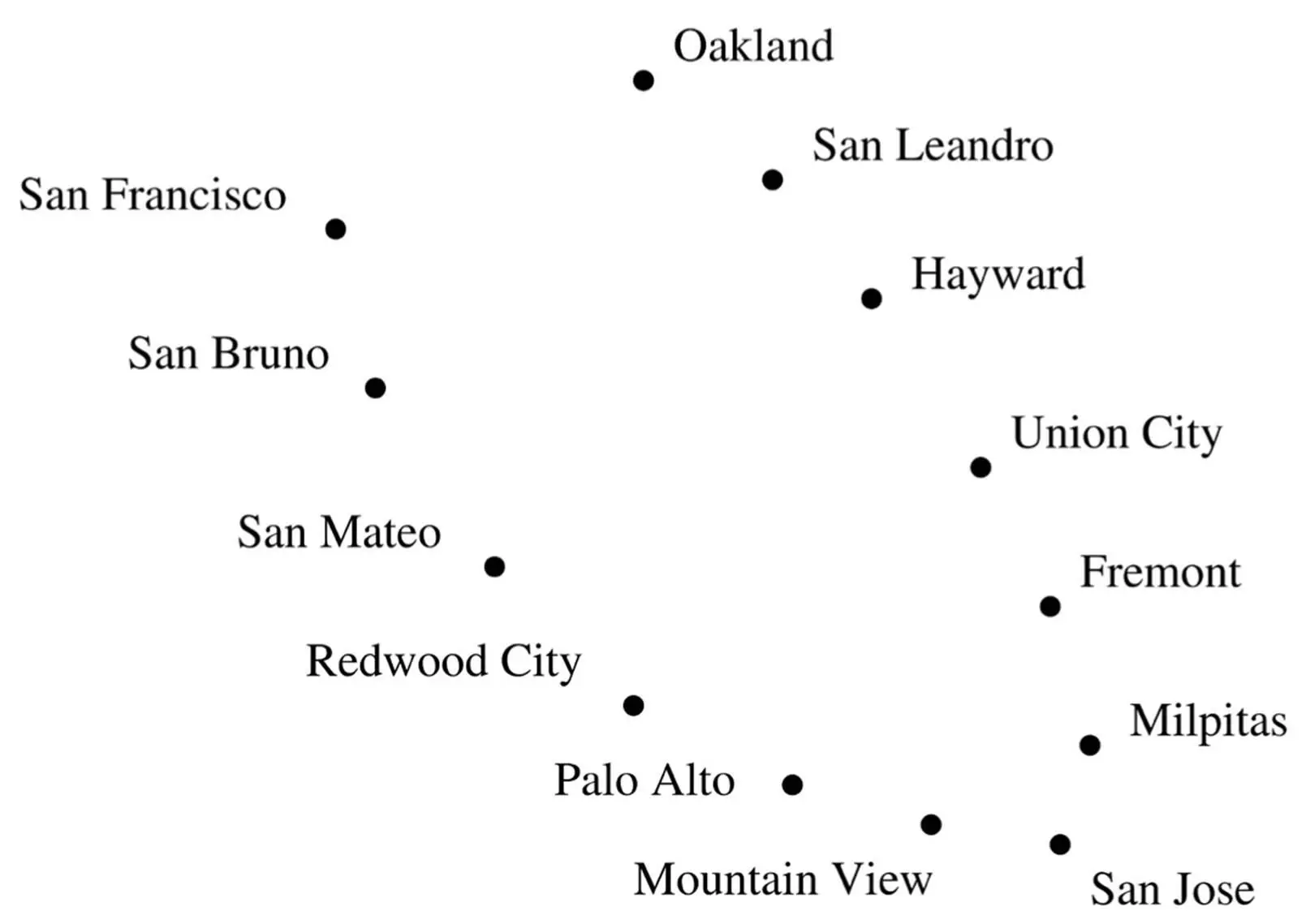
Again, you can probably surmise just by looking at this plot that the cities are on a bay, and if you draw a line running through them, you can locate each city using just one number: how far it is from San Francisco along that line. But PCA can’t find this curve; instead, it draws a straight line running down the middle of the bay, where there are no cities at all. Far from elucidating the shape of the data, PCA obscures it.
Instead, imagine for a moment that we’re going to develop the Bay Area from scratch. We’ve decided where each city will be located, and our budget allows us to build a single road connecting them. Naturally, we lay down a road that goes from San Francisco to San Bruno, from there to San Mateo, and so on all the way to Oakland. This road is a pretty good one-dimensional representation of the Bay Area and can be found by a simple algorithm: build a road between each pair of nearby cities. Of course, in general this will result in a network of roads, not a single road running by every city. But we can force the latter by building the single road that best approximates the network, in the sense that the distances between cities along this road are as close as possible to the distances along the network.
One of the most popular algorithms for nonlinear dimensionality reduction, called Isomap, does just this. It connects each data point in a high-dimensional space (a face, say) to all nearby points (very similar faces), computes the shortest distances between all pairs of points along the resulting network and finds the reduced coordinates that best approximate these distances. In contrast to PCA, faces’ coordinates in this space are often quite meaningful: one may represent which direction the face is facing (left profile, three quarters, head on, etc.); another how the face looks (very sad, a little sad, neutral, happy, very happy, etc.); and so on. From understanding motion in video to detecting emotion in speech, Isomap has a surprising ability to zero in on the most important dimensions of complex data.
Читать дальшеИнтервал:
Закладка:
Похожие книги на «The Master Algorithm: How the Quest for the Ultimate Learning Machine Will Remake Our World»
Представляем Вашему вниманию похожие книги на «The Master Algorithm: How the Quest for the Ultimate Learning Machine Will Remake Our World» списком для выбора. Мы отобрали схожую по названию и смыслу литературу в надежде предоставить читателям больше вариантов отыскать новые, интересные, ещё непрочитанные произведения.


Обсуждение, отзывы о книге «The Master Algorithm: How the Quest for the Ultimate Learning Machine Will Remake Our World» и просто собственные мнения читателей. Оставьте ваши комментарии, напишите, что Вы думаете о произведении, его смысле или главных героях. Укажите что конкретно понравилось, а что нет, и почему Вы так считаете.