Bruce Barnbaum - The Art of Photography - An Approach to Personal Expression
Здесь есть возможность читать онлайн «Bruce Barnbaum - The Art of Photography - An Approach to Personal Expression» весь текст электронной книги совершенно бесплатно (целиком полную версию без сокращений). В некоторых случаях можно слушать аудио, скачать через торрент в формате fb2 и присутствует краткое содержание. Жанр: Старинная литература, на английском языке. Описание произведения, (предисловие) а так же отзывы посетителей доступны на портале библиотеки ЛибКат.

- Название:The Art of Photography: An Approach to Personal Expression
- Автор:
- Жанр:
- Год:неизвестен
- ISBN:нет данных
- Рейтинг книги:5 / 5. Голосов: 1
-
Избранное:Добавить в избранное
- Отзывы:
-
Ваша оценка:
The Art of Photography: An Approach to Personal Expression: краткое содержание, описание и аннотация
Предлагаем к чтению аннотацию, описание, краткое содержание или предисловие (зависит от того, что написал сам автор книги «The Art of Photography: An Approach to Personal Expression»). Если вы не нашли необходимую информацию о книге — напишите в комментариях, мы постараемся отыскать её.
The Art of Photography: An Approach to Personal Expression — читать онлайн бесплатно полную книгу (весь текст) целиком
Ниже представлен текст книги, разбитый по страницам. Система сохранения места последней прочитанной страницы, позволяет с удобством читать онлайн бесплатно книгу «The Art of Photography: An Approach to Personal Expression», без необходимости каждый раз заново искать на чём Вы остановились. Поставьте закладку, и сможете в любой момент перейти на страницу, на которой закончили чтение.
Интервал:
Закладка:
For several months in the mid-1990s I switched to a rapid fix, but I began observing problems caused by its use. Moderate or extensive bleaching caused yellow stains. Extended bleaching over long periods of time—even small amounts of bleaching in numerous areas scattered about the print—caused the entire print to become lighter as a result of extended immersion in the rapid fix. As soon as I returned to the standard fix, the problems disappeared. Thus, I recommend standard fixers for printing, not rapid fixers.
Final Fixing of the Image
All of my reducing and reimmersion is done using the first tray of fix. After about five minutes in the first fix if there is no bleaching, or five minutes after all potassium ferricyanide reducing is complete, I transfer the print to the second fix for another few minutes. I then rinse the prints thoroughly with a hose (just like I do prior to bleaching) and place them in a holding tray of water for the remainder of the darkroom session.
Periodically during the day, I remove a print from the holding tray and place it on my acrylic sheet for additional inspection. I may notice problems on the second or third inspection that I missed at first, and I can return to that negative and reprint it during the same session.
The first fix stabilizes the image by removing all undeveloped silver while preventing the remaining silver from staining or slowly disappearing. As it removes the undeveloped silver from each print, silver salts build up in the fixer tray. Eventually, when enough prints are developed in one printing session, the salts can build up to a saturation point, and then embed themselves into the emulsion and paper base of subsequent prints. These salts cannot be washed out in water, and they will eventually degrade the image. The second fix removes the salts. Thus, if you make only a few prints, there’s no need for a second fixing tray. You’ll have to make many, many prints to saturate the first fix. Light, high key prints exhaust the fixer quicker because more silver is removed.
At the end of my printing session, I pour the remaining potassium ferricyanide solution into the first tray of fix to neutralize it. I also rinse both the glass container and the brush with the fix to neutralize them. I then use a small silver recovery system to remove silver from the fix before disposing of it. As for disposing of photographic chemicals, it is surprising to learn that when developer, stop bath, and fix are all mixed together, they neutralize with a small amount of ammonia left over. Since ammonia is a perfect fertilizer, the best place to dump it is on your lawn! Believe it or not, it will improve your lawn noticeably. The second fixing solution then becomes my first fixer in my next darkroom session, and I mix a new solution for my second fixer.
Local vs. Overall Contrast Control
One of the greatest difficulties encountered in printing is the common yet perplexing situation in which overall contrast is high but local contrast is low. For example, suppose you have a landscape with a great disparity between the darkness of the land and the brightness of the sky. Yet when you look only at the land, there is relatively low contrast; and when you look at the sky, there is low contrast between the sky and the clouds.
The problem is apparent. If you lower the contrast to accommodate the vast difference between the sky and the ground, you end up with a photograph that is easier to print but lacks punch. Both the sky and the ground are lifeless. On the other hand, if you raise the contrast to make both the ground and the sky more attractive, then the disparity between them is enormous, making it almost impossible to print.
What do you do in a situation like this? My recommendation is that virtually 100 percent of the time you’re better off if you base your printing on the local contrasts. If you work with the local contrasts in order to make each of them visually interesting, you have the option of dodging the darker areas and/or burning the brighter areas to bring the two closer to one another, and therefore bring the entire print into better overall balance.
If the situation is as simple as the example in Figure 10-17 (i.e., if the horizon is a horizontal, straight line) then it’s easy to burn the sky after exposing the ground for the correct amount of time. Of course, with variable contrast papers you can even adjust the degree of contrast for the burn in the sky. In fact, you can expose the ground to one level of contrast while dodging the sky entirely, then burn the sky at a completely different level of contrast—adjusting the exposure given to each so as to meld the two parts into one smooth, believable, finished exposure.
But what if the dark and light portions of the print are not as easily delineated as in an image with a dark foreground, a straight horizon line, and a bright sky? It may turn out that some complicated dodging and burning, perhaps using the burning tools detailed above, can solve the problem. However, if the array of darks and lights is so complicated that it’s effectively like a checkerboard, then masking may be the best approach (Figure 10-9). This, in fact, is one of the chief reasons for masking in the first place: an array of light and dark areas that becomes too complicated to effectively burn and dodge with only two hands.
Another method would be to print any or all of the local areas a bit too dark, then work carefully to lighten those areas by reducing (bleaching)—thereby increasing the local contrast as bleaching does so well.
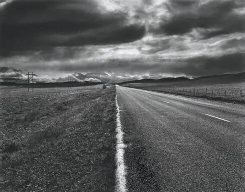
This image breaks all the rules. The sky and ground are divided in half. The edge of the road splits the lower portion in half. I wanted to create a stark, ominous image of this little-traveled road leading toward a powerful incoming storm. The sky was brighter than the ground, but burning the sky (easily done at the horizon line) was a simple fix to bring the two portions into tonal equality, imparting a foreboding feel to the composition .
Figure 10-17. The Empty Road
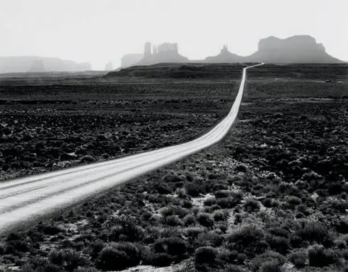
This is an enormous landscape, but the photograph has never been printed larger than 5″ × 7″. The reason is that the dark areas of uninteresting sagebrush on either side of the road would simply be too dominant and oppressive in a bigger print. Yet those areas look wonderful in a small print. As an aside, the road, which may appear to be dodged to make it glow, is actually burned extensively. Sunlight on the asphalt turned it astonishingly bright .
Figure 10-18. Road to Monument Valley
However you approach a photograph that has the disparity of high overall contrast but low local contrast, I strongly recommend doing whatever is needed to increase the local contrast as the prime consideration.
Scale
Once I’ve made a print that pleases me in 8″ × 10″, I decide what size my final display print will be. The 8″ × 10″ print has become increasingly important over the years, as I can scan a print that size, make a TIFF or JPEG of it, and send it out to a gallery, museum, magazine, individual, etc., for viewing, for potential purchase or publication, or for a variety of other uses, so it now goes well beyond the idea of just learning how to print the image. For display purposes, I usually have a good idea about the size of the final print as I stand behind the camera to make my exposure, since I feel it’s a necessary part of visualizing the final image. Sometimes, though, I alter that initial previsualization. Size is an important consideration to me because the scale of a print materially imparts an emotional response to the image. For this reason I print each of my exhibition quality photographs in one size only. The same negative printed in 8″ × 10″ and 16″ × 20″ has a decidedly different character in each size. In general, I print only the size that I feel best compliments the mood I want to convey, and I don’t display an image in any other size. On occasion I find an image that looks good in more than one size, but that is a rare print, indeed! Beyond that, I make even larger prints from selected 16″ × 20″ images, going to 20″ × 24″, 24″ × 30″, and even 30″ × 40″.
Читать дальшеИнтервал:
Закладка:
Похожие книги на «The Art of Photography: An Approach to Personal Expression»
Представляем Вашему вниманию похожие книги на «The Art of Photography: An Approach to Personal Expression» списком для выбора. Мы отобрали схожую по названию и смыслу литературу в надежде предоставить читателям больше вариантов отыскать новые, интересные, ещё непрочитанные произведения.


Обсуждение, отзывы о книге «The Art of Photography: An Approach to Personal Expression» и просто собственные мнения читателей. Оставьте ваши комментарии, напишите, что Вы думаете о произведении, его смысле или главных героях. Укажите что конкретно понравилось, а что нет, и почему Вы так считаете.