Bruce Barnbaum - The Art of Photography - An Approach to Personal Expression
Здесь есть возможность читать онлайн «Bruce Barnbaum - The Art of Photography - An Approach to Personal Expression» весь текст электронной книги совершенно бесплатно (целиком полную версию без сокращений). В некоторых случаях можно слушать аудио, скачать через торрент в формате fb2 и присутствует краткое содержание. Жанр: Старинная литература, на английском языке. Описание произведения, (предисловие) а так же отзывы посетителей доступны на портале библиотеки ЛибКат.

- Название:The Art of Photography: An Approach to Personal Expression
- Автор:
- Жанр:
- Год:неизвестен
- ISBN:нет данных
- Рейтинг книги:5 / 5. Голосов: 1
-
Избранное:Добавить в избранное
- Отзывы:
-
Ваша оценка:
The Art of Photography: An Approach to Personal Expression: краткое содержание, описание и аннотация
Предлагаем к чтению аннотацию, описание, краткое содержание или предисловие (зависит от того, что написал сам автор книги «The Art of Photography: An Approach to Personal Expression»). Если вы не нашли необходимую информацию о книге — напишите в комментариях, мы постараемся отыскать её.
The Art of Photography: An Approach to Personal Expression — читать онлайн бесплатно полную книгу (весь текст) целиком
Ниже представлен текст книги, разбитый по страницам. Система сохранения места последней прочитанной страницы, позволяет с удобством читать онлайн бесплатно книгу «The Art of Photography: An Approach to Personal Expression», без необходимости каждый раз заново искать на чём Вы остановились. Поставьте закладку, и сможете в любой момент перейти на страницу, на которой закончили чтение.
Интервал:
Закладка:
Another photographer standing in that same spot may have experienced a feeling of brilliance, and that feeling may have been translated into a very different image. I have often seen photographs of sunlight pouring through trees in which the trees are silhouetted. That type of rendition would have been perfectly valid and could have been used here, but only by someone who responded differently to the feeling of light.
The second example is drawn from England. Figure 3-5 has no whites and hardly a light gray. It was photographed at dusk with a misty rain falling. In the fading light, it required a 30-second exposure. Though it was a gloomy time, it did not impart a depressing mood.
When I first printed the image, I was concerned about the lack of whites (not because of the way it looked, but because I had never made a print without whites or very light grays). So I tried printing it in different ways. First, I attempted higher contrast in order to obtain lighter grays while maintaining the dark tones. Then I printed it lighter in tone overall. Neither version conveyed the feeling I had in mind. I returned to my original print of the image, realizing that for the mood I wished to convey—quiet, calm, contemplative—white or light gray was undesirable.
A well-conceived high key print usually conveys a feeling of enveloping light and overall airiness, and perhaps a degree of optimism. The creative photographer can sometimes use the same tones to convey a somber mood, however. I have seen such effects, and I feel that each photographer should discover when, where, and how they could be achieved.
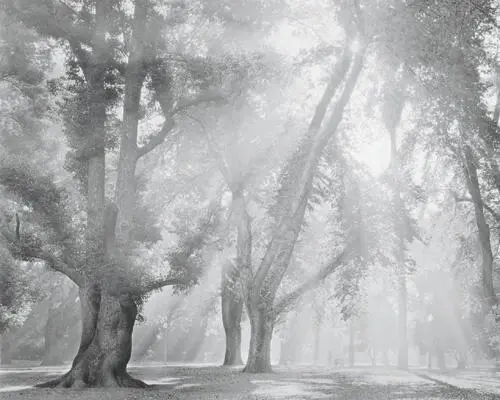
The darkest portions of this print are barely middle gray. Dark tonalities would have been inappropriate; they would have negated the feeling of light suffusing the scene as morning fog gave way to sunlight. The unwritten rule that prints must have a pure white and a pure black should be ignored, as should all rules dealing with art and personal expression.
Figure 3-4. Sunlight, Capitol Park, Sacramento
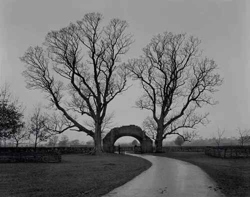
The lightest portion of this image, the sky at the horizon, does not approach white or even a very light gray. At dusk, beneath heavy overcast skies and a light drizzle, detail in the gatehouse and tree was barely visible. Bright tonalities would have been inappropriate. As in Figure 3-4, the rule that a black and a white are both needed is ignored.
Figure 3-5. Gatehouse, Lanercost Priory
Can a low key print impart a feeling of openness and optimism? Ansel Adams’s “Moonrise Over Hernandez” is dominated by deep tones, yet the print overflows with brilliance and optimism. His print is highlighted by gleaming whites and light tones in the moon, the clouds, and even the tiny hamlet in the foreground. Could the inherent optimism have been achieved without the brilliant light tones and without the high overall contrast?
In general, deep tones tend to convey strength and stability, and sometimes pessimism, mystery, and somber moods. High contrast imparts brilliance and drama while low contrast imparts quiet. Of course, these statements are true in general! With skill, the creative artist can turn these generalizations around effectively, in a way that enhances the effect because of its unexpected character.
Many photographers, beginners in particular, overemphasize high contrast in most of their prints. Rich blacks and gleaming whites usually cause people to have an immediate positive reaction to prints because of their eye-catching nature, but often after that initial impact the viewer is left with empty feelings concerning the content of the image. Unfortunately, the beginner is encouraged by the initial reaction and continues printing with excessive contrast, often with tonalities that are too deep. I cannot count the number of times I have seen student prints at workshops that were printed unnecessarily dark and brooding in an effort to impart dramatic or mysterious effects, only to end up as prints that were unnecessarily dark and brooding! This seems to be a common trap for beginners (myself included) who wish to become an instant Ansel Adams, Brett Weston, or Yousuf Karsh. Only those who are analytical and objective enough to look past the reaction of others to their own reactions can recognize that a more subtle approach may improve many images. Some do require low contrast. And some really require high contrast. It is always better to match the tonalities and contrast level to the desired mood rather than to a standard printing formula.
What about the midtones, the middle grays? These are often the tones that are hardest to deal with because they can be amazingly boring when used incorrectly. Middle gray, just by its very name, seems to elicit yawns. But consider that those tones can also be middle silver! When the middle grays begin to glow as middle silvers, the photographer has truly achieved something extraordinary.
Subtlety and brilliance in printing comes from all tonal ranges. Too often the midtones are skipped over as mere transitional elements between the “important” black and white tones, but they can be the heart of the image. In portraits, the midtones can convey the character behind the face with richness and authority. Usually it is not the blacks or whites that carry a portrait, but the midtones which show the smoothness or cragginess of the skin, every pore of the cheeks and nose, and the curves or angularities of the features. Jay Dusard, with whom I have worked for years, is the ultimate master of turning the middle grays into middle silvers . From a distance, many of his prints seem subdued, sometimes even muddy in character, but on closer inspection those tones tend to glow with an internal richness. He tends to have shimmering midtones throughout his imagery, both portraits and landscapes.
Midtones are equally important in landscapes, studio setups, still lifes, product and architectural photographs, and every other conceivable subject matter. In a real sense, the midtones need the greatest care of all because they can be the death of a print. They can also give the print its most subtle characteristics.
You can alter the tonalities of any scene to most effectively express yourself. You can print any image lighter or darker than a literal rendition. This involves the concept of visualizing the final print as you stand there looking at the scene, a concept that will be explored in depth in the next chapter. The print is your creation, and you are free to do whatever you want with your own creation. But always beware of the enticing trap of pushing too hard in an attempt to create a mood, for it will often end up as an artificial mood. Get in tune with your honest feelings and work toward conveying them with the most appropriate tones and contrasts. You will get your strongest photographs with the honest approach.
Line
After contrast and tone, which largely set the mood of the image, we come to line, which is possibly the strongest element of composition. Lines are compelling pulls for the eye, as artists learned in the Renaissance when perspective was first discovered. It was quickly seen that the eye follows a perspective line into the distance as if there were no choice. In essence, there is no choice! The eye will follow a line from beginning to end unless it becomes so convoluted that it is no longer a simple line.
Note
When the middle grays begin to glow as middle silvers, the photographer has truly achieved something extraordinary.
Читать дальшеИнтервал:
Закладка:
Похожие книги на «The Art of Photography: An Approach to Personal Expression»
Представляем Вашему вниманию похожие книги на «The Art of Photography: An Approach to Personal Expression» списком для выбора. Мы отобрали схожую по названию и смыслу литературу в надежде предоставить читателям больше вариантов отыскать новые, интересные, ещё непрочитанные произведения.


Обсуждение, отзывы о книге «The Art of Photography: An Approach to Personal Expression» и просто собственные мнения читателей. Оставьте ваши комментарии, напишите, что Вы думаете о произведении, его смысле или главных героях. Укажите что конкретно понравилось, а что нет, и почему Вы так считаете.