Dawn Willoughby - Numbers - B2+
Здесь есть возможность читать онлайн «Dawn Willoughby - Numbers - B2+» — ознакомительный отрывок электронной книги совершенно бесплатно, а после прочтения отрывка купить полную версию. В некоторых случаях можно слушать аудио, скачать через торрент в формате fb2 и присутствует краткое содержание. Жанр: unrecognised, на английском языке. Описание произведения, (предисловие) а так же отзывы посетителей доступны на портале библиотеки ЛибКат.
- Название:Numbers: B2+
- Автор:
- Жанр:
- Год:неизвестен
- ISBN:нет данных
- Рейтинг книги:4 / 5. Голосов: 1
-
Избранное:Добавить в избранное
- Отзывы:
-
Ваша оценка:
Numbers: B2+: краткое содержание, описание и аннотация
Предлагаем к чтению аннотацию, описание, краткое содержание или предисловие (зависит от того, что написал сам автор книги «Numbers: B2+»). Если вы не нашли необходимую информацию о книге — напишите в комментариях, мы постараемся отыскать её.
Numbers: B2+ — читать онлайн ознакомительный отрывок
Ниже представлен текст книги, разбитый по страницам. Система сохранения места последней прочитанной страницы, позволяет с удобством читать онлайн бесплатно книгу «Numbers: B2+», без необходимости каждый раз заново искать на чём Вы остановились. Поставьте закладку, и сможете в любой момент перейти на страницу, на которой закончили чтение.
Интервал:
Закладка:
Without looking back at the section ‘What is statistics?’, put these statistical stages into the correct order.
1organize data
2present data
3collect data
4interpret data

Exercise 10
Use the words in the box to complete these questions about the stages above.
data features patterns sets of data
display method present technique
1What type of ________are we interested in?
2Which data collection ________shall we use?
3What ________shall I use to summarize my data?
4What interesting ________or ________can I see?
5What questions do my ________answer?
6What is the clearest way to ________and ________my data?
Exercise 11
Match the questions in Exercise 10 to the stages in Exercise 9.
Using spreadsheets
You can store, organize and present your data in a computer program called a spreadsheet.
Glossary
gridA grid is something which is in a pattern of straight lines that cross over each other, forming squares. On maps the grid is used to help you find a particular thing or place.
rowA row of things or people is a number of them arranged in a straight line.
intersectionAn intersection is a place where lines or roads meet or cross.
cellA cell is one of the small squares in a chart or spreadsheet into which you can add a single piece of data.
A spreadsheet appears as a table or grid containing a set of rows and columns. Rows are displayed horizontally on the grid and each one is labelled with a number (1, 2, 3 …); the label for each column is a letter (A, B, C …) and columns are displayed vertically across the grid.
The empty spreadsheet grid shown below has eight rows and five columns, but a spreadsheet in a computer program will have many, many more rows and columns.
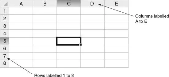
The intersection of a row and a column is called a cell. Each cell has its own name, which consists of the letter of the column followed by the number of the row. The highlighted cell in the spreadsheet grid shown above is called C5 – it is where column C and row 5 meet.
Tip
 Use the glossaries to help you with some of the key words in this book. Consider making similar lists for your modules to help you learn key words.
Exercise 12
Look at the section of a spreadsheet below, and answer the questions.
| A | B | |
| 1 | Subject | Grade |
| 2 | Statistics | 80% |
| 3 | Information Systems | 67% |
| 4 | Sociology | 65% |
| 5 | Academic Skills | 53% |
| 6 | Business and Management | 74% |
1What is contained in the following cells?
aA6
bB3
2What is the reference for the cells that contain the following?
aThe number ‘53%’
bThe word ‘Statistics’
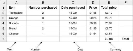
The data values in each spreadsheet cell can be displayed in different ways depending on how the information is described. You can use:
text
numbers
currency
dates and times
The spreadsheet opposite records the food purchased by a shopper at a supermarket. Row 1 in this grid is used to show the names of the columns so that it is easy to understand what information is being stored.
A spreadsheet is very useful for performing simple calculations. It uses formulae to perform operations such as addition, subtraction and multiplication.
The following spreadsheet shows the different nationalities of students enrolled on an English course. It includes a formula which uses the individual numbers of each nationality to calculate the total number of students enrolled on the course. The formula is usually hidden from view and only the result is displayed.
Glossary
formulaA formula is a group of letters, numbers or other symbols which represents a scientific or mathematical rule.
The formula SUM(B2:B8) is used to calculate the total of number of students enrolled on the course. It adds up the numbers in cells B2 to B8. If a number in one of these cells is changed, then the result of the formula is automatically updated by the spreadsheet.
So, if another French student enrols on the course, then the cell B5 becomes 4 and the total in cell B10 is changed automatically to 44 to include the new student.
Once you have organized your data in a spreadsheet, it is then possible to use the computer program to create graphs and charts to display the information in a visual way. The bar chart below has been created using the data in the previous example.
For more information on graphics, see Chapter 8.
Tip
When using spreadsheets, you can click on the Help button in the computer program to search for advice on how to use formulae for calculations.
Using graphics
A number of different visuals are used in academic writing to present data or information. In academic texts they are often referred to as figures, but sometimes a wider range of terms such as chart and table are used as well. A pie chartis used to show the proportion of something in different segments. A key is used to label a pie chart when there are many sections. A bar chartis used to compare different amounts of something. A line graph is used to show trends or patterns. The axes are labelled to show what data is being presented. The x axis is horizontal and the y axis is vertical. A tableis a grid with columns and rows of numbers. Diagramsare often used to describe functions. For example, they may show the organization of a company or the stages in the process involved in manufacturing or in decision-making.
Glossary
proportionA proportion of a group or an amount is a part of it.
trendA trend is a change or development towards something new or different.
Exercise 13
Look at the pictures below and label them with words from the box.
Читать дальшеИнтервал:
Закладка:
Похожие книги на «Numbers: B2+»
Представляем Вашему вниманию похожие книги на «Numbers: B2+» списком для выбора. Мы отобрали схожую по названию и смыслу литературу в надежде предоставить читателям больше вариантов отыскать новые, интересные, ещё непрочитанные произведения.


Обсуждение, отзывы о книге «Numbers: B2+» и просто собственные мнения читателей. Оставьте ваши комментарии, напишите, что Вы думаете о произведении, его смысле или главных героях. Укажите что конкретно понравилось, а что нет, и почему Вы так считаете.