Chris Jones - End-to-end Data Analytics for Product Development
Здесь есть возможность читать онлайн «Chris Jones - End-to-end Data Analytics for Product Development» — ознакомительный отрывок электронной книги совершенно бесплатно, а после прочтения отрывка купить полную версию. В некоторых случаях можно слушать аудио, скачать через торрент в формате fb2 и присутствует краткое содержание. Жанр: unrecognised, на английском языке. Описание произведения, (предисловие) а так же отзывы посетителей доступны на портале библиотеки ЛибКат.
- Название:End-to-end Data Analytics for Product Development
- Автор:
- Жанр:
- Год:неизвестен
- ISBN:нет данных
- Рейтинг книги:3 / 5. Голосов: 1
-
Избранное:Добавить в избранное
- Отзывы:
-
Ваша оценка:
End-to-end Data Analytics for Product Development: краткое содержание, описание и аннотация
Предлагаем к чтению аннотацию, описание, краткое содержание или предисловие (зависит от того, что написал сам автор книги «End-to-end Data Analytics for Product Development»). Если вы не нашли необходимую информацию о книге — напишите в комментариях, мы постараемся отыскать её.
• Presents a guide to innovation feasibility and formulation and process development
• Contains the statistical tools used to solve challenges faced during product innovation and feasibility
• Offers information on stability studies which are common especially in chemical or pharmaceutical fields
• Includes a companion website which contains videos summarizing main concepts
Written for undergraduate students and practitioners in industry,
offers resources for the planning, conducting, analyzing and interpreting of controlled tests in order to develop effective products and processes.
End-to-end Data Analytics for Product Development — читать онлайн ознакомительный отрывок
Ниже представлен текст книги, разбитый по страницам. Система сохранения места последней прочитанной страницы, позволяет с удобством читать онлайн бесплатно книгу «End-to-end Data Analytics for Product Development», без необходимости каждый раз заново искать на чём Вы остановились. Поставьте закладку, и сможете в любой момент перейти на страницу, на которой закончили чтение.
Интервал:
Закладка:
By observing the frequency distribution of a quantitative discrete or continuous variable, several shapes may be detected related also to the presence or absence of symmetry (Figures 1.3 and 1.4).
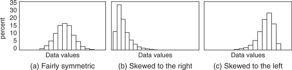
Figure 1.3 Shapes of distributions (symmetric and skewed distributions).
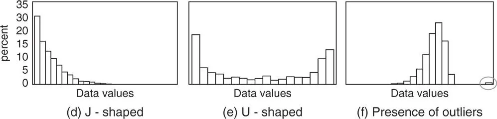
Figure 1.4 Other shapes of distributions.
If one side of the histogram (or bar chart for quantitative discrete variables) is close to being a mirror image of the other, then the data are fairly symmetric (a). Middle values are more frequent, while low and high values are less frequent. If data are not symmetric, they may be skewed to the right (b) or skewed to the left (c). In (b) low and middle values are more frequent than high values. In (c) high and middle values are more frequent than low values.
If histograms (or bar charts for quantitative discrete variables) show ever‐decreasing or ever‐increasing frequencies, the distribution is said to be J‐shaped (d). If frequencies are decreasing on the left side of the graph and increasing on the right side, the distribution is said to be U‐shaped (e). Sometimes there are values that do not fall near any others. These extremely high or low values are called outliers (f).
Stat Tool 1.6 Measures of Central Tendency: Mean and Median 
When quantitative data distributions tend to concentrate around certain values, we can try to locate these values by calculating the so‐called measures of central tendency : the mean and the median . These measures describe the area of the distribution where most values occur.
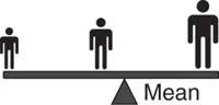
The mean is the sum of all data divided by the number of data. It represents the “balance point” of a set of values.
The median is the middle value in a sorted list of data. It divides data in half: 50% of data are greater than the median, 50% are less than the median.

For symmetric data, mean and median tend to be close in value (Figure 1.5):
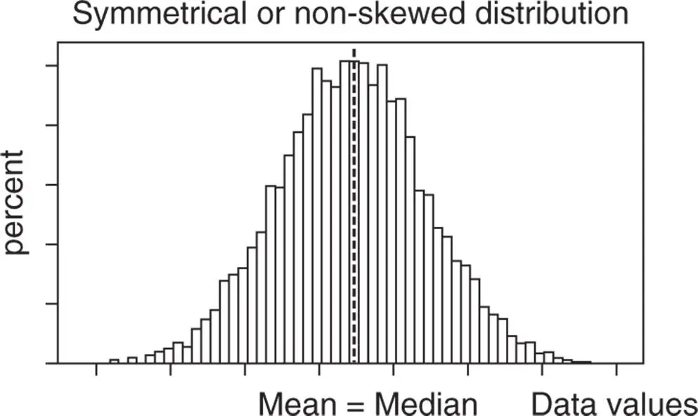
Figure 1.5 Mean and median in symmetric distributions.
In skewed data or data with extreme values , mean and median can be quite different. Usually for such data, the median tends to be a better indicator of the central tendency rather than the mean, because while the mean tends to be pulled in the direction of the skew, the median remains closer to the majority of the observations (Figure 1.6).
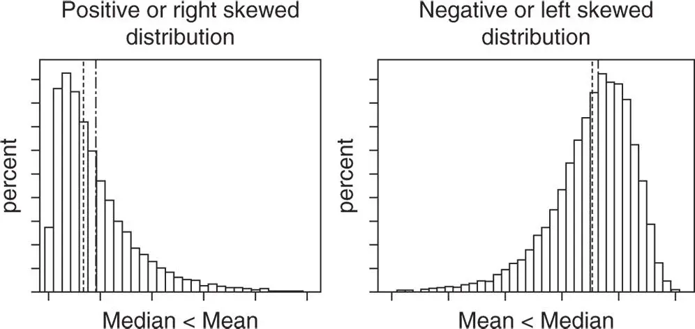
Figure 1.6 Mean and median in skewed distributions.
Stat Tool 1.7 Measures of Non‐Central Tendency: Quartiles
Particularly when numeric data do not tend to concentrate around a unique central value (e.g. fairly uniform distributions), more than one descriptive measure is needed to summarize the data distribution. These measures are called quantiles .

The most common quantiles are quartiles, which are three values (first quartile Q 1, second quartile Q 2, and third quartile Q 3) corresponding to specific positions in the sorted list of data values (Figure 1.7).
75% of the data are less than Q3 and 25% are greater than Q3.
50% of the data are less than Q2 and 50% are greater than Q2.
25% of the data are less than Q1 and 75% are greater than Q1.
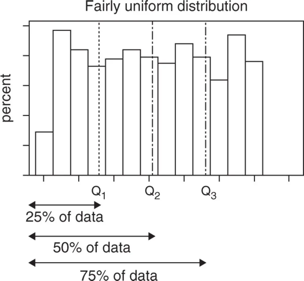
Figure 1.7 Quartiles.
The first quartile is also known as the 25th percentile, the median as the 50th percentile, and the third quartile as the 75th percentile.
Stat Tool 1.8 Measures of Variability: Range and Interquartile Range
Variability refers to how spread out a set of datavalues is.

Consider the following graphs (see Figure 1.8):
The two data distributions are quite different in terms of variability: the graph on the left shows more densely packed values (less variability), while the graph on the right reveals more spread out data (higher variability).
The terms variability, spread, variation, and dispersion are synonyms, and refer to how spread out a distribution is.

Figure 1.8 Frequency distributions and variability.
How can the spread of a set of numeric values be quantified?
The range , commonly represented as R, is a simple way to describe the spread of data values. It is the difference between the maximum value and the minimum value in a data set. The range can also be represented as the interval: (minimum value; maximum value).
A large range value (or a wide interval) indicates greater dispersion in the data. A small range value (or a narrow interval) indicates that there is less dispersion in the data.
Note that the range only uses two data values. For this reason, it is most useful in representing dispersion when data doesn't include outliers.
A second measure of variation is the interquartile range , commonly represented as IQR. It is the difference between the third quartile Q 3and the first quartile Q 1in a data set. IQR can also be represented as the interval: (Q 1; Q 3). Fifty percent of the data are within this range: as the spread of these data increases, the IQR becomes larger.
The IQR is not affected by the presence of outliers.
Stat Tool 1.9 Measures of Variability: Variance and Standard Deviation
Интервал:
Закладка:
Похожие книги на «End-to-end Data Analytics for Product Development»
Представляем Вашему вниманию похожие книги на «End-to-end Data Analytics for Product Development» списком для выбора. Мы отобрали схожую по названию и смыслу литературу в надежде предоставить читателям больше вариантов отыскать новые, интересные, ещё непрочитанные произведения.


Обсуждение, отзывы о книге «End-to-end Data Analytics for Product Development» и просто собственные мнения читателей. Оставьте ваши комментарии, напишите, что Вы думаете о произведении, его смысле или главных героях. Укажите что конкретно понравилось, а что нет, и почему Вы так считаете.