Brad Williams - Professional WordPress Plugin Development
Здесь есть возможность читать онлайн «Brad Williams - Professional WordPress Plugin Development» — ознакомительный отрывок электронной книги совершенно бесплатно, а после прочтения отрывка купить полную версию. В некоторых случаях можно слушать аудио, скачать через торрент в формате fb2 и присутствует краткое содержание. Жанр: unrecognised, на английском языке. Описание произведения, (предисловие) а так же отзывы посетителей доступны на портале библиотеки ЛибКат.
- Название:Professional WordPress Plugin Development
- Автор:
- Жанр:
- Год:неизвестен
- ISBN:нет данных
- Рейтинг книги:4 / 5. Голосов: 1
-
Избранное:Добавить в избранное
- Отзывы:
-
Ваша оценка:
Professional WordPress Plugin Development: краткое содержание, описание и аннотация
Предлагаем к чтению аннотацию, описание, краткое содержание или предисловие (зависит от того, что написал сам автор книги «Professional WordPress Plugin Development»). Если вы не нашли необходимую информацию о книге — напишите в комментариях, мы постараемся отыскать её.
addresses modern plugin development for WordPress, the highly popular content management system (CMS). If you’re using WordPress to create and manage websites, WordPress plugins are the software that can extend or enhance CMS functionality. This book offers guidance on writing plugins for WordPress sites to share or sell to other users.
The second edition of
covers the building of advanced plugin development scenarios. It discusses the plugin framework and coding standards as well as dashboards, settings, menus, and related application programming interfaces (APIs). Additional topics include security, performance, data validation, and SQL statements.
• Learn about the power of hooks in WordPress
• Discover how JavaScript and Ajax will work in your site
• Understand key technologies: Block Editor/Gutenberg, JS/React, PHP, and the REST API
• Create and use custom post types and taxonomies.
• Creating custom dashboard menus and plugin settings
• Work with users and user data
• Schedule tasks and utilizing Cron
• Performance and security considerations
Written by experienced plugin developers,
also helps you internationalize and localize your WordPress website. Find out about debugging systems and optimizing your site for speed. As WordPress use continues to increase, you can elevate your professional knowledge of how to extend WordPress through plugins.
Professional WordPress Plugin Development — читать онлайн ознакомительный отрывок
Ниже представлен текст книги, разбитый по страницам. Система сохранения места последней прочитанной страницы, позволяет с удобством читать онлайн бесплатно книгу «Professional WordPress Plugin Development», без необходимости каждый раз заново искать на чём Вы остановились. Поставьте закладку, и сможете в любой момент перейти на страницу, на которой закончили чтение.
Интервал:
Закладка:
You're going to use register_uninstall_hook(), which was covered in Chapter 2, “Plugin Framework.” First you need to register your uninstall function as shown here:
register_uninstall_hook( __FILE__, 'pdev_plugin_uninstall' );
Next you'll use the unregister_setting()function of the Settings API. The unregister_setting()function accepts the following parameters:
option_group: Settings group name used during registration
option_name: Name of the option to unregister
You can simply grab these two values from when you registered your settings group. Let's look at the full function in action.
// Deregister our settings group and delete all options function pdev_plugin_uninstall() { // Clean de-registration of registered setting unregister_setting( 'pdev_plugin_options', 'pdev_plugin_options' ); // Remove saved options from the database delete_option( 'pdev_plugin_options' ); }
The unregister_setting()function will unregister your settings group from WordPress. You also need to remove the value from the database using delete_option(). Remember you are using the uninstall hook, which means this code will be executed only if the plugin is uninstalled. If the plugin is deactivated, the options will remain and be available should the user decide to reactivate the plugin.
KEEPING IT CONSISTENT
They say consistency is one of the principles of good UI design. Creating a plugin for WordPress is no different, and it's a best practice to make your plugin match the WordPress user interface as closely as possible. This helps keep the interface consistent for end users and can make your plugin more professional by providing a solid user experience from the start.
One of the primary advantages to using the WordPress Settings API is that the UI design elements are handled for you. The headers, description text, form fields, buttons, and notices are all styled exactly as the rest of the WordPress Dashboard. It's also future‐proof, meaning if the WordPress admin design and styles are updated in a future version, your plugin will automatically use the updated styling.
WordPress features many different styles that you can easily use in your plugin. In this section, you'll learn how to use the styling available in WordPress for your plugins. To demonstrate, create a simple plugin with a settings page.
Throughout this section, you'll modify the pdev_styling_settings()function.
Using the WordPress UI
The most important part of using the WordPress styles is to wrap your plugin in the class wrap div.
This class sets the stage for all admin styling.
Headings
WordPress has custom styles available for all heading tags. Now look at how those heading tags display:
My Plugin
My Plugin
My Plugin
My Plugin
My Plugin
My Plugin
Each heading is slightly smaller than the previous, as shown in Figure 3‐8. The main heading should always be an
, and any subsequent headings should (likely) be bumped one level up. There should be no skipped levels. This is important for accessibility support as most screen readers will start with the
tag and progress down from there.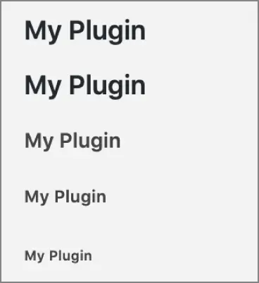
FIGURE 3‐8 : Heading levels
Dashicons
WordPress features its own open source font icon library called Dashicons. These icons (or dashicons ) are used throughout the WordPress Dashboard and are available to use easily in your plugins.
As an example, let's add some fun dashicons to your various plugin headers.
My Plugin
My Plugin
My Plugin
My Plugin
My Plugins
My Plugin
You simply add a custom dashiconsclass to your tag to identify the dashicon you'd like to display. In this example you're using a span tag, but they can be added to additional HTML tags as well, such as a paragraph tag. The preceding code generates the icons shown in Figure 3‐9.
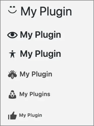
FIGURE 3‐9 : Dashicons
It's important to note that dashicons are automatically loaded within the WordPress Dashboard, but not on the frontend of the website. If you'd like to use dashicons on the public side, you'll need to enqueue the dashicon script, as shown here:
Now your plugin has a clean header and uses the Plug icon.
For more information and a complete list of all Dashicons available, see the official resource at https://developer.wordpress.org/resource/dashicons.
Messages
When an action occurs in your plugin, such as saving settings, it's important to display a message to the user verifying whether the update was successful. WordPress features some different styles for displaying these messages.
There has been an error.
This is a warning message.
This is a success message.
This is some information.
As you can see, there are four different types of notices supported: error, warning, success, and info. Notice the class, is‐dismissible, included in the outer
These styles will generate the messages shown in Figure 3‐10.
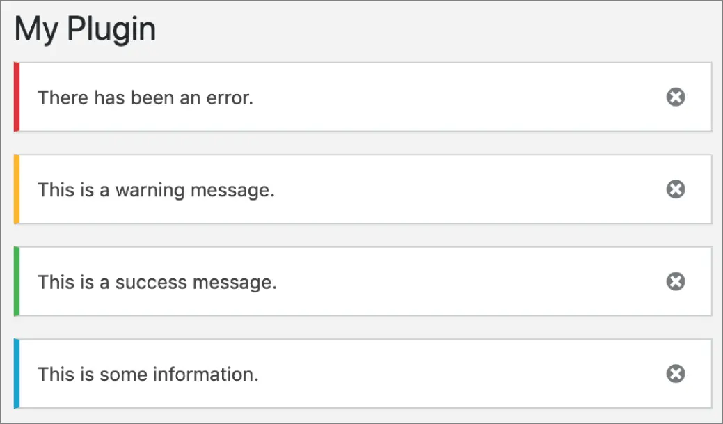
FIGURE 3‐10 : Dismissable notices
Buttons
As discussed earlier, the easiest method for adding a form submission button is using the submit_button()function. However, there's no reason you can't manually create form buttons using the preset WordPress admin stylings. When manually adding buttons to your form, you can take advantage of multiple classes. The first two you use are the button‐primaryand button‐secondaryclasses. These classes style your buttons to match the WordPress UI.
This example demonstrates a standard unstyled button as compared to the WordPress styled button. As you can tell, the WordPress‐styled button looks familiar and uses the proper styling, as shown in Figure 3‐11.
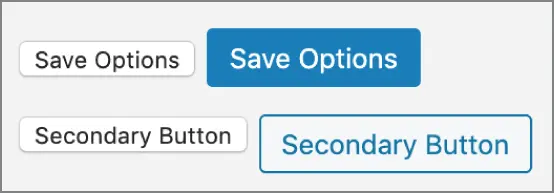
FIGURE 3‐11 : WordPress‐styled button
Links can also take the form of a button by using the appropriate class.
Search Search Primary Search Secondary
Интервал:
Закладка:
Похожие книги на «Professional WordPress Plugin Development»
Представляем Вашему вниманию похожие книги на «Professional WordPress Plugin Development» списком для выбора. Мы отобрали схожую по названию и смыслу литературу в надежде предоставить читателям больше вариантов отыскать новые, интересные, ещё непрочитанные произведения.


Обсуждение, отзывы о книге «Professional WordPress Plugin Development» и просто собственные мнения читателей. Оставьте ваши комментарии, напишите, что Вы думаете о произведении, его смысле или главных героях. Укажите что конкретно понравилось, а что нет, и почему Вы так считаете.