Mattias Vermeiren - Crisis and Inequality
Здесь есть возможность читать онлайн «Mattias Vermeiren - Crisis and Inequality» — ознакомительный отрывок электронной книги совершенно бесплатно, а после прочтения отрывка купить полную версию. В некоторых случаях можно слушать аудио, скачать через торрент в формате fb2 и присутствует краткое содержание. Жанр: unrecognised, на английском языке. Описание произведения, (предисловие) а так же отзывы посетителей доступны на портале библиотеки ЛибКат.

- Название:Crisis and Inequality
- Автор:
- Жанр:
- Год:неизвестен
- ISBN:нет данных
- Рейтинг книги:5 / 5. Голосов: 1
-
Избранное:Добавить в избранное
- Отзывы:
-
Ваша оценка:
Crisis and Inequality: краткое содержание, описание и аннотация
Предлагаем к чтению аннотацию, описание, краткое содержание или предисловие (зависит от того, что написал сам автор книги «Crisis and Inequality»). Если вы не нашли необходимую информацию о книге — напишите в комментариях, мы постараемся отыскать её.
In this innovative new textbook Mattias Vermeiren does just this, demonstrating that both the global financial crisis and the European sovereign debt crisis resulted from a mutually reinforcing but ultimately unsustainable relationship between countries with debt-led and export-led growth models, models fundamentally shaped by soaring income and wealth inequality. He traces the emergence of these two growth models by giving a comprehensive overview, deeply informed by the comparative and international political economy literature, of recent developments in the four key domains that have shaped the dynamics of crisis and inequality: macroeconomic policy, social policy, corporate governance and financial policy. He goes on to assess the prospects for the emergence of a more egalitarian and sustainable form of democratic capitalism.
This fresh and insightful overview of contemporary Western capitalism will be essential reading for all students and scholars of international and comparative political economy.
Crisis and Inequality — читать онлайн ознакомительный отрывок
Ниже представлен текст книги, разбитый по страницам. Система сохранения места последней прочитанной страницы, позволяет с удобством читать онлайн бесплатно книгу «Crisis and Inequality», без необходимости каждый раз заново искать на чём Вы остановились. Поставьте закладку, и сможете в любой момент перейти на страницу, на которой закончили чтение.
Интервал:
Закладка:
Source: World Inequality Database, https://wid.world
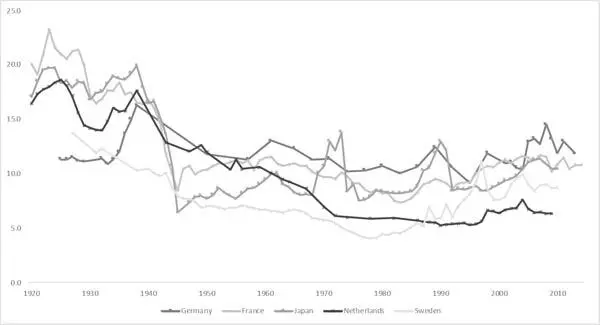
Figure 1.4 Share of the top percentile in total income in continental Europe and Japan, 1920–2014
Source: World Inequality Database, https://wid.world
There is a considerable difference between the Anglo-Saxon countries and other rich OECD countries in terms of the income share of the top 1 per cent. The Anglo-Saxon countries – Australia, Canada, Ireland, the United Kingdom and the United States – all show a U-shape. Over the period 1980 to 2012, the top 1 per cent income share more or less doubled in these five countries (and rose by more than 50 per cent in New Zealand, not shown). According to this measure, income inequality is highest in the United States, where the top 1 per cent’s income share rose from 10.6 per cent in the 1970s to 20.8 per cent in 2012. The experience is again markedly different in continental Europe and Japan, where the long pattern is closer to an L-shaped curve. The income shares of the top 1 per cent have also risen in these countries in recent years, but they are not extremely far today from their levels in the late 1940s.
In his best-selling book Capital in the 21st Century , Piketty rightly notes that ‘the share of income (or wealth) going to the top decile or centile is a useful index for judging how unequal a society is, because it reflects not just the existence of extremely high incomes or extremely large fortunes but also the number of individuals who enjoy such rewards’. 1The group is, by definition, a very small minority of the population, but is nevertheless far larger than the dozens or hundreds of ‘super elites’ who are tracked by Forbes’ or Bloomberg’s billionaires lists. In a country like the United Kingdom with more than 60 million citizens (of whom about 45 million are adults), the top centile contains about 450,000 people. In a country like the United States with about 250 million adults, the top centile consists of 2.5 million individuals. These are numerically large groups of people who inevitably have the most social and political influence in their country, which is why Piketty labels this group as the ‘dominant class’. 2
Similar cross-regional differences emerge if we look at the evolution of the income shares of people in the bottom 50 per cent – who can be called the ‘lower classes’ – and the middle 40 per cent – the ‘middle classes’, who stand between the fifth and ninth decile of the income distribution. Table 1.1presents accumulated income growth rates in Europe and North America from 1980 to 2016 for these income groups. Real national income growth per adult – that is, income growth adjusted for inflation – during this period reached 40 per cent in Europe and 63 per cent in North America (the United States and Canada). In both regions income growth is systematically higher for upper income groups. But in Europe the growth gap between the bottom 50 per cent and the full population is much lower, as is the gap between the bottom 50 per cent and top income groups. To better understand the significance of these unequal rates of growth, it is useful to focus on the share of total growth captured by each group over the entire period. The top 1 per cent captured 35 per cent of total growth in the United States and Canada, whereas it ‘merely’ seized 18 per cent of total growth in Europe. In Europe, the fruits of income growth have also been shared more equally with the bottom 50 per cent: 14 per cent against a meagre 2 per cent in North America. While the middle 40 per cent also reaped a higher share in total accumulated income growth in Europe than in the United States and Canada (38 per cent against 32 per cent), it is especially the experience of the bottom 50 per cent that has been strikingly different.
Table 1.1Total income growth and inequality, 1980–2016
| Total cumulative income growth per adult | Share of total accumulated income growth captured by income groups | |||
|---|---|---|---|---|
| Europe | United States and Canada | Europe | United States and Canada | |
| Full population | 40% | 63% | 100% | 100% |
| Bottom 50% | 26% | 5% | 14% | 2% |
| Middle 40% | 34% | 44% | 38% | 32% |
| Top 10% | 58% | 123% | 48% | 67% |
| Top 1% | 72% | 206% | 18% | 35% |
| Top 0.1% | 76% | 320% | 7% | 18% |
| Top 0.01% | 87% | 452% | 3% | 9% |
| Top 0.001% | 120% | 629% | 1% | 4% |
| Source: Alvaredo et al. 2018, https://wir2018.wid.world |
But the same table also shows that the inequality in North America has been markedly higher in the top end of the income distribution. This difference becomes larger the higher we go in the hierarchy: the share of total income captured by the top 1 per cent is twice as large in the United States and Canada as in Europe, whereas it is three times as large for the top 0.01 per cent and four times as large for the top 0.001 per cent. To be sure, the top 0.01 per cent and top 0.001 per cent are much smaller groups than the top 1 per cent: in the United States, these two groups amount to, respectively, 25,000 and 2,500 individuals. Focusing on the evolution of the income share of this group is nevertheless highly important for our understanding of the structure of inequality: individuals belonging to these groups are ‘super elites’ who derive most of their income from capital rather than from their labour. Remember that the Gini index is a measure of total income inequality: it measures the distribution of income from both labour (wages, salaries, bonuses, etc.) and capital investments (banking accounts, stocks, bonds, real estate and other assets). This is also the case for the income share of different groups discussed above. The key issue here is that income from capital – for example, interest rate income on savings accounts and bond investments, dividend income on stock investments (see box 1.1), rental income on real estate, etc. – becomes increasingly important for groups at the top end of the income hierarchy.
Box 1.1 Stocks and bonds
Stocks and bonds are financial assets that can be bought and sold on financial markets. Firms issue stocks and bonds to attract funding, which can be used to finance their operations or expand their production. Stocks and bonds have different implications both for the firm and for the owner of these assets. The purchaser of a company’s stocks becomes a partial owner of the firm – a shareholder – who receives a part of the company’s profits every year in the form of a dividend. The purchaser of a company’s bonds is only a lender to that company: bonds are a certificate of indebtedness that specifies the obligations of the borrower to the owner of the bond; it identifies the time at which the loan will be repaid (called the maturity) and the rate of interest that will be paid periodically until the loan matures. As such, investing in a company’s bonds is less ‘risky’ than investing in its stocks, as bond investors can be sure to get all their money back if the company does not go bankrupt. The returns for a stock investor, by contrast, depend on the profitability of the firm and its performance on the stock market. See chapter 5for a more elaborate discussion.
Читать дальшеИнтервал:
Закладка:
Похожие книги на «Crisis and Inequality»
Представляем Вашему вниманию похожие книги на «Crisis and Inequality» списком для выбора. Мы отобрали схожую по названию и смыслу литературу в надежде предоставить читателям больше вариантов отыскать новые, интересные, ещё непрочитанные произведения.


Обсуждение, отзывы о книге «Crisis and Inequality» и просто собственные мнения читателей. Оставьте ваши комментарии, напишите, что Вы думаете о произведении, его смысле или главных героях. Укажите что конкретно понравилось, а что нет, и почему Вы так считаете.