William Kinlaw - Asset Allocation
Здесь есть возможность читать онлайн «William Kinlaw - Asset Allocation» — ознакомительный отрывок электронной книги совершенно бесплатно, а после прочтения отрывка купить полную версию. В некоторых случаях можно слушать аудио, скачать через торрент в формате fb2 и присутствует краткое содержание. Жанр: unrecognised, на английском языке. Описание произведения, (предисловие) а так же отзывы посетителей доступны на портале библиотеки ЛибКат.

- Название:Asset Allocation
- Автор:
- Жанр:
- Год:неизвестен
- ISBN:нет данных
- Рейтинг книги:3 / 5. Голосов: 1
-
Избранное:Добавить в избранное
- Отзывы:
-
Ваша оценка:
Asset Allocation: краткое содержание, описание и аннотация
Предлагаем к чтению аннотацию, описание, краткое содержание или предисловие (зависит от того, что написал сам автор книги «Asset Allocation»). Если вы не нашли необходимую информацию о книге — напишите в комментариях, мы постараемся отыскать её.
—the newly and substantially revised
of
—accomplished finance professionals William Kinlaw, Mark P. Kritzman, and David Turkington deliver a robust and insightful exploration of the core tenets of asset allocation.
Drawing on their experience working with hundreds of the world’s largest and most sophisticated investors, the authors review foundational concepts, debunk fallacies, and address cutting-edge themes like factor investing and scenario analysis. The new edition also includes references to related topics at the end of each chapter and a summary of key takeaways to help readers rapidly locate material of interest.
The book also incorporates discussions of:
The characteristics that define an asset class, including stability, investability, and similarity The fundamentals of asset allocation, including definitions of expected return, portfolio risk, and diversification Advanced topics like factor investing, asymmetric diversification, fat tails, long-term investing, and enhanced scenario analysis as well as tools to address challenges such as liquidity, rebalancing, constraints, and within-horizon risk. Perfect for client-facing practitioners as well as scholars who seek to understand practical techniques,
is a must-read resource from an author team of distinguished finance experts and a forward by Nobel prize winner Harry Markowitz.
Asset Allocation — читать онлайн ознакомительный отрывок
Ниже представлен текст книги, разбитый по страницам. Система сохранения места последней прочитанной страницы, позволяет с удобством читать онлайн бесплатно книгу «Asset Allocation», без необходимости каждый раз заново искать на чём Вы остановились. Поставьте закладку, и сможете в любой момент перейти на страницу, на которой закончили чтение.
Интервал:
Закладка:
(2.13) 
These marginal utilities measure how much we increase or decrease expected utility, starting from our current asset mix, by increasing our exposure to each asset class. A negative marginal utility indicates that we improve expected utility by reducing exposure to that asset class, whereas a positive marginal utility indicates that we should raise the exposure to that asset class in order to improve expected utility.
Let us retain our earlier assumptions about the expected returns and standard deviations of stocks and bonds and their correlation. Further, let us assume our portfolio is currently allocated 60% to stocks and 40% to bonds, and that our aversion toward risk equals 2. A risk aversion of 2 means that we are willing to reduce expected return by two units in order to lower variance by one unit.
If we substitute these values into Equations 2.12and 2.13, we find that we improve our expected utility by 0.008 units if we increase our exposure to stocks by 1%, and that we improve our expected utility by 0.04 units if we increase our exposure to bonds by 1%. Both marginal utilities are positive. However, we can only allocate 100% of the portfolio. We should therefore increase our exposure to the asset class with the higher marginal utility by 1% and reduce by the same amount our exposure to the asset class with the lower marginal utility. In this way, we ensure that we are always 100% invested.
Having switched our allocations in line with the relative magnitudes of the marginal utilities, we recompute the marginal utilities given our new allocation of 59% stocks and 41% bonds. Again, bonds have a higher marginal utility than stocks; hence, we shift again from stocks to bonds. If we proceed in this fashion, we find when our portfolio is allocated 1∕3 to stocks and 2∕3 to bonds, the marginal utilities are exactly equal to each other. At this point, we cannot improve expected utility any further by changing the allocation between stocks and bonds. We have maximized our objective function.
By varying the values we assign to  we identify mixes of stocks and bonds for many levels of risk aversion, thus enabling us to construct the entire efficient frontier of stocks and bonds. Figure 2.1shows the efficient frontier based on the expected returns, standard deviations, and correlations shown in Tables 2.1and 2.2. All the portfolios along the efficient frontier offer a higher level of expected return for the same level of risk than the portfolios residing below the efficient frontier.
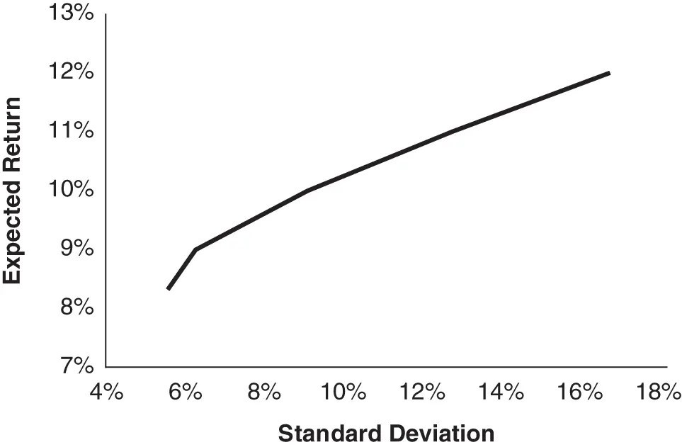
FIGURE 2.1Efficient frontier.
Now let us consider the efficient frontier that is composed of the six asset classes specified in Tables 2.1and 2.2. In particular, let us now focus on three efficient portfolios that lie along this efficient frontier: one for a conservative investor, one for an investor with moderate risk aversion, and one for an aggressive investor. Table 2.4shows the three efficient portfolios.
TABLE 2.4Conservative, Moderate, and Aggressive Efficient Portfolios
| Asset Classes | Conservative (%) | Moderate (%) | Aggressive (%) |
|---|---|---|---|
| US Equities | 15.9 | 25.5 | 36.8 |
| Foreign Developed Market Equities | 14.5 | 23.2 | 34.5 |
| Emerging Market Equities | 5.6 | 9.1 | 15.8 |
| Treasury Bonds | 15.5 | 14.3 | 0.0 |
| US Corporate Bonds | 11.4 | 22.0 | 8.9 |
| Commodities | 4.0 | 5.9 | 4.0 |
| Cash Equivalents | 33.2 | 0.0 | 0.0 |
| Expected Return | 6.0 | 7.5 | 9.0 |
| Standard Deviation | 6.8 | 10.8 | 15.2 |
The composition of these portfolios should not be surprising. The conservative portfolio has nearly a 1∕3 allocation to cash equivalents.
The moderate portfolio is well diversified and not unlike many institutional portfolios. The aggressive portfolio, by contrast, has more than an 86% allocation to US and foreign equities. It should be comforting to note that we did not impose any constraints in the optimization process to arrive at these portfolios. The process of employing an equilibrium perspective for estimating expected returns yields nicely behaved results.
The Optimal Portfolio
The final step is to select the portfolio that best suits our aversion to risk, which we call the optimal portfolio. As we discussed earlier in this chapter, the theoretical approach to identifying the optimal portfolio is to specify how many units of expected return we are willing to give up to reduce our portfolio's risk by one unit. We would then draw a line with a slope equal to our risk aversion and find the point of tangency of this line with the efficient frontier. The portfolio located at this point of tangency is theoretically optimal because its risk/return trade-off matches our preference for balancing risk and return.
In practice, however, we do not know intuitively how many units of expected return we are willing to sacrifice in order to lower variance by one unit. Therefore, we need to translate combinations of expected return and risk into metrics that are more intuitive. Because continuous returns are approximately normally distributed, 9 we can easily estimate the probability that a portfolio with a particular expected return and standard deviation will experience a specific loss over a particular horizon. Alternatively, we can estimate the largest loss a portfolio might experience given a particular level of confidence. We call this measure value at risk. We can also rely on the assumption that continuous returns are normally distributed to estimate the likelihood that a portfolio will grow to a chosen value at some future date. Table 2.5shows the likelihood of loss over a five-year investment horizon for the three efficient portfolios, as well as value at risk measured at a 1% significance level, which means we are 99% confident that the portfolio value will not fall by more than this amount.
TABLE 2.5Exposure to Loss
| Risk statistics for end of five years | |||
|---|---|---|---|
| Conservative (%) | Moderate (%) | Aggressive (%) | |
| Probability of Loss (return below 0%) | 2.5 | 6.7 | 10.8 |
| 1% Value at Risk | 5.1 | 17.0 | 28.7 |
If exposure to loss were our only consideration, we would choose the conservative portfolio, but by doing so we forgo upside opportunity. One way to assess the upside potential of these portfolios is to estimate the distribution of future wealth associated with investment in each of them.
Table 2.6shows the probable terminal wealth as a multiple of initial wealth at varying confidence levels 15 years from now. For example, there is only a 5% chance that our nominal wealth would grow to less than 1.4 times initial wealth in 15 years, assuming we invest in the moderate portfolio. And there is a 5% chance (1 – 0.95) that our wealth could grow to a value as high as 5.2 times initial wealth.
TABLE 2.6Distribution of Wealth 15 Years Forward (as a Multiple of Initial Investment)
Читать дальшеИнтервал:
Закладка:
Похожие книги на «Asset Allocation»
Представляем Вашему вниманию похожие книги на «Asset Allocation» списком для выбора. Мы отобрали схожую по названию и смыслу литературу в надежде предоставить читателям больше вариантов отыскать новые, интересные, ещё непрочитанные произведения.


Обсуждение, отзывы о книге «Asset Allocation» и просто собственные мнения читателей. Оставьте ваши комментарии, напишите, что Вы думаете о произведении, его смысле или главных героях. Укажите что конкретно понравилось, а что нет, и почему Вы так считаете.