Eyal, Nir - Hooked - How to Build Habit-Forming Products
Здесь есть возможность читать онлайн «Eyal, Nir - Hooked - How to Build Habit-Forming Products» весь текст электронной книги совершенно бесплатно (целиком полную версию без сокращений). В некоторых случаях можно слушать аудио, скачать через торрент в формате fb2 и присутствует краткое содержание. Год выпуска: 2014, Издательство: Nir Eyal, Жанр: Старинная литература, на английском языке. Описание произведения, (предисловие) а так же отзывы посетителей доступны на портале библиотеки ЛибКат.
- Название:Hooked: How to Build Habit-Forming Products
- Автор:
- Издательство:Nir Eyal
- Жанр:
- Год:2014
- ISBN:нет данных
- Рейтинг книги:5 / 5. Голосов: 1
-
Избранное:Добавить в избранное
- Отзывы:
-
Ваша оценка:
Hooked: How to Build Habit-Forming Products: краткое содержание, описание и аннотация
Предлагаем к чтению аннотацию, описание, краткое содержание или предисловие (зависит от того, что написал сам автор книги «Hooked: How to Build Habit-Forming Products»). Если вы не нашли необходимую информацию о книге — напишите в комментариях, мы постараемся отыскать её.
Hooked: How to Build Habit-Forming Products — читать онлайн бесплатно полную книгу (весь текст) целиком
Ниже представлен текст книги, разбитый по страницам. Система сохранения места последней прочитанной страницы, позволяет с удобством читать онлайн бесплатно книгу «Hooked: How to Build Habit-Forming Products», без необходимости каждый раз заново искать на чём Вы остановились. Поставьте закладку, и сможете в любой момент перейти на страницу, на которой закончили чтение.
Интервал:
Закладка:
The Evolution of Twitter’s Homepage
In 2009, the Twitter homepage was cluttered with text and dozens of links (figure 14). The page was confusing, especially for new users unfamiliar with the product. Twitter’s value proposition of sharing what you were doing with friends and family failed to resonate with most users, who wondered, "why would I want to broadcast my activities?" The page design demanded a high level of attention and comprehension.
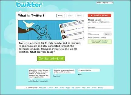
Figure 14 - The Twitter homepage in 2009
A year later, Twitter redesigned its homepage, touting itself as a service to “share and discover what’s happening” (figure 15). Although the page became more focused on action, it was still visually onerous. Even more unfortunate, the task users were most likely to do — search — was not what Twitter really wanted them to do. Twitter management knew from early users that those who followed other people on the service were more likely to stay engaged and form a habit. But searching on Twitter was not helping that goal, so the company decided to make another switch.
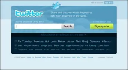
Figure 15 - The Twitter homepage in 2010
During the company’s period of hypergrowth, the Twitter homepage became radically more simple (figure 16). The product description is itself only 140 characters long and has evolved from the cognitively difficult request that users broadcast their information (as seen in 2009), to the less taxing “Find out what’s happening, right now, with the people and organizations you care about.”

Figure 16 - The Twitter homepage in 2012
The big bold image of people looking into some kind of light-emanating event, like a concert or a soccer match, metaphorically communicates the value of the service while piquing curiosity. Most strikingly, the page has two very clear calls-to-action: sign in or sign up. The company made the desired action as simple as possible, knowing that getting users to experience the service would yield better results than trying to convince them to use it while still on the homepage.
Of course, it is worth noting that Twitter was in a different place in 2012 than in 2009. People came to the site having heard more about the service as its popularity grew. Twitter’s homepage evolution reveals how the company discovered its users’ scarcest resource. In 2009, the Twitter homepage attempted to boost motivation. But by 2012, Twitter had discovered that no matter how much users knew about the service, driving them to open an account and start following people resulted in much higher engagement.
Recently, Twitter’s homepage has been modified slightly to encourage downloading of the company’s mobile apps (figure 17). The simplicity of the large sign-in or sign-up triggers on the 2012 version remain, but Twitter now knows that driving users to install the app on their phones leads to the highest rates of repeat engagement.
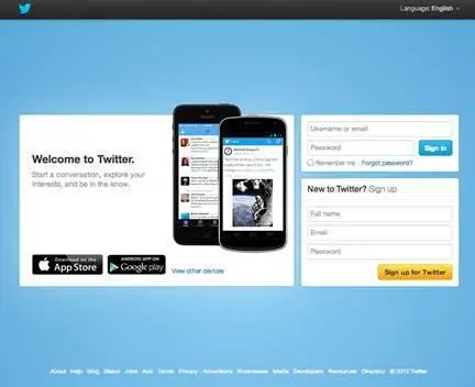
Figure 17 - The Twitter homepage in 2013
On Heuristics and Perception
So far, we have discussed Fogg’s Core Motivators and the six elements of simplicity as levers for influencing the likelihood of a particular behavior occurring. These factors echo ideals of how people react when making rational decisions. For example, every Economics 101 student learns that as prices decrease, consumers purchase more — in Fogg’s terms, an example of increasing ability by decreasing price.
However, although the principle seems elementary, the law, like many other theories of human behavior, has exceptions. The field of behavioral economics, as studied by luminaries such as Nobel Prize winner Daniel Kahneman, exposed exceptions to the rational model of human behavior. Even the notion that people always consume more if something costs less, for example, is a tendency, not an absolute.
There are many counterintuitive and surprising ways companies can boost users’ motivation or increase their ability by understanding heuristics — the mental shortcuts we take to make decisions and form opinions. It is worth mentioning a few of these brain biases. Even though users are often unaware of these influences on their behavior, heuristics can predict their actions.
The Scarcity Effect
In 1975, researchers Worchel, Lee, and Adewole wanted to know how people would value cookies in two identical glass jars. [lxiii]One jar held ten cookies while the other contained just two stragglers. Which cookies would people value more?
While the cookies and jars were identical, participants valued the ones in the near-empty jar more highly. The appearance of scarcity affected their perception of value.
There are many theories as to why this is the case. For one, scarcity may signal something about the product. If there are fewer of an item, the thinking goes, it might be because other people know something you don’t. Namely, that the cookies in the almost-empty jar are the better choice. The jar with just two cookies left in it conveys valuable, albeit irrelevant, information since the cookies are identical. Yet, the perception of scarcity changed their perceived value.
In the second part of their experiment, the researchers wanted to know what would happen to the perception of the value of the cookies if they suddenly became scarce or abundant. Groups of study participants were given jars with either two cookies or ten. Then, the people in the group with ten cookies suddenly had eight taken away. Conversely, those with only two cookies had eight new cookies added to their jars. How would these changes affect the way participants valued the cookies?
Results remained consistent with the scarcity heuristic. The group left with only two cookies rated them to be more valuable, while those experiencing sudden abundance by going from two to ten, actually valued the cookies less. In fact, they valued the cookies even lower than people who had started with ten cookies to begin with. The study showed that a product can decrease in perceived value if it starts off as scarce and becomes abundant.
For an example of how perception of a limited supply can increase sales, look no further than Amazon.com. My recent search for a DVD revealed there were “only 14 left in stock” (figure 18), while a search for a book I’ve had my eye on says only three copies remain. Is the world’s largest online retailer almost sold out of nearly everything I want to buy or are they using the scarcity heuristic to influence my buying behavior?

Figure 18 - “Only 14 left in stock”?
The Framing Effect
Context also shapes perception. In a social experiment, world-class violinist Joshua Bell decided to play a free impromptu concert in a Washington, DC subway station. [lxiv]Bell regularly sells out venues such as the Kennedy Center and Carnegie Hall for hundreds of dollars per ticket, but when placed in the context of the DC subway, his music fell upon deaf ears. Almost nobody knew they were walking past one of the most talented musicians in the world.
Читать дальшеИнтервал:
Закладка:
Похожие книги на «Hooked: How to Build Habit-Forming Products»
Представляем Вашему вниманию похожие книги на «Hooked: How to Build Habit-Forming Products» списком для выбора. Мы отобрали схожую по названию и смыслу литературу в надежде предоставить читателям больше вариантов отыскать новые, интересные, ещё непрочитанные произведения.


Обсуждение, отзывы о книге «Hooked: How to Build Habit-Forming Products» и просто собственные мнения читателей. Оставьте ваши комментарии, напишите, что Вы думаете о произведении, его смысле или главных героях. Укажите что конкретно понравилось, а что нет, и почему Вы так считаете.