Chris Smith - The Conversion Code
Здесь есть возможность читать онлайн «Chris Smith - The Conversion Code» — ознакомительный отрывок электронной книги совершенно бесплатно, а после прочтения отрывка купить полную версию. В некоторых случаях можно слушать аудио, скачать через торрент в формате fb2 и присутствует краткое содержание. Жанр: marketing, на английском языке. Описание произведения, (предисловие) а так же отзывы посетителей доступны на портале библиотеки ЛибКат.
- Название:The Conversion Code
- Автор:
- Жанр:
- Год:неизвестен
- ISBN:нет данных
- Рейтинг книги:4 / 5. Голосов: 1
-
Избранное:Добавить в избранное
- Отзывы:
-
Ваша оценка:
The Conversion Code: краткое содержание, описание и аннотация
Предлагаем к чтению аннотацию, описание, краткое содержание или предисловие (зависит от того, что написал сам автор книги «The Conversion Code»). Если вы не нашли необходимую информацию о книге — напишите в комментариях, мы постараемся отыскать её.
Second Edition, digital marketing and lead conversion expert Chris Smith delivers the ultimate exploration of the marketing and advertising tactics that are successfully generating higher quality leads that are easier for salespeople to convert. Smith researches and tests the latest and most popular platforms, including TikTok, YouTube and Instagram, while also studying the most effective sales techniques, tools, and scripts.
In this book, you'll learn to:
Increase your lead conversion rate, reduce your cost per lead and improve your overall ROI from marketing and sales Generate an endless supply of high-quality leads from social media that are easy to convert into closed sales Stop chasing leads and start attracting clients with amazing marketing and clever ads Adapt to the consumer privacy changes that have made targeting ads and getting leads to answer the phone harder than ever Differentiate your brand in a way that positions you as the authority and gets people contacting you who are already sold An invaluable reference and easy to follow guide for real estate agents, loan officers, SaaS and small businessescompeting in the hyper-competitive online environment.
, Second Edition, is also a fantastic resource for sales leaders, marketing managers, business owners and anyone else with a team who is responsible for growing revenue.
The Conversion Code — читать онлайн ознакомительный отрывок
Ниже представлен текст книги, разбитый по страницам. Система сохранения места последней прочитанной страницы, позволяет с удобством читать онлайн бесплатно книгу «The Conversion Code», без необходимости каждый раз заново искать на чём Вы остановились. Поставьте закладку, и сможете в любой момент перейти на страницу, на которой закончили чтение.
Интервал:
Закладка:
Optimize is simple to set up, easy to use, and free for most people. It is also worth mentioning that although it is typically referred to as an A/B test, you can run A/B/C or A/B/C/D tests as well. You are not limited to two variants.
DO THIS RIGHT NOW
Add Hotjar and Google Optimize to your website and set up at least one A/B test for your home page.
Beyond my advice in this chapter, I want you to be able to find A+ design inspiration anytime you need it. Website design trends are constantly changing, so instead of sharing screenshots or examples that can quickly become outdated, I want you to check out Dribbble, Awwwards, and Siteinspire instead.
Dribbble is a community of extraordinary designers showcasing their best work. You can search using keywords (e.g., “real estate”) and categories (e.g., “branding”). You can even search for designs by color, including hex codes. Not only can you find ideas on Dribbble but also you can hire help. Many of the designers there are freelancers looking for work.
Siteinspire and Awwwards are a curated collection of the best websites on the internet right now. They both update regularly and provide links to visit all the sites they feature. They are also searchable by keyword and category, and they give you the ability to connect with the designers and firms who built the sites you like the most.
If you're updating your website out of the dark ages and have a budget, do yourself a favor: hire a professional. Have them build you an amazing website and plan to get a new one every couple of years.
If you take the DIY approach, make sure you adhere to the following best practices.
HOW TO BUILD A WEBSITE THAT BUILDS TRUST AND CAPTURES LEADS
Whether you build a new website, update your existing one, or outsource the project, there are six things you should be sure you factor into the design.
One Column
A one-column layout allows for a one-page, one-purpose approach. Two- and three-column website designs can feel cluttered, complex, and busy. Plus, it's much easier to make a one-column layout look great on mobile devices, which is where more than 50% of your traffic and leads will come in from.
Social Proof
“They are great” is the new “We are great.” When you display the feedback of your happiest customers and not just your own marketing messages, you will find that the quality of your leads will increase.
Using actual reviews from Yelp, Google, or Facebook and recommendations from LinkedIn is ideal. Remember, your leads can instantly identify and already trust those logos much more so than yours. It amazes me how many business owners have great reviews online, but they don't showcase those reviews on their websites in a beautiful way.
A recent study found that going from 10 reviews on your website to 50 can increase its conversion rate by 33% 6 ( Figure 2.3). No surprise considering 88% of consumers say they trust online reviews as much as personal recommendations.
Another clever and effective way to incorporate social proof is the aptly named website add-on Proof. Proof will pop up in real-time as people browse how many other people have or are viewing the same page they are on. It can show how many people have signed up for your email list.
According to Proof, adding their technology to your marketing funnel can “increase conversions by 10–15% per page” by building trust and adding urgency.
For example, if a serious buyer finds a listing they love on a real estate agent's site, but they also see that 18 other people are currently viewing the same listing, there is more urgency for them to schedule a showing or contact the agent.
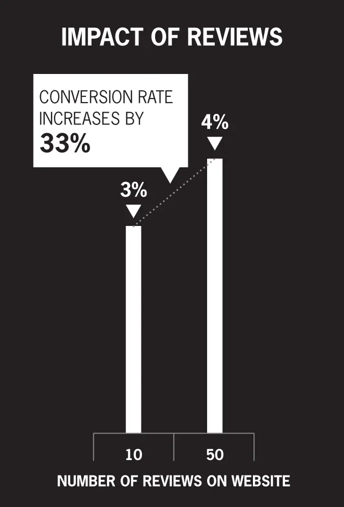
Figure 2.3 Impact of Reviews on Website Conversions
Contrast
The fewer colors you use, the more each one pops. Whitespace on websites is highly underrated and underused. When you look through the examples of amazing websites, you will notice how many of the best designs are the ones that are the simplest.
Increase your contrast by taking a less-is-more approach. Not only do colors stand out more when you keep it simple, so do images and videos.
Use colors to draw attention to your calls to action. This will get the people clicking on the pages, buttons, and content you want them to the most. A well-designed website will get people to the parts of it that give you the highest likelihood of generating a high-quality lead that is easy to convert.
Notably, we've also entered the “dark mode” era. Many of the most popular apps have already incorporated dark mode, and your website can, too.
Currently, you will likely need to get the help of a developer to add a dark mode to your site. They can use a tool like darkmode.js, which adds a light mode/dark mode toggle button.
I'm confident that moving forward, there will be simple dark mode add-ons easy enough for anyone to install on any website. There already are several highly rated WordPress plugins such as WP Dark Mode that make it a couple of clicks to add.
DO THIS RIGHT NOW
Download the Chrome extension Super Dark Mode to see what your website will look like in dark mode.
Fewer Form Fields
There is a direct correlation between a website's conversion rate and the amount of information required to complete a form. Going from three fields to five decreases the conversion rate by 20%, and going from five fields to six-plus decreases it by another 25% 7 ( Figure 2.4).
Conversely, the more fields someone is willing to complete directly correlate to a lead that is easier for sales to convert. You must find the right balance.
If you do not want to ask for a ton of information so that you get more leads, then stick to the basics of name, phone number, and email. You can also use a Facebook or Google registration button so they can complete a form without any keystrokes at all.
You can even have an option site-wide that lets visitors use their Gmail to opt in. If they are already logged into Gmail (which has more than 1.5 billion users), they simply click twice, with one of the clicks authorizing Google to give you their email address.
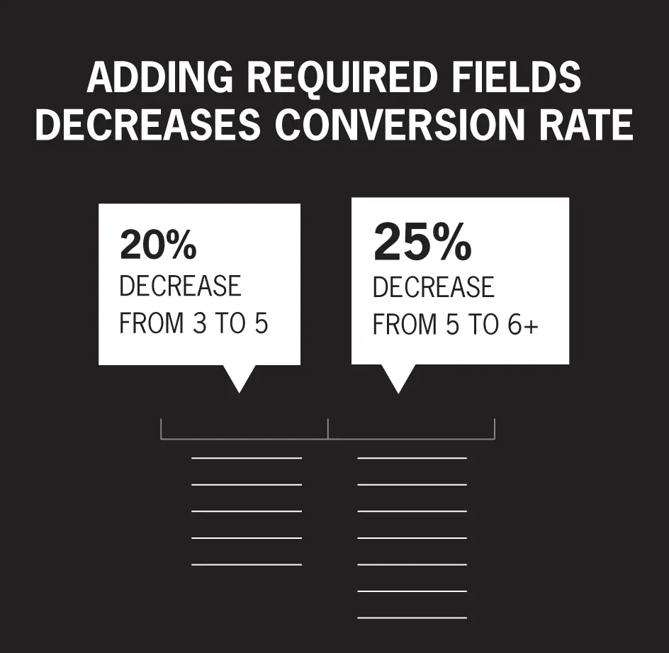
Figure 2.4 Adding Required Fields Decreases Conversion Rate
If you go the higher-quality lead route and ask for additional information, be sure that what you require directly improves the lead's experience during your sales calls. For example, if you are a real estate agent generating a seller lead, knowing their time frame and if they need to buy another home puts you in a position to have a more meaningful conversation.
Ultimately, just make sure that the data you gather when you capture a lead makes the experience better for the customer. That can mean better calls, but it can also mean better marketing. The more you know about your leads, the easier it is to send them the right email marketing campaigns and show them relevant ads.
I have also found it to be worth having a backup option such as “Or you can call/text 555–5555 or email Hello@Curaytor.com” anytime you display a contact form. The bottom line is that if someone is willing to fill out a form on your website to be contacted, they might prefer to talk to someone right away.
If it takes more than a moment or two for a visitor to locate your phone number and email address on your website, fix that immediately. My entire marketing philosophy is to stop chasing leads. My goal for you is to attract clients. When it works and someone is ready to contact you, make sure there is zero friction.
Читать дальшеИнтервал:
Закладка:
Похожие книги на «The Conversion Code»
Представляем Вашему вниманию похожие книги на «The Conversion Code» списком для выбора. Мы отобрали схожую по названию и смыслу литературу в надежде предоставить читателям больше вариантов отыскать новые, интересные, ещё непрочитанные произведения.


Обсуждение, отзывы о книге «The Conversion Code» и просто собственные мнения читателей. Оставьте ваши комментарии, напишите, что Вы думаете о произведении, его смысле или главных героях. Укажите что конкретно понравилось, а что нет, и почему Вы так считаете.