Using Predictive Analytics to Improve Healthcare Outcomes
Здесь есть возможность читать онлайн «Using Predictive Analytics to Improve Healthcare Outcomes» — ознакомительный отрывок электронной книги совершенно бесплатно, а после прочтения отрывка купить полную версию. В некоторых случаях можно слушать аудио, скачать через торрент в формате fb2 и присутствует краткое содержание. Жанр: unrecognised, на английском языке. Описание произведения, (предисловие) а так же отзывы посетителей доступны на портале библиотеки ЛибКат.
- Название:Using Predictive Analytics to Improve Healthcare Outcomes
- Автор:
- Жанр:
- Год:неизвестен
- ISBN:нет данных
- Рейтинг книги:5 / 5. Голосов: 1
-
Избранное:Добавить в избранное
- Отзывы:
-
Ваша оценка:
Using Predictive Analytics to Improve Healthcare Outcomes: краткое содержание, описание и аннотация
Предлагаем к чтению аннотацию, описание, краткое содержание или предисловие (зависит от того, что написал сам автор книги «Using Predictive Analytics to Improve Healthcare Outcomes»). Если вы не нашли необходимую информацию о книге — напишите в комментариях, мы постараемся отыскать её.
Discover a comprehensive overview, from established leaders in the field, of how to use predictive analytics and other analytic methods for healthcare quality improvement. Using Predictive Analytics to Improve Healthcare Outcomes
before
proven in advance
Using Predictive Analytics to Improve Healthcare Outcomes
Using Predictive Analytics to Improve Healthcare Outcomes — читать онлайн ознакомительный отрывок
Ниже представлен текст книги, разбитый по страницам. Система сохранения места последней прочитанной страницы, позволяет с удобством читать онлайн бесплатно книгу «Using Predictive Analytics to Improve Healthcare Outcomes», без необходимости каждый раз заново искать на чём Вы остановились. Поставьте закладку, и сможете в любой момент перейти на страницу, на которой закончили чтение.
Интервал:
Закладка:
Reviewing the data for accuracy can also begin to give the team a feel for the “personality” of the data.
Reviewing the data for accuracy can also begin to give the team a feel for the “personality” of the data. This data all comes from people, but instead of a coherent conversation or observation of the people contained in the data, it is initially just data. As the data is examined, an understanding of the respondents will begin to emerge.
Step 11: Analyze the Data
For this step, it is important to engage a professional who is trained in analytics so the data can be interpreted accurately. There are several options in today's analytic software, such as SPSS, SAS or R, to aid in the examination of data flaws that are not obvious by merely looking at the dataset or its associated graphic representations. Your organization may have software, such as Tableau, which generates graphs automatically and is dependable for graphic visualization. In this step, it is important to engage an analyst or data scientist who can take advantage of the tools and tests contained in analytic software.
Step 12: Present Data to the People Who Work Directly With the Variable of Interest, and Get Their Interpretation of the Data
Ultimately, the most relevant and useful interpretation will be provided by those who live the clinical experience, because they can validate or refine the interpretation of the data. These people are typically clinicians, not analysts, however, so showing complex data in a format that is accessible to the employee not trained in analytics is important. When possible, use bubble graphs that provide a visual review of overall findings.
Figures 1.2and 1.3convey two ways to facilitate understanding of complex mathematics. Figure 1.2provides a visual representation of the traditional graphic for results from a regression equation which examined three predictor variables related to reduction of central line‐associated blood stream infection (CLABSI). The three predictors—location of the central line insertion, the RN assigned, and the phase of the project—have been tested to see the degree to which each of them explains the frequency of CLABSI.
Similarly, Figure 1.3is a bubble graph which also shows how much of the outcome variable is explained by the same three predictor variables.
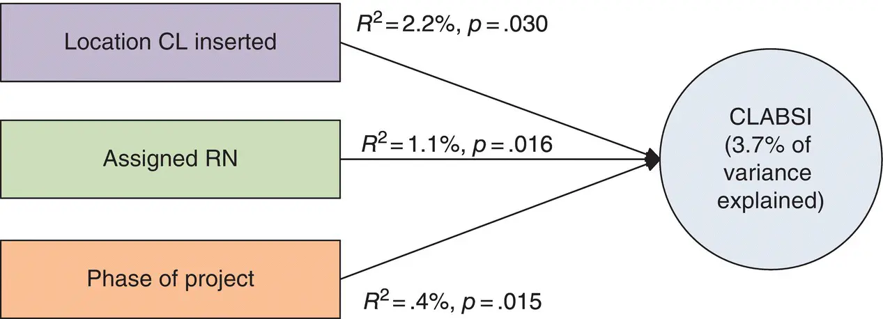
Figure 1.2 Explained variance of CLABSI, traditional graphic.
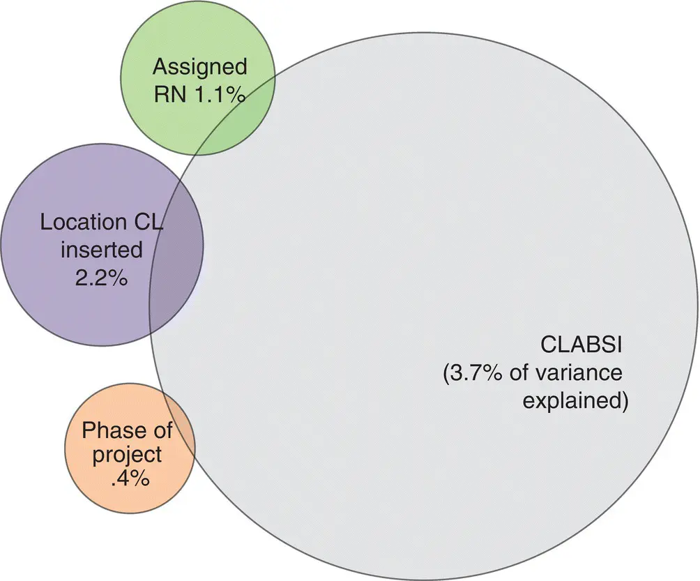
Figure 1.3 Explained variance of CLABSI, bubble graphic.
Both models reveal that the location of the central line insertion predicted 2.2% of CLABSI, the assigned RN predicted 1.1%, and the phase of the project predicted .4%. It has been the experience of this author that the visual representation in Figure 1.2does not convey information as quickly as does the visual representation in Figure 1.3, in part because it relies too heavily on statistical symbols and equations to convey the information. In this book, however, you will see that most of the graphic representations of models and their results are expressed in traditional graphs, as many readers are likely to want more information than bubble graphs convey.
Analysts can provide a review of the results, but it is only the staff members who can provide validation or reflections that may suggest the need for secondary analysis to understand the data more deeply. When the data is being presented, pay attention to the listeners' responses. Even people who do not want to speak up may provide useful insight through nonverbal responses such as silence or even a shift in energy in the room. All of these cues can be informative. It is not uncommon for this author to pull listeners aside to discuss the nonverbal cues or silence that was observed. When encouraged to express themselves, these are often people from whom extremely valuable feedback is elicited.
Step 13: Respecify (Correct, Refine, and/or Expand) the Measurement Model
This is also the work of the data analyst, but it is done in close collaboration with staff members. This step includes refinement and possible expansion of the model to make it an even more sensitive model to detect predictors accurately. During presentation of the data to staff members, new variables will be identified, or variables that could not be measured in the first round but belong in the overall model will be addressed. Respecify the model to include anything that could not be included in the initial analysis or was identified in the interpretation as missing, and delete anything that was determined in the analysis to be unimportant. In one real‐life example, we were measuring the performance of charge nurses as the variable of interest, and we had proposed that our three predictor variables were (a) demographics of the charge nurse, (b) attending the charge nurse program, and (c) the preceptor who trained the charge nurse into the role. The originally specified model looked like Figure 1.4.
After Model 1 was used to examine this variable of interest, and after the data was presented to unit managers, charge nurses, and staff members from the unit, those who attended the presentation reported that Model 1 was missing two influential predictor variables: (a) mentoring of the unit manager and (b) resources available on the job for charge nurses to execute their required role. These influential variables were added to a respecified model ( Figure 1.5), and the study was conducted again to see whether analysis of the respecified model could further explain what was influencing performance of charge nurses.
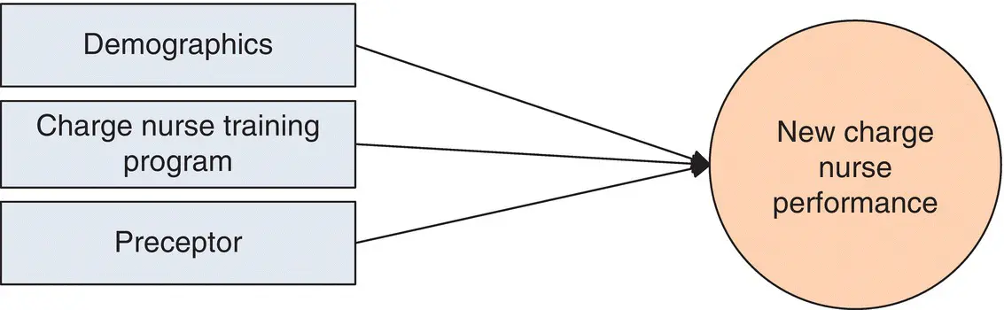
Figure 1.4 Model 1 to measure new charge nurse performance.
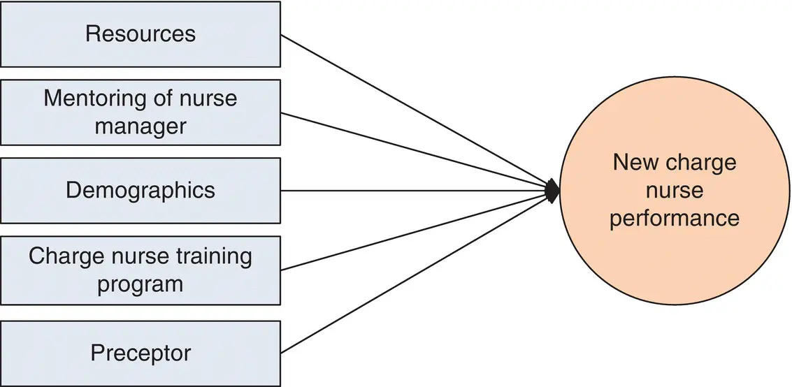
Figure 1.5 Model 2, respecified with new predictor variables to measure new charge nurse performance.
Note also that in structural models such as Figures 1.4and 1.5, we have rectangles that look like they are representing one variable, when in many cases they represent multiple variables. For example, the rectangle labeled “Demographics” in both figures might be representing a dozen or so variables. These smaller, more compact models, which appear throughout this book, are called over‐aggregated structural models. Remember when you see them that what looks like a model testing three or four variables is actually testing dozens of variables at the same time.
Step 14: Repeat Steps 2–13 if Explained Variance Declines
In nearly every instance, the data analyst will, along with staff, be repeating Steps 2–13. When initiating use of predictive analytics, conventional wisdom says that at least 50% of the variance should be explained using regression analysis, but it is the experience of this author that explained variance of 70–75% for a variable of interest can be achieved with a good fitting model, using 10 predictor variables or fewer, in a regression analysis.
As practice changes are implemented based on the information that emerges, variables from the initial model will no longer predict the variable of interest because the problem (or part of the problem) will have been solved by the practice changes. Traditionally, the analyst would then have to start over and develop a new model, but in this case, much of the work has already been done when developing the initial full model that is graphically depicted in Figure 1.1. As you return to Step 2, you will review the existing full model and rerun all the analytics to identify existing predictor variables that have now become an issue due to the new practice changes and/or identify new variables that relate to the variable of interest.
Читать дальшеИнтервал:
Закладка:
Похожие книги на «Using Predictive Analytics to Improve Healthcare Outcomes»
Представляем Вашему вниманию похожие книги на «Using Predictive Analytics to Improve Healthcare Outcomes» списком для выбора. Мы отобрали схожую по названию и смыслу литературу в надежде предоставить читателям больше вариантов отыскать новые, интересные, ещё непрочитанные произведения.


Обсуждение, отзывы о книге «Using Predictive Analytics to Improve Healthcare Outcomes» и просто собственные мнения читателей. Оставьте ваши комментарии, напишите, что Вы думаете о произведении, его смысле или главных героях. Укажите что конкретно понравилось, а что нет, и почему Вы так считаете.