Michael Alexander - Excel Dashboards & Reports For Dummies
Здесь есть возможность читать онлайн «Michael Alexander - Excel Dashboards & Reports For Dummies» — ознакомительный отрывок электронной книги совершенно бесплатно, а после прочтения отрывка купить полную версию. В некоторых случаях можно слушать аудио, скачать через торрент в формате fb2 и присутствует краткое содержание. Жанр: unrecognised, на английском языке. Описание произведения, (предисловие) а так же отзывы посетителей доступны на портале библиотеки ЛибКат.
- Название:Excel Dashboards & Reports For Dummies
- Автор:
- Жанр:
- Год:неизвестен
- ISBN:нет данных
- Рейтинг книги:3 / 5. Голосов: 1
-
Избранное:Добавить в избранное
- Отзывы:
-
Ваша оценка:
Excel Dashboards & Reports For Dummies: краткое содержание, описание и аннотация
Предлагаем к чтению аннотацию, описание, краткое содержание или предисловие (зависит от того, что написал сам автор книги «Excel Dashboards & Reports For Dummies»). Если вы не нашли необходимую информацию о книге — напишите в комментариях, мы постараемся отыскать её.
Excel Dashboards & Reports For Dummies
Excel Dashboards & Reports For Dummies
Excel Dashboards & Reports For Dummies
Excel Dashboards & Reports For Dummies — читать онлайн ознакомительный отрывок
Ниже представлен текст книги, разбитый по страницам. Система сохранения места последней прочитанной страницы, позволяет с удобством читать онлайн бесплатно книгу «Excel Dashboards & Reports For Dummies», без необходимости каждый раз заново искать на чём Вы остановились. Поставьте закладку, и сможете в любой момент перейти на страницу, на которой закончили чтение.
Интервал:
Закладка:
If you want to follow along with the examples in this book, you can download the sample files at www.dummies.com/go/exceldashboardsreportsfd4e . The files are organized by chapter.
Where to Go from Here
It’s time to start your Excel dashboarding adventure! If you’re a complete dashboard novice, start with Chapter 1and progress through the book at a pace that allows you to absorb as much of the material as possible. If you’ve got the basics down and you’re interested in advanced charting techniques that help create meaningful visualizations, skip to Part 3. Turn to Part 4for an in-depth look at turning your basic dashboards into macro-driven interactive reporting.
Part 1
Getting Started with Excel Dashboards and Reports
IN THIS PART …
Discover how to think about your data in terms of creating effective dashboards and reports and get a solid understanding of the fundamentals and basic ground rules for creating effective dashboards and reports.
Uncover the best practices for setting up the source data for your dashboards and reports and explore the key Excel functions that help you build effective dashboard models.
Explore how pivot tables can enhance your analytical and reporting capabilities as well as your dashboards.
Dive into Power Query and explore some of the ways to incorporate external data into your reporting mechanisms.
Chapter 1
Getting in the Dashboard State of Mind
IN THIS CHAPTER
 Comparing dashboards to reports
Getting started on the right foot
Dashboarding best practices
In his song “New York State of Mind,” Billy Joel laments the differences between California and New York. In this homage to the Big Apple, he implies a mood and a feeling that come with thinking about New York. I admit it’s a stretch, but I’ll extend this analogy to Excel — don’t laugh.
In Excel, the differences between building a dashboard and creating standard table-driven analyses are as great as the differences between California and New York. To approach a dashboarding project, you truly have to get into the dashboard state of mind. As you’ll come to realize in the next few chapters, dashboarding requires far more preparation than standard Excel analyses. It calls for closer communication with business leaders, stricter data modeling techniques, and the following of certain best practices. It’s beneficial to have a base familiarity with fundamental dashboarding concepts before venturing off into the mechanics of building a dashboard.
In this chapter, you get a solid understanding of these basic dashboard concepts and design principles as well as what it takes to prepare for a dashboarding project.
Defining Dashboards and Reports
It isn’t difficult to use report and dashboard interchangeably. In fact, the line between reports and dashboards frequently gets muddied. I’ve seen countless reports referred to as dashboards just because they included a few charts. Likewise, I’ve seen many examples of what could be considered dashboards but have been called reports.
Now, this may all seem like semantics to you, but it’s helpful to clear the air and understand the core attributes of what are considered to be reports and dashboards.
Defining reports
The report is probably the most common application of business intelligence. A report can be described as a document that contains data used for reading or viewing. It can be as simple as a data table or as complex as a subtotaled view with interactive drill-downs, similar to Excel’s Subtotal or Pivot Table functionality.
The key attribute of a report is that it doesn’t lead a reader to a predefined conclusion. Although reports can include analysis, aggregations, and even charts, reports often allow for the end users to apply their own judgment and analysis to the data.
To clarify this concept, Figure 1-1 shows an example of a report. This report shows the National Park overnight visitor statistics by period. Although this data can be useful, it’s clear this report isn’t steering the reader toward any predefined judgment or analysis; it’s simply presenting the aggregated data.
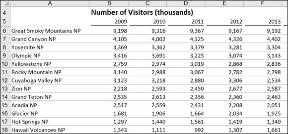
FIGURE 1-1:Reports present data for viewing but don’t lead readers to conclusions.
Defining dashboards
A dashboard is a visual interface that provides at-a-glance views into key measures relevant to a particular objective or business process. Dashboards have three main attributes:
Dashboards are typically graphical in nature, providing visualizations that help focus attention on key trends, comparisons, and exceptions.
Dashboards often display only data that are relevant to the goal of the dashboard.
Because dashboards are designed with a specific purpose or goal, they inherently contain predefined conclusions that relieve the end user from performing his own analysis.
Figure 1-2 illustrates a dashboard that uses the same data shown in Figure 1-1. This dashboard displays key information about the national park overnight-visitor stats. As you can see, this presentation has all the main attributes that define a dashboard. First, it’s a visual display that allows you to quickly recognize the overall trending of the overnight-visitor stats. Second, you can see that not all the detailed data is shown here — you see only the key pieces of information relevant to support the goal of this dashboard, which in this case would be to get some insights on which parks would need some additional resources to increase visitor rates. Finally, by virtue of its objective, this dashboard effectively presents you with analysis and conclusions about the trending of overnight visitors.
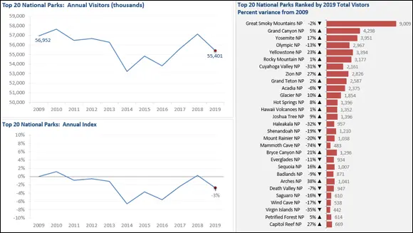
FIGURE 1-2:Dashboards provide at-a-glance views into key measures relevant to a particular objective or business process.
Preparing for Greatness
Imagine that your manager asks you to create a dashboard that tells him everything he should know about monthly service subscriptions. Do you jump to action and slap together whatever comes to mind? Do you take a guess at what he wants to see and hope it’s useful? These questions sound ridiculous, but these types of situations happen more than you think. I’m continually called to create the next great reporting tool but am rarely provided the time to gather the true requirements for it. Between limited data and unrealistic deadlines, the end product often ends up being unused or having little value.
This brings me to one of the key steps in preparing for dashboarding: collecting user requirements.
In the non-IT world of the Excel analyst, user requirements are practically useless because of sudden changes in project scope, constantly changing priorities, and shifting deadlines. The gathering of user requirements is viewed to be a lot of work and a waste of valuable time in the ever-changing business environment. But as I mention at the start of this chapter, it’s time to get into the dashboard state of mind.
Читать дальшеИнтервал:
Закладка:
Похожие книги на «Excel Dashboards & Reports For Dummies»
Представляем Вашему вниманию похожие книги на «Excel Dashboards & Reports For Dummies» списком для выбора. Мы отобрали схожую по названию и смыслу литературу в надежде предоставить читателям больше вариантов отыскать новые, интересные, ещё непрочитанные произведения.


Обсуждение, отзывы о книге «Excel Dashboards & Reports For Dummies» и просто собственные мнения читателей. Оставьте ваши комментарии, напишите, что Вы думаете о произведении, его смысле или главных героях. Укажите что конкретно понравилось, а что нет, и почему Вы так считаете.