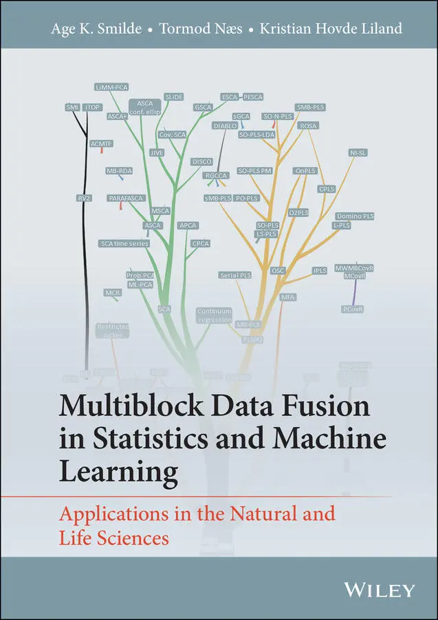
Tormod Næs - Multiblock Data Fusion in Statistics and Machine Learning
Здесь есть возможность читать онлайн «Tormod Næs - Multiblock Data Fusion in Statistics and Machine Learning» — ознакомительный отрывок электронной книги совершенно бесплатно, а после прочтения отрывка купить полную версию. В некоторых случаях можно слушать аудио, скачать через торрент в формате fb2 и присутствует краткое содержание. Жанр: unrecognised, на английском языке. Описание произведения, (предисловие) а так же отзывы посетителей доступны на портале библиотеки ЛибКат.
- Название:Multiblock Data Fusion in Statistics and Machine Learning
- Автор:
- Жанр:
- Год:неизвестен
- ISBN:нет данных
- Рейтинг книги:3 / 5. Голосов: 1
-
Избранное:Добавить в избранное
- Отзывы:
-
Ваша оценка:
Multiblock Data Fusion in Statistics and Machine Learning: краткое содержание, описание и аннотация
Предлагаем к чтению аннотацию, описание, краткое содержание или предисловие (зависит от того, что написал сам автор книги «Multiblock Data Fusion in Statistics and Machine Learning»). Если вы не нашли необходимую информацию о книге — напишите в комментариях, мы постараемся отыскать её.
Explore the advantages and shortcomings of various forms of multiblock analysis, and the relationships between them, with this expert guide Multiblock Data Fusion in Statistics and Machine Learning: Applications in the Natural and Life Sciences
Multiblock Data Fusion in Statistics and Machine Learning: Applications in the Natural and Life Sciences
Multiblock Data Fusion in Statistics and Machine Learning — читать онлайн ознакомительный отрывок
Ниже представлен текст книги, разбитый по страницам. Система сохранения места последней прочитанной страницы, позволяет с удобством читать онлайн бесплатно книгу «Multiblock Data Fusion in Statistics and Machine Learning», без необходимости каждый раз заново искать на чём Вы остановились. Поставьте закладку, и сможете в любой момент перейти на страницу, на которой закончили чтение.
Интервал:
Закладка:
Figure 2.20 Illustration of true versus predicted values from aregression model. The ideal line is indicated in dashed green.
Figure 2.21 Visualisation of bias variance trade-off as a function of model complex-ity. The observed MSE (in blue) is the sum of the bias 2(red dashed),the variance (yellow dashed) and the irreducible error (purple dotted).
Figure 2.22 Learning curves showing how median R 2and Q 2from linear regression develops with the number of training samples for a simulated data set.
Figure 2.23 Visualisation of the process of splitting a data set into a set ofsegments (here chosen to be consecutive) and the sequentialhold-out of one segment ( V k) for validation of models. Alldata blocks X mand the response Yare split along the sampledirection and corresponding segments removed simultaneously.
Figure 2.24 Cumulative explained variance for PCA of the concatenatedRaman data using naive cross-validation (only leavingout samples). R 2is calibrated and Q 2is cross-validated.
Figure 2.25 Null distribution and observed test statistic usedfor significance estimation with permutation testing.
Figure 3.1 Skeleton of a three-block data set with a shared sample mode.
Figure 3.2 Skeleton of a four-block data set with a shared sample mode.
Figure 3.3 Skeleton of a three-block data set with a shared variable mode.
Figure 3.4 Skeleton of a three-block L-shaped data setwith a shared variable or a shared sample mode.
Figure 3.5 Skeleton of a four-block U-shaped data set with a shared variable or ashared sample mode (a) and a four-block skeleton with a shared variableand a shared sample mode (b). This is a simplified version; it should be understood that all sample modes are shared as well as all variable modes.
Figure 3.6 Topology of a three-block data set with a shared sample mode and unsupervised analysis: (a) full topology and (b) simplified representation.
Figure 3.7 Topology of a three-block data set with ashared variable mode and unsupervised analysis.
Figure 3.8 Different arrangements of data sharing twomodes. Topology (a) and multiway array (b).
Figure 3.9 Unsupervised combination of a three-way and two-way array.
Figure 3.10 Supervised three-set problem sharing the sample mode.
Figure 3.11 Supervised L-shape problem. Block X 1is a predic-tor for block X 2and extra information regardingthe variables in block X 1is available in block X 3.
Figure 3.12 Path model structure. Blocks are connected throughshared samples and a causal structure is assumed.
Figure 3.13 Idea of linking two data blocks with ashared sample mode. For explanation, see text.
Figure 3.14 Different linking structures: (a) identity link, (b) flexible link, (c) partial identity link: common ( T 12C) and distinct ( T 1D, T 2D) components.
Figure 3.15 Idea of linking two data blocks with shared variable mode.
Figure 3.16 Different linking structures for supervised analysis: (a) linking structure where components are used both for the X-blocks and the Y-block; (b) linking structure that only uses components for the X-blocks.
Figure 3.17 Treating common and distinct linking structures for supervised analysis: (a) Linking structure with no differentiation between common and distinct in the X-blocks ( Cis common, D 1, D 2are distinct for X 1and X 2, respectively; e X 1and e X 2represent the unsystematic parts of X 1and X 2); (b) first X 1is used and then the remainder of X 2after removing common (predictive) part T 1of X 1.
Figure 4.1 Explanation of the scale (a) and orientation (b) component of the SVD.The axes are two variables and the spread of the samples are visualised including their contours as ellipsoids. Hence, this is a representation ofthe row-spaces of the matrices. For more explanation, see text. Source: Smilde et al. (2015). Reproduced with permission of John Wiley and Sons.
Figure 4.2 Topology of interactions between genomics data sets. Source: Aben et al. (2018). Reproduced with permission of Oxford University Press.
Figure 4.3 The RV and partial RV coefficients for the genomics example.For explanation, see the main text. Source: Aben et al. (2018). Reproduced with permission of Oxford University Press.
Figure 4.4 Decision tree for selecting a matrix correlation method.Abbreviations: HOM is homogeneous data, HET is heterogeneousdata, Gen-RV is generalised RV, Full means full correlations,Partial means partial correlations. For more explanation, see text.
Figure 5.1 Unsupervised analysis as discussed in this chapter, (a) links between samples and (b) links betweenvariables (simplified representations, see Chapter 3).
Figure 5.2 Illustration explaining the idea of exploring multiblock data. Source:Smilde et al. (2017). Reproduced with permission of John Wiley and Sons.
Figure 5.3 The idea of common (C), local (L) and distinct (D) parts of three datablocks. The symbols X tdenote row spaces; X t 13L, e.g., is the part of X t 1and X t 3which is in common but does not share a partwith X t 2.
Figure 5.4 Proportion of explained variances (variances accounted for)for the TIV Block (upper part); the LAIV block (mid-dle part) and the concatenated blocks (lower part). Source:Van Deun et al. (2013). Reproduced with permission of Elsevier.
Figure 5.5 Row-spaces visualised. The true row space (blue) contains thepure spectra (blue arrows). The row-space of Xis the green plane which contains the estimated spectra (green arrows). The redarrows are off the row-space and closer to the true pure spectra.
Figure 5.6 Difference between weights and correlation loadings explained. Green arrows are variables of X m; red arrow is the consensus component t; bluearrow is the common component t m. Dotted lines represent projections.
Figure 5.7 The logistic function η ( θ ) = (1 + exp ( −θ )) −1visualised. Only thepart between [ − 4,4] is shown but the function goes from −∞ to + ∞ .
Figure 5.8 CNA data visualised. Legend: (a) each line is a sample (cell line),blanks are zeros and black dots are ones; (b) the proportionof ones per variable illustrating the unbalancedness. Source:Song et al. (2021). Reproduced with permission of Elsevier.
Figure 5.9 Score plot of the CNA data. Legend: (a) scores of a logisticPCA on CNA; (b) consensus scores of the first two GSCA components of a GSCA model (MITF is a special gene). Source: Smilde et al. (2020). Licensed under CC BY 4.0.
Figure 5.10 Plots for selecting numbers of components for the sensory example. (a) SCA: the curve represents cumulative explained variance for the concatenated data blocks. The bars show how much variance each component explains in the individual blocks. (b) DISCO: each point represents the non-congruence value for a given target (model).The plot includes all possible combinations of common and distinct components based on a total rank of three. The horizontal axis represents the number of common components and the numbers inthe plot represent the number of distinct components for SMELLand TASTE, respectively. (c) PCA-GCA: black dots representthe canonical correlation coefficients between the PCA scoresof the two blocks (x100) and the bars show how much variancethe canonical components explain in each block. Source: Smilde et al. (2017). Reproduced with permission of John Wiley and Sons.
Читать дальшеИнтервал:
Закладка:
Похожие книги на «Multiblock Data Fusion in Statistics and Machine Learning»
Представляем Вашему вниманию похожие книги на «Multiblock Data Fusion in Statistics and Machine Learning» списком для выбора. Мы отобрали схожую по названию и смыслу литературу в надежде предоставить читателям больше вариантов отыскать новые, интересные, ещё непрочитанные произведения.


Обсуждение, отзывы о книге «Multiblock Data Fusion in Statistics and Machine Learning» и просто собственные мнения читателей. Оставьте ваши комментарии, напишите, что Вы думаете о произведении, его смысле или главных героях. Укажите что конкретно понравилось, а что нет, и почему Вы так считаете.