William Boyd - Bamboo - Essays and Criticism
Здесь есть возможность читать онлайн «William Boyd - Bamboo - Essays and Criticism» весь текст электронной книги совершенно бесплатно (целиком полную версию без сокращений). В некоторых случаях можно слушать аудио, скачать через торрент в формате fb2 и присутствует краткое содержание. Год выпуска: 2007, Издательство: Bloomsbury USA, Жанр: Современная проза, на английском языке. Описание произведения, (предисловие) а так же отзывы посетителей доступны на портале библиотеки ЛибКат.
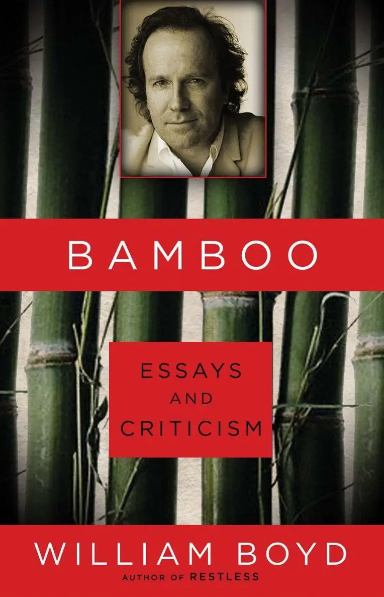
- Название:Bamboo: Essays and Criticism
- Автор:
- Издательство:Bloomsbury USA
- Жанр:
- Год:2007
- ISBN:нет данных
- Рейтинг книги:4 / 5. Голосов: 1
-
Избранное:Добавить в избранное
- Отзывы:
-
Ваша оценка:
Bamboo: Essays and Criticism: краткое содержание, описание и аннотация
Предлагаем к чтению аннотацию, описание, краткое содержание или предисловие (зависит от того, что написал сам автор книги «Bamboo: Essays and Criticism»). Если вы не нашли необходимую информацию о книге — напишите в комментариях, мы постараемся отыскать её.
, an erudite and entertaining collection of essays and opinions from one of our generation's most talented writers. "Plant one bamboo shoot-cut bamboo for the rest of your life." William Boyd's prolific, fruitful career is a testament to this old Chinese saying. Boyd penned his first book review in 1978-the proverbial bamboo shoot-and we've been reaping the rewards ever since. Beginning with the Whitbread Award-winning
, William Boyd has written consistently artful, intelligent fiction and firmly established himself as an international man of letters. He has done nearly thirty years of research and writing for projects as diverse as a novel about an ecologist studying chimpanzees (
), an adapted screenplay about the emotional lives of soldiers (
, which he also directed), and a fictional biography of an American painter (
). All the while, Boyd has been accruing facts and wisdom-and publishing it in the form of articles, essays, and reviews.
Now available for the first time in the United States,
gathers together Boyd's writing on literature, art, the movie business, television, people he has met, places he has visited and autobiographical reflections on his African childhood, his years at boarding school, and the profession of novelist. From Pablo Picasso to the Cannes Film Festival, from Charles Dickens to Catherine Deneuve, from mini-cabs to Cecil Rhodes, this collection is a fascinating and surprisingly revealing companion to the work of one of Britain's leading novelists.
Bamboo: Essays and Criticism — читать онлайн бесплатно полную книгу (весь текст) целиком
Ниже представлен текст книги, разбитый по страницам. Система сохранения места последней прочитанной страницы, позволяет с удобством читать онлайн бесплатно книгу «Bamboo: Essays and Criticism», без необходимости каждый раз заново искать на чём Вы остановились. Поставьте закладку, и сможете в любой момент перейти на страницу, на которой закончили чтение.
Интервал:
Закладка:
Hopper died in 1967 when he was two months short of his eighty-fifth birthday. He was born in a small town called Nyack some forty miles up the Hudson River from New York and almost all his life was lived in Manhattan (in Greenwich Village) or in Truro in Cape Cod. In his eighty-five years he spent approximately fifteen months in Europe, showing, after 1910, no serious inclination to return there. In these circumstances, to try to position him as somehow European in spirit takes tendentious effort. It would be more appropriate to reconfigure Augie March’s proud boast: “I am American, Nyack-born.” It seems the natural claim for Edward Hopper.
5. Hopper liked to paint buildings. The more angled the sunlight, at the beginning or the end of the day, the more obvious the building’s form and decoration — entablatures, friezes and architraves were picked out and defined by the longer shadows. His many watercolours of houses and Cape Cod street scenes are testimony to this straightforward aesthetic delight. In the composition it is the blockiness and mass of the houses that attract him and he uses the pigment as if it is poster paint, with a bold impasto effect that almost seems to fight against the medium. In his oils, however, buildings take on vaguer, more symbolic freight — their isolation in the landscape being the resonating feature. Unlike the water-colours, these buildings are not rendered with an architect’s knowing eye: they become simpler, cruder and sometimes the perspective of their walls and roof planes is deliberately slightly skewed.
6. Hopper was a realist, squarely positioned in the capacious and all-embracing tradition of figuration. But to claim, as Clement Greenberg does, that his work is “photographic” in some way is absurd. In his poem “Lines on a Young Lady’s Photograph Album” Philip Larkin precisely describes what a photograph does:
But o, photography! As no art is,
Faithful and disappointing! That records
Dull days as dull, and hold-it smiles as frauds,
And will not censor blemishes …
“As no art is,/Faithful and disappointing” (my emphasis). Gail Levin, Hopper’s exemplary biographer, first wrote about him in a small book called Hopper’s Places (1985) where she juxtaposes, with as much exactitude as possible, photographs of the houses, landscapes and buildings with Hopper’s finished paintings. The book is a brilliant elucidation of Hopper’s working practice: it tells you so much about his purpose and ambition for his paintings and at the same time provides the most succinct and telling refutation of the photographic comparison. Hopper’s discerning, transforming eye — his stern aesthetic of simplification and reduction (Levin calls it: “his relentless parsimony of exclusions”) — is everywhere in evidence. Being “faithful” to what he sees is the last thing on his mind.
7. Our intellect is hard-wired to seek explanations and understanding. As the critic Frank Kermode commented, “We are programmed to prefer fulfilment to disappointment; the closed to the open.” When you look at a Hopper painting, particularly his peopled paintings, the urge to supply a narrative, to link a causal chain together, to place the image into a context — to “close” the picture — is very powerful. But all serious artists know that in reality life isn’t like that: at best we can interpret, not explain, and our interpretation will be subjective, not final. The plots in our lives never thin, they relentlessly thicken. There are any number of possible interpretations of Nighthawks for example, each one of them perfectly valid. Hopper knew that because he was painting realistic people in realistic settings — hotel lobbies, motel rooms, apartment buildings — the viewer would instinctively and inevitably attempt an interpretation of what they were doing there and what was going on. But to signal the impossibility of arriving at a true explanation he chose the blandest of titles: Office at Night, Office in a Small City, Automat . A rare exception to this rule is the late painting Excursion into Philosophy (1959) — a very un-Hopperian title. This painting, soused in sexual conflict, repression and disappointment prompted Jo Hopper to write to a friend: “It may be that Edward won’t stand for naming the new picture ‘Excursion into Philosophy.’ You know E. Hopper. He’ll call it ‘Sunlight on the Floor’ or something equally non-committal. But ‘Excursion into Philosophy’ is its true name, that’s how he referred to it himself & I grabbed right on to it as perfect.” Hopper knew exactly what he was doing with his scenes of isolated and alienated people and what emotions and feelings would be aroused by them but his titles were deliberately chosen to defeat the idea of any final interpretation. His great paintings remain fully “open.”
8. In 1948 during one of Hopper’s artistic blocks he and his wife went driving around Cape Cod looking for subjects to paint — in vain, as it turned out. “Nothing seemed to crystallize into a picture,” Jo Hopper wrote in her diary. Looking back over previous canvasses searching for inspiration, she added, “Only a few of them had been done from the fact. The fact is so much easier — than digging it out of one’s inner consciousness. It’s such a struggle.”
9. For the last six years I have probably looked more closely at actual Edward Hopper paintings than the work of any other artist. In New York, the Whitney Museum regularly displays about half a dozen of its large Hopper holding in its permanent collection. When I’m in New York, about three to four times a year, I walk past the Whitney at least twice a day: on several of those days I pop in and look at the Hoppers. Their allure never dulls and their integrity shines with iconic force in that institution.
What you immediately notice when you look at a Hopper oil up close (say six inches) is how laboriously the paint is applied and worked. There is nothing free-flowing, no agile brushstroking. There is a doggedness and flatness about the painted surface, a patient air of covering the canvas diligently. The effect, as I’ve mentioned above, is to make the paintings look almost amateurish in technique. If you look at how the grass is painted in Four-Lane Road no effort is made to render the blades of grass, to convey any tuftiness or differentiation in light and shade. He might as well be painting Astroturf. Similarly the trees in Gas are an amorphous lumpy mass with a lot of black mixed with the near uniform green. Time and again the great paintings illustrate this homogenizing, low-rent effect — the bleached grass in South Carolina Morning , the slab buildings in Approaching a City , the cow-pat hills in Western Motel . The technique looks clumsy, heavy-handed and homespun. It’s not quite paint-by-numbers but there is something automatic about the look: “grass is green,” “paint walls beige,” “shadows are purply-blue.” Hopper used a great deal of turpentine when he painted in oil. This simple parsimonious texture of his actual canvases explains why they reproduce so exceptionally well — nothing is really lost in the process apart from the evidence of how it is achieved.
The same qualities apply to his figures. His wife posed for all the women in his paintings but there is no sense that a portrait of Jo is ever being attempted. The raddled stripper in Girlie-Show , the buxom secretary in Office at Night , the woman reading in Chair Car barely register as individuals — they are more mannequins than people.
Why did Hopper subdue his manifest skills in this way? A glance at his preparatory sketches shows his tremendous facility, his confidence, his natural sense of composition. But everything in the finished painting seems designed to remove any indication of talent and ability. Faces are cartoonishly hybrid, poses are awkward, hands are badly rendered. It’s as if he wanted to be seen as a very average, not particularly gifted painter (he certainly convinced Clement Greenberg). He did not want his virtuosity to get in the way of the picture’s effect.
Читать дальшеИнтервал:
Закладка:
Похожие книги на «Bamboo: Essays and Criticism»
Представляем Вашему вниманию похожие книги на «Bamboo: Essays and Criticism» списком для выбора. Мы отобрали схожую по названию и смыслу литературу в надежде предоставить читателям больше вариантов отыскать новые, интересные, ещё непрочитанные произведения.


Обсуждение, отзывы о книге «Bamboo: Essays and Criticism» и просто собственные мнения читателей. Оставьте ваши комментарии, напишите, что Вы думаете о произведении, его смысле или главных героях. Укажите что конкретно понравилось, а что нет, и почему Вы так считаете.