Dan Binkley - Forest Ecology
Здесь есть возможность читать онлайн «Dan Binkley - Forest Ecology» — ознакомительный отрывок электронной книги совершенно бесплатно, а после прочтения отрывка купить полную версию. В некоторых случаях можно слушать аудио, скачать через торрент в формате fb2 и присутствует краткое содержание. Жанр: unrecognised, на английском языке. Описание произведения, (предисловие) а так же отзывы посетителей доступны на портале библиотеки ЛибКат.
- Название:Forest Ecology
- Автор:
- Жанр:
- Год:неизвестен
- ISBN:нет данных
- Рейтинг книги:5 / 5. Голосов: 1
-
Избранное:Добавить в избранное
- Отзывы:
-
Ваша оценка:
- 100
- 1
- 2
- 3
- 4
- 5
Forest Ecology: краткое содержание, описание и аннотация
Предлагаем к чтению аннотацию, описание, краткое содержание или предисловие (зависит от того, что написал сам автор книги «Forest Ecology»). Если вы не нашли необходимую информацию о книге — напишите в комментариях, мы постараемся отыскать её.
Forest Ecology
An Evidence-Based Approach Forest Ecology: An Evidence-Based Approach
Forest Ecology: An Evidence-Based Approach
Forest Ecology — читать онлайн ознакомительный отрывок
Ниже представлен текст книги, разбитый по страницам. Система сохранения места последней прочитанной страницы, позволяет с удобством читать онлайн бесплатно книгу «Forest Ecology», без необходимости каждый раз заново искать на чём Вы остановились. Поставьте закладку, и сможете в любой момент перейти на страницу, на которой закончили чтение.
Интервал:
Закладка:
The growth of a forest with a given temperature could depend on water supply. The range of sites could be divided into three groups: sites with less than 2000 mm yr −1, 2000–4000 mm yr −1, and more than 4000 mm yr −1( Figure C). The trends between temperature and stem growth are similar across these three groups at temperatures below 23 °C, but at higher temperatures growth seemed to decline more on drier sites than on wetter sites. This breakdown of the temperature relationship into three precipitation groups increases that amount of variation accounted for in growth to 31%, and very high confidence is warranted that predictions of temperature responses of growth differ among the precipitation groups.
Separating the sites into precipitation groups actually throws away some information that might be useful. For example, a site with 1950 mm yr −1precipitation would be tallied in the driest group, and one with 2050 mm yr −1would be separated into the medium group. Yet these two sites would be more similar to each other than the 2050 mm yr −1site would be to another in the medium group with 3950 mm yr −1site. Another version of the analysis could be done with all the data from each site allowed to influence the trend, and then a full three‐dimensional pattern can be developed. The second graph in Figure Bhas two horizontal axes. The temperature axis increases to the right, and “backward” into the 3D space. The precipitation axis goes the other way, increasing to the left and also going backward into the space. This graph shows how any given level of temperature, and any level of precipitation, connect to give an estimate of the expected rate of stem growth. Keeping all the information on precipitation included (rather than lumping into three groups) increases the variation accounted for to 34%. A key difference is that this full‐information analysis shows that growth continues to increase at high temperatures if the precipitation is high, but levels off (with no decline) on drier sites. This might seem like a small improvement in the pattern, but the improvement does warrant very high confidence.
It can be challenging to read the values for stem growth on the 3D graph, compared with straightforward 2D graphs. The grid lines give some help for visualizing how the overall trend changes, and the use of colors helps peg a value to any given point on the surface. Overall, 3D graphs can be very useful for illustrating overall trends, but 2D graphs might be more useful when the precise values of variables need to be identified.
Why do temperature and precipitation relate to only about one‐third of all the variation in stem growth among tropical forests? Two points are important. This analysis used only annual averages, and two sites with similar annual average might differ in important seasonal ways. A given amount of rain spread evenly across 12 months might have very different effects on growth than if all the rain fell during a 4‐month rainy season (with no rain for 8 months). The second point is that stem growth depends on a wide range of ecological factors, including soil nutrient supplies, and the genotypes of trees present. Attempts to explain forest growth often go beyond the ability of graphs to capture the relationship, using simulation models and other tools that have a chance to capture variations in growth patterns that go beyond two or three dimensions ( Chapter 7).
The Most Important Points to Understand from Figures Band CAre Not About Precipitation or Temperature
The most important point is one that is not found in the graph, but applies to this graph and most others in this book. Graphs plot the values for a variable (such as forest growth) based on another variable (such as precipitation). Even when the association between the two variables is very strong, it's fundamentally important to recognize that evidence of an association is not evidence of a cause‐and‐effect relationship. The forests that provided the data for Figure Bhad very different species composition, different soils, different ages, and different local histories of events. Some of these may happen to vary with precipitation, and might be the actual drivers of the trends that relate to precipitation. Similarly, if forest growth tended to decline in the warmest sites, that might result from increased activities of insects (or monkeys) rather than a direct effect of temperature.
Identification of driving causes behind patterns requires other sorts of evidence, especially evidence from experiments. If the addition (or removal) of water changed growth as much as was expected from the geographic gradient, then increased confidence would be warranted in water influencing growth across many locations. If plantations of a single species also declined in growth at high temperatures, then the trend in Figure Bmay be less influenced by changes in tree species across sites.
This fundamental idea is summarized in the aphorism, “Correlation does not equal causation.” All scientists know this, but placing science into sentences can be challenging for both thinking processes and writing processes. It's easy to find examples where scientists forgot this basic point (perhaps even a few places in this book?).
Confidence Bands Around Trends Come in Two Types
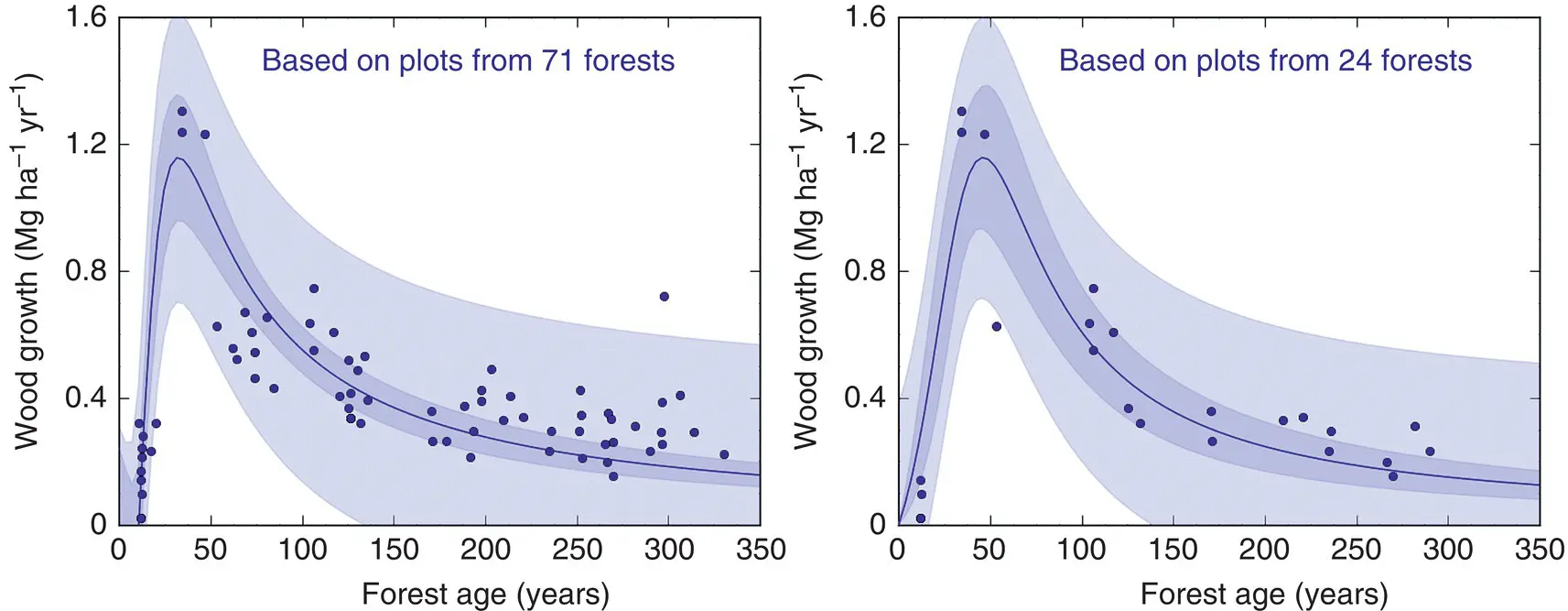
Most of this book's graphs have shaded bands around the trend lines, and these represent the 95% confidence interval around the trend. A narrow band means the value on the Y axis was tightly related to the value on the X axis. Other types of bands can also be used, and Figure Dshows a band that describes the distribution pattern for all the observations rather than the confidence warranted in the average trend. Both shaded bands in Figure Ddeal with 95%, but one describes the region where 95% of the observations are likely to be found, and the other the region where 95% of the trends (from repeated experiments) would be expected to occur. A key point is that the variation in the population of forests does not depend on how many samples are taken; a given proportion of forest would be a bit smaller (or much smaller) than average, and another proportion would be a bit larger (or much larger) than average. That variation does not change as the number of forests are sampled from the same landscape of forests. A sample of 24 forests produces about the same light‐shaded band as a sample of 71 forests, but the confidence warranted in the trend is tighter when based on a larger number of samples (the dark bands).

FIGURE D Rates of wood growth for lodgepole pine forests in Yellowstone National Park, Wyoming, USA rise quickly as new forests develop after fires, and then decline more slowly. The left graph shows that confidence in the average trend is warranted within the dark 95% confidence band. The points are dispersed around that average trend, and the lighter band covers the domain where about 95% of the observations would occur. The graph on the right used only a subset of 24 of the plots, and the average trend is similar, but the smaller number of sampled stands leads to a wider 95% confidence band (the darker band) for the trend compared to the full dataset on the left. The light blue band represents where 95% of the observations would be expected to fall, and the breadth of that band is quite similar between the two sampling intensities
(Source: based on data from Kashian et al. 2013; see also Figure 9.11).
Larger numbers of samples reduce the uncertainty about average trends, but not about the level of variability among forests across a landscape.
The Stories in This Book Have Two Pieces, Told in Three Ways
Интервал:
Закладка:
Похожие книги на «Forest Ecology»
Представляем Вашему вниманию похожие книги на «Forest Ecology» списком для выбора. Мы отобрали схожую по названию и смыслу литературу в надежде предоставить читателям больше вариантов отыскать новые, интересные, ещё непрочитанные произведения.
Обсуждение, отзывы о книге «Forest Ecology» и просто собственные мнения читателей. Оставьте ваши комментарии, напишите, что Вы думаете о произведении, его смысле или главных героях. Укажите что конкретно понравилось, а что нет, и почему Вы так считаете.


