Christopher alexander - A pattern language
Здесь есть возможность читать онлайн «Christopher alexander - A pattern language» весь текст электронной книги совершенно бесплатно (целиком полную версию без сокращений). В некоторых случаях можно слушать аудио, скачать через торрент в формате fb2 и присутствует краткое содержание. Жанр: Прочая научная литература, на английском языке. Описание произведения, (предисловие) а так же отзывы посетителей доступны на портале библиотеки ЛибКат.

- Название:A pattern language
- Автор:
- Жанр:
- Год:неизвестен
- ISBN:нет данных
- Рейтинг книги:3 / 5. Голосов: 1
-
Избранное:Добавить в избранное
- Отзывы:
-
Ваша оценка:
A pattern language: краткое содержание, описание и аннотация
Предлагаем к чтению аннотацию, описание, краткое содержание или предисловие (зависит от того, что написал сам автор книги «A pattern language»). Если вы не нашли необходимую информацию о книге — напишите в комментариях, мы постараемся отыскать её.
A pattern language — читать онлайн бесплатно полную книгу (весь текст) целиком
Ниже представлен текст книги, разбитый по страницам. Система сохранения места последней прочитанной страницы, позволяет с удобством читать онлайн бесплатно книгу «A pattern language», без необходимости каждый раз заново искать на чём Вы остановились. Поставьте закладку, и сможете в любой момент перейти на страницу, на которой закончили чтение.
Интервал:
Закладка:
II52
250 WARM COLORS**
. . . this pattern helps to create and generate the right kind of GOOD MATERIALS (2O7), FLOOR SURFACE (233), SOFT INSIDE walls (235). Where possible leave the materials in their natural state, just add enough color for decoration, and to make the light inside alive and warm.
.% .j.
The greens and greys of hospitals and office corridors are depressing and cold. Natural wood, sunlight, bright colors are warm. In some way, the warmth of the colors in a room makes a great deal of difference between comfort and discomfort.
But just what are warm colors and cold colors? In a very simple minded sense, red and yellow and orange and brown are warm; blue and green and grey are cold. But, obviously, it is not true that rooms with red and yellow feel good; while rooms with blue and grey feel cold. There is some superficial truth to this simple statement: it is true that reds and browns and yellows helf to make rooms comfortable; but it is also true that white and blue and green can all make people comfortable too. After all, the sky is blue, and grass is green. Obviously, we feel comfortable out in the green grass of a meadow, under the blue sky.
The explanation is simple and fascinating. It is not the color of the things, the surfaces, which make a place warm or cold, but the color of the light . What exactly does this mean? We can estimate the color of the light at a particular point in space by holding a perfectly white surface there. If the light is warm, this surface will be slightly tinted toward the yellow-red. If the light is cold, this surface will be slightly tinted toward the blue-green. This tinting will be very slight: indeed, on a small white surface it may be so hard to see that you need a spectrometer to do it.
11 53
But when you realize that everything in that space is lightly tinted—people’s faces, hands, shirts, dresses, food, paper, everything—it is not so hard to see that this can have a huge effect on the emotional quality that people experience there.
Now, the color of the light in a space does not depend in any simple way on the color of the surface. It depends on a complex interaction between the color of the light sources and the way this light then bounces on and off the many surfaces. In a meadow, on a spring day, the sunlight bouncing off the green grass is still warm light—that is, in the yellowish reddish range. The light in a hospital corridor, lit by fluorescent tubes, bouncing off green walls is cold light—in the green-blue range. In a room with lots of natural light, the overall light is warm. In a room whose windows face onto a grey building across the street, the light may be cold, unless there is a very strong concentration of yellow and red fabrics.
If you are in any doubt about the objective character of the light in the room and you don’t have a spectrometer, all you need to do is to try to use color film. If the light is warm and the film is properly exposed, white walls will come out slightly pink. If the light is cold, white walls will come out slightly blue.
So, in order to make a room comfortable, you must use a collection of colors which together with the sources of light and the reflecting surfaces outside the room, combine to make the reflected light which exists in the middle of the room warm, that is, toward the yellow-red. Yellow and red colors will always do it. Blues and greens and whites will only do it in the proper places, balanced with other colors, and when the light sources are helping.
To complete the discussion we now make the concept of warm light precise in terms of chromaticity. Consider the light falling on any given surface in the middle of the room. This light contains a variety of different wavelengths. Its character is specified, exactly, by some distribution of spectral energies p(A.), which gives the relative proportions of different wavelengths present in this light.
We know that any light whatsoever—in short, any p(A.)—can be plotted as a single point on the color triangle—more formally known as the two-dimensional chromaticity diagram—by means of the standard color matching functions given in Gunter Wyszecki
1154 250 WARM COLORS
and W, S. Stiles, Color Science , New York, 1967, pp. 228-317. The coordinates of a plot in this color triangle define the chroma-ticity of an/ given energ/ distribution.
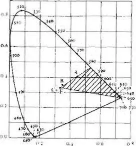 |
| Chromaticity diagram. |
We may now identify a region on the chromaticity diagram which we shall call the warm region. It is shown hatched on the drawing.
This hatched area is based on a number of empirical results. For example, we know that people have a clear subjective impression of the relative warmth, or coldness, of different spaces. See, for instance, Committee on Colorimetry of the Optical Society of America, The Science of Color, New York, 1953, p. 168. One study which attempts to identify the objective correlates of perceived “warmth” is S. M. Newhall, “Warmth and Coolness of Colors,” Psychological Record , 4, 1941, pp. 198-212. This study revealed a maximum for “warmest” judgments at dominant wave-length 610 millimicrons, which is in the middle of the orange range. And individual observer stability in such judgments is high. Thus, one study gives reliability coefficients of 0.95 for warmth and 0.82 for coolness—N. Collins, “The Appropriateness of Certain Color Combinations in Advertising,” M. A. thesis, Columbia University, New York, 1924.
Finally, it is vital to remember that this pattern requires only that the light —the total light in the middle of a room, coming from sunlight, artificial lights, reflections from walls, reflections from outside, from carpets—the total light, lies in that part of the color triangle we call “warm.” It does not require that any individual color surfaces in the room should be red or orange or
A PATTERN LANGUAGE
The patterns are ordered, beginning with the very largest, for regions and towns, then working down through neighborhoods, clusters of buildings, buildings, rooms and alcoves, ending finally with details of construction.
This order, which is presented as a straight linear sequence, is essential to the way the language works. It is presented, and explained more fully, in the next section. What is most important about this sequence, is that it is based on the connections between the patterns. Each pattern is connected to certain “larger” patterns which come above it in the language 5 and to certain “smaller” patterns which come below it in the language. The pattern helps to complete those larger patterns which are “above” it, and is itself completed by those smaller patterns which are “below” it.
Thus, for example, you will find that the pattern accessible green (60), is connected first to certain larger patterns: subculture boundary (13), identifiable
NEIGHBORHOOD ( 14), WORK COMMUNITY (41), and
quiet backs (59). These appear on its first page. And it is also connected to certain smaller patterns: positive
OUTDOOR SPACE (1O7), TREE PLACES (171), and GARDEN
wall (173). These appear on its last page.
What this means, is that identifiable neighborhood, subculture boundary, work community, and quiet backs are incomplete, unless they contain an accessible green j and that an accessible green is itself incomplete, unless it contains positive outdoor space, tree places, and a garden wall.
Читать дальшеИнтервал:
Закладка:
Похожие книги на «A pattern language»
Представляем Вашему вниманию похожие книги на «A pattern language» списком для выбора. Мы отобрали схожую по названию и смыслу литературу в надежде предоставить читателям больше вариантов отыскать новые, интересные, ещё непрочитанные произведения.


Обсуждение, отзывы о книге «A pattern language» и просто собственные мнения читателей. Оставьте ваши комментарии, напишите, что Вы думаете о произведении, его смысле или главных героях. Укажите что конкретно понравилось, а что нет, и почему Вы так считаете.