Zia Rahman - In the Light of What We Know
Здесь есть возможность читать онлайн «Zia Rahman - In the Light of What We Know» весь текст электронной книги совершенно бесплатно (целиком полную версию без сокращений). В некоторых случаях можно слушать аудио, скачать через торрент в формате fb2 и присутствует краткое содержание. Год выпуска: 2014, Издательство: Farrar, Straus and Giroux, Жанр: Современная проза, на английском языке. Описание произведения, (предисловие) а так же отзывы посетителей доступны на портале библиотеки ЛибКат.
- Название:In the Light of What We Know
- Автор:
- Издательство:Farrar, Straus and Giroux
- Жанр:
- Год:2014
- ISBN:нет данных
- Рейтинг книги:4 / 5. Голосов: 1
-
Избранное:Добавить в избранное
- Отзывы:
-
Ваша оценка:
In the Light of What We Know: краткое содержание, описание и аннотация
Предлагаем к чтению аннотацию, описание, краткое содержание или предисловие (зависит от того, что написал сам автор книги «In the Light of What We Know»). Если вы не нашли необходимую информацию о книге — напишите в комментариях, мы постараемся отыскать её.
In the Light of What We Know In an extraordinary feat of imagination, Zia Haider Rahman has telescoped the great upheavals of our young century into a novel of rare intimacy and power.
In the Light of What We Know — читать онлайн бесплатно полную книгу (весь текст) целиком
Ниже представлен текст книги, разбитый по страницам. Система сохранения места последней прочитанной страницы, позволяет с удобством читать онлайн бесплатно книгу «In the Light of What We Know», без необходимости каждый раз заново искать на чём Вы остановились. Поставьте закладку, и сможете в любой момент перейти на страницу, на которой закончили чтение.
Интервал:
Закладка:
The picture means much to me. Of course it reminds me of my childhood in Princeton, releasing time from the deep eddies of memory. Those were happy years. But it is the austerity of the image that is most affecting, the simplicity of its content. When I look at this picture, I see two people undeterred by time, walking and talking, bumping against each other, as they discuss the things that matter to them and why they matter.
Acknowledgments
I am indebted to Eric Chinski and Gabriella Doob at Farrar, Straus and Giroux; Paul Baggaley, Kris Doyle, and Kate Harvey at Picador; and Charles Buchan, Sarah Chalfant, Andrew Wylie, and Alba Ziegler-Bailey at the Wylie Agency. To Eric, Kris, Kate, Sarah, and Andrew, I owe a special debt. Discussions with Eric were vital. My thanks to Ivan Birks, Şeyda Emek, Ruth Franklin, Anja König, Lauren Marks-Nino, Sanjay Reddy, Amy Rosenberg, and Melinda Stege-Arsouze. Amy made fine comments on the manuscript. I am grateful to a physician for her clear responses to my questions. I would like to thank the staff and benefactors of the British Library, the New York Public Library, and the Saratoga Springs Public Library. It is a pleasure to record my gratitude to Elaina Richardson, Candace Wait, and the Corporation of Yaddo.
A Note About the Author
Born in rural Bangladesh, Zia Haider Rahman was educated at Balliol College, Oxford, and at Cambridge, Munich, and Yale Universities. He has worked as an investment banker on Wall Street and as an international human rights lawyer. In the Light of What We Know is his first novel.
Notes
* The following year, I read in the press of the arrest and conviction of a number of members of Combat 18, although two of its ringleaders absconded to the United States, where, curiously, they claimed political asylum.
* Zafar’s discussion of maps continued, but I have chosen to include it here as a footnote. I am reminded of a passage in The Razor’s Edge by Somerset Maugham (an author I rather liked as a boy), in which the narrator states: I feel it right to warn the reader that he can very well skip this chapter without losing the thread of such story as I have to tell, since for the most part it is nothing more than the account of a conversation that I had with Larry. Having dismissed the passage thus, the narrator goes on, preposterously I think, to state: I should add, however, that except for this conversation I should perhaps not have thought it worth while to write this book.
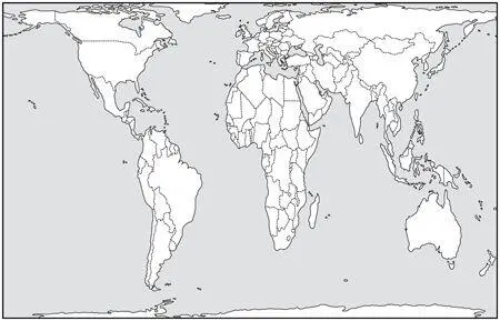
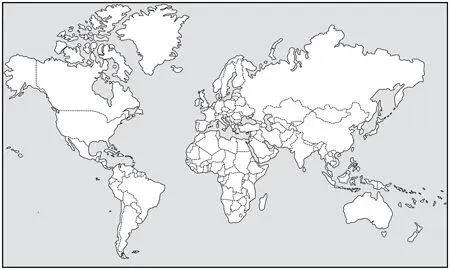
I will forgo Maugham’s addendum but include here Zafar’s discussion of map projections. I have added two diagrams culled from the Internet, which correspond to diagrams that Zafar himself sketched very crudely in the course of the discussion.
Have you, Zafar asked me, ever seen the Peters projection?
I’ve heard of it.
Have you seen it?
I don’t think so.
It’s a version of the map of the world in which areas of landmasses are shown proportionately, said Zafar.
It’s the one, I interjected, where Africa looks vast. I do remember it.
Africa looks vast because it is vast. In fact, on Mercator’s projection, which is the most widely used, the one everyone’s familiar with, the one that everyone remembers, Greenland appears bigger than Africa, when in reality you could get fourteen Greenlands into the whole of Africa.
I had no idea.
It gets better, said Zafar. In Mercator’s projection, Brazil looks roughly the same size as Alaska, when it’s actually five times bigger. Another odd thing is that Finland looks longer, from north to south, than India. In actual fact, it’s the other way around.
When it first came out in the 1980s, continued my friend, the Peters projection set the cat among the pigeons, precisely because it was obvious that the choice of map projection had political implications for how we see the world. Critics of Mercator’s projection had pointed out its flaws, and they did have something; after all, how many schoolchildren have looked at maps and asked, Which is the biggest country in the world?
The basic problem of mapping the globe is how to transfer the curved surface of the earth, an oblate spheroid, onto a flat surface. And there’s another complication: If you stand on the earth and start walking in any direction and just keep walking, you’ll never hit any kind of boundary. You can just keep on going around the world. But if you stand on a map, a rectangular piece of paper, and do the same, you’ll eventually hit the edge of the paper. Getting a representation of the curved surface of the earth onto a bounded piece of flat paper, that’s the business of projection.
You have the same problem in translating poetry. You start off in one language and you have to project the work onto another. And the similarity is even closer. In map projections, there are a variety of things you want to preserve, such as area, distances, angles in triangles, and so on. But the trouble is you can’t preserve them all. The mathematics won’t allow it. Your flat map can’t reflect every one of these things even approximately. You have to choose among them which ones you want to keep. And that’s where the choice of projection comes in.
There’s an easy way to show how you arrive at Mercator’s projection. Take a ball and slice off the very top and the bottom. Then imagine stretching it out so that the surface looks like a hollow tube. Now cut a slit along a length of the hollow tube. You can roll this out on a table. Notice how you’ve lost the very top and bottom of the ball and, in fact, if you look at the common Mercator’s map of the world, you’ll see that it doesn’t actually show you the North and South Poles or even small regions around them. That’s Mercator’s projection, but there are different ways of projecting the world.
And the similarity with poetry? I asked.
The cartographer’s job is to take the material on the surface of the globe — lakes, mountains, and cities — and represent these on a flat surface. The translator takes a poem, a piece of text, in one language and has the task of trying to represent aspects of the poem — rhyme, meter, rhythm, metaphor, and meaning — in another language. A cartographer doesn’t give you a miniature globe with all the same details on it as the globe of the world itself has. Nor does the translator simply give you the poem in the original language along with a Hungarian dictionary.
Both of them face the same problem, namely, that they cannot capture everything exactly and they have to give up some things in order to convey anything at all.
In going from the curved surface of the earth to the flat surface of a map, the cartographer would ideally want to preserve a number of aspects such as relative distances (so that the distance between Islamabad and Kabul should be in the same proportion to the distance between London and Dhaka on the map as it is in the real world); relative areas (so that the ratio of the area of Nigeria to that of the borough of Brooklyn is the same on the map as it is in the real world); angles (so that the angle subtended at Bagram air base outside Kabul by the lines to that air base from the island of Diego Garcia in the Indian Ocean, home to an American air base, and from RAF Brize Norton in the Royal County of Oxfordshire is the same on the map as it is in the world); and so on. There are a number of such aspects, more than these few that I mention, but the fact is that the cartographer can’t preserve them all.
Читать дальшеИнтервал:
Закладка:
Похожие книги на «In the Light of What We Know»
Представляем Вашему вниманию похожие книги на «In the Light of What We Know» списком для выбора. Мы отобрали схожую по названию и смыслу литературу в надежде предоставить читателям больше вариантов отыскать новые, интересные, ещё непрочитанные произведения.


Обсуждение, отзывы о книге «In the Light of What We Know» и просто собственные мнения читателей. Оставьте ваши комментарии, напишите, что Вы думаете о произведении, его смысле или главных героях. Укажите что конкретно понравилось, а что нет, и почему Вы так считаете.