Other colours range from the bold to the bizarre. If you are writing to a designer, for example, then you may wish to appear design-led, but pause to think about whether this image might be more effectively displayed with a small but potent logo in the bottom corner of the page, for example. Try to achieve the perfect balance between creativity with flair and coming across as pretentious or simply too loud and attention-seeking.
 Never use lined paper – it looks as if you are still learning the alphabet.
Marbled paper, particularly the hand-painted varieties from certain Tuscan villages, can be stunning, but bear in mind that they may not make the clearest backgrounds for print. Always check you can read the text before plumping for this option. Embossed and edged papers are very fancy and probably inappropriate unless you’re inviting guests to a very grand event like a wedding. In any other circumstances, using such decorative flourishes might simply be seen as flashy.
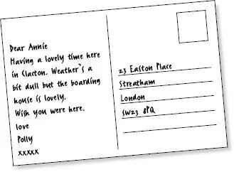
Apart from when they are on holiday, many people no longer use postcards as a method of communication, although they are, on certain occasions, the perfect medium on which to write a letter. Though this probably isn’t a huge factor, they may save you money on an envelope, and writing on both sides of a blank postcard can create space for quite a long message, even though it might be one that still feels very casual. For any brief message, a postcard is ideal, although clearly not when this message contains confidential or personal information. They are particularly suitable when sending ‘thank-you’ notes for gifts or for a dinner invitation, since you don’t need to say the same thing several different ways just to fill the page.

ILLUSTRATION 2 Typical postcard layout. Keep your message brief
When choosing a postcard, think about both the message you want to convey and the personality of the recipient. A comic illustration may be good for your college friend but singularly inappropriate for your aunt or one of your work colleagues. Plain postcards, these days, tend to be enclosed inside envelopes anyway, so, if you are considering one of these, you might just as well use A5 headed cards. Postcards with subdued works of art tend to be suitable for just about anybody. If you want to appear sophisticated, always choose this more general variety rather than the type that displays a saucy image of a seaside pier.
There is a very wide range of writing tools from which to choose. Ball-point, fountain pen or felt tip are all possible. You need to make a decision about which might be the appropriate one for your particular requirements (and which might suit your handwriting and your message).
The short history of pen technology (above) may help to shed some light on how they all emerged but will not necessarily help you to choose. Imagine what effect is created when the most beautifully written letter in Britain is covered with a series of ink smudges and strange, psychopathic blotches. All credibility will be destroyed. On top of which, no one will be able to read the contents and people will not take you seriously. Your letter will almost certainly end up in the bin.
Many traditionalists, and many aesthetes, still think of the fountain pen as the classic means with which to write a handwritten letter. It looks amazingly elegant; you can choose the colour of your ink and it allows for the full potential sensuality of writing. The most effective love letters tend to be written in fountain pen.
 Do not attempt to use a fountain pen if you don’t think your handwriting is up to it.
Most people use black or blue ink but any coloured ink will do. Pale blue is not too wacky but makes a personal statement and tends to look slightly more feminine than dark blue. Many literary men have preferred to use brown ink since it is, similarly, slightly more personal in appearance but not too brazen. Bear in mind, if choosing a pale colour, that it must still be legible on the page and that yellows tend to fade from view even before arriving at the recipient’s door. Also bear in mind that fountain pens can scratch the paper if you are not careful, and this is clearly not a good thing.
Biros are a step down from fountain pens in sophistication but they have their own advantages. For one thing, they do not, generally, smudge. They may not require quite the concentration or hand control that fountain pens do and they are not as wet. A biro is certainly an appropriate tool with which to write a postcard or a casual memo or note to a colleague. It is also, of course, much easier to transport than a fountain pen, since it will not automatically require extra paraphernalia like cartridges and bottles and, on a practical note, is relatively unlikely to leak into your coat pocket.
 A fountain pen may give your writing more character than a biro, but a biro is far more convenient and practical.
Most biros tend to be filled with black or blue ink. Similar rules about colour apply as for the pen. Other colours might be fine if your recipient works in the world of art or fashion. Otherwise, they might find bright orange both illegible and a bit eccentric.
Felt tip is really best saved for the clear marking of envelopes. Most felt-tip nibs are quite broad and difficult to wield and they tend to remind people of their primary school. But they are excellent for writing on difficult surfaces, like a Jiffy bag.
Typeface is the word for the style of print that you are using on the page. There are many different kinds of typeface and each might appeal to a different kind of customer. Generally speaking, the two most common typefaces for business communication are Arial and Times New Roman. Arial is a bold, round sort of typeface without excessive adornment. Times New Roman tends to look slightly more serious since it is thinner and longer and the letters have all their formal curlicues, base lines and the n , for example, has its back hook at the top of the first stroke. This cross-line finishing off the stroke of a letter is called a serif. Characters without cross-lines (as in an Arial typeface) are referred to as ‘sans-serif’, from the French, meaning ‘without a serif’.
1 Compare these typefaces.
2 Decide which one you like the best and consider why.
3 Consider which you find easiest to read.
4 Compare each text extract, which is the opening paragraph of a novel by Dickens, with its designated typeface and decide whether the two could be said to match in style.
5 Think briefly about your friends and decide which typeface you might use to write to each of them.
HELVETICA
My father’s family name being Pirrip, and my Christian name Philip, my infant tongue could make of both names nothing longer or more explicit than Pip. So I called myself Pip, and came to be called Pip.
Charles Dickens, ‘Great Expectations’ (1860)
This is a piece of prose supposedly describing someone’s childhood nickname. The written style is simple and the typeface is sans-serif and quite childlike in appearance. There is quite an appropriate match between style and content.
Читать дальше
 Never use lined paper – it looks as if you are still learning the alphabet.