Jonathan Strahan, Karen Joy Fowler, Ellen Klages, Pat Cadigan, Nnedi Okorafor, Elizabeth Bear, Maureen F. McHugh, Jeffrey Ford, Nicola Griffith, Peter S. Beagle, Daniel Abraham, Paul Di Filippo, Tom Pudding, Jane Yolen, Adam Stemple, Molly Gloss, Caitlín R. Kiernan, Ellen Kushner
Eclipse Three

© 2009
Introduction, story notes, and arrangement by Jonathan Strahan. © 2009 Jonathan Strahan.
"The Pretenders' Tourney," by Daniel Abraham. Copyright © 2009 Daniel Abraham.
"Sleight of Hand," by Peter S. Beagle. Copyright © 2009 Avicenna Development Corporation.
"Swell," by Elizabeth Bear. Copyright © 2009 Sarah Bear Elizabeth Wishnevsky.
"Don't Mention Madagascar," by Pat Cadigan. Copyright © 2009 Pat Cadigan.
"Yes We Have No Bananas," by Paul Di Filippo. Copyright © 2009 Paul Di Filippo.
"The Coral Heart," by Jeffrey Ford. Copyright © 2009 Jeffrey Ford.
"The Pelican Bar," by Karen Joy Fowler. Copyright © 2009 Karen Joy Fowler.
"The Visited Man," by Molly Gloss. Copyright © 2009 Molly Gloss.
"It Takes Two," by Nicola Griffith. Copyright © 2009 Nicola Griffith.
"Galápagos," by Caitlín R. Kiernan. Copyright © 2009 Caitlín R. Kiernan.
"A Practical Girl," by Ellen Klages. Copyright © 2009 Ellen Klages.
"Dulce Domum," by Ellen Kushner. Copyright © 2009 Ellen Kushner.
"Useless Things," by Maureen F. McHugh. Copyright © 2009 Maureen F. McHugh.
"On the Road," by Nnedi Okorafor. Copyright © 2009 Nnedi Okorafor.
"Mesopotamian Fire," by Jane Yolen & Adam Stemple. Copyright © 2009 Jane Yolen & Adam Stemple.
For the late, great Charles N. Brown, last of science fiction's
great lions, dear friend, and tireless supporter.
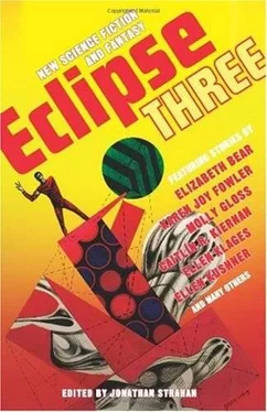
Eclipse Three is, as always, more than just the product of one person: it's the creative output from a small village of people. Once again, Jeremy, Jason, and Ross at the Shade have stood tall and provided me with the support I needed to do the book that I wanted to do; something for which I'm incredibly grateful. I'd also like to thank all of the contributors to the book. This book evolved much more naturally than it's predecessors, with stories coming from unexpected places at unexpected times, so I'm very grateful to everyone who has sent me stories this time. I'd like to thank Peter Watts for his understanding, and the Richard Powers Estate for the fabulous cover.
Finally, two special thanks. This book may not have been completed without the support of my good friend Gary Wolfe, who has never ceased to remind me of its value, and it certainly wouldn't have been done without the support and hard work of Marianne Jablon, who was both in-house editor on this book for me and tireless supporter. I'm very lucky indeed.
Introduction by Jonathan Strahan
A good book cover attracts the eye of a potential reader. It makes a book pleasing to behold, and makes you eager to pick it up and look further. A great book cover does more. It encapsulates the essence of the book and communicates that essence clearly and simply to anyone who might be interested.
When I first saw the cover for Eclipse One, the opening volume in this series, I could immediately see that it was a good cover, but I wasn't sure that it was a great one. It certainly had all of the right ingredients. Designer Michael Fusco had created a clean, simple series design that could be used with almost any piece of art. Multiple award-winning artist Michael Whelan's pre-existing art provided an appropriate air of ambiguity. What the cover didn't do, though, was "fit" the book that I felt I had in my mind's eye. It didn't have quite the same feel; represent the essence of the stories completely.
Now, creating a cover that fits an anthology is always difficult, and it is especially difficult when you are talking about a book such as Eclipse, which is unthemed and intended to be as varied as possible. Still that fit is something an art editor strives for, and that a designer works to achieve. It's also something that has become enormously important to me as an anthologist over the last year or two.
Increasingly I've felt that it's essential to create a total package that is, for want of a better word, "honest." I want the cover, the blurbs, the cover quotes, the introduction, and the stories to tell the same story, to deliver the same message to anyone who picks the book up so that they have a clear idea of what it is they're going to get. It's an ideal, but it's one that I think is worth working towards.
Because of that I was much more confident about the cover for Eclipse Two, which came out last year. I had decided, in consultation with my publisher, to make the second volume in the series a much more science fiction oriented book. I approached more science fiction writers than fantasy writers for the book. I chose stories that had robots and spaceships and vast empires. And art editor Jeremy Lassen provided a peach of a cover, taking a well-known piece of art by Hugo Award-winning artist Donato Giancola and nudging it into Michael Fusco's design in such a way that it was bright and shiny and new. I remember the excitement I felt when I opened the email that had the cover attached, and how I felt that it was just exactly right for the book. Even now, I think it's one of the best covers to appear on any of my books.
I was, however, frankly nervous about what kind of cover would be found for Eclipse Three. Like the first volume of the series, it's a varied volume featuring stories that range from straight fantasy to swords and sorcery to eloquent social science fiction. What could possibly, I wondered, honestly represent that variety? I needn't have worried.
When I first saw the cover art for Eclipse Three I knew immediately it was right. Following his own passion for great science fiction art, Jeremy Lassen had searched out and found something special: an unpublished piece of art by the late Richard Powers. Powers was possibly the greatest artist ever to work in the science fiction field, producing more than eight hundred science fiction paintings during a long and distinguished career that saw him produce iconic covers for Robert Heinlein, Isaac Asimov, Arthur C. Clarke, and many, many more. Although when Powers started his career his work fit the conventional pulp paperback style of the day, he quickly evolved a Surrealist style that was influenced by the likes of Picasso and Yves Tanguy, but was highly personal and very much his own.
The painting was perfect for Eclipse because it was vibrant, rich, and evocative. It suggested something hip and cool, but it didn't prescribe anything. It spoke directly to the essence of what I thought an Eclipse volume should be-varied, engaging, and ever changing. It also had connections to the science fiction world that I couldn't resist. The first volume of Damon Knight's classic Orbit series of anthologies had a Powers cover, as did the first volume of Pohl's Star and one of Robert Silverberg's New Dimensions. He'd also done some classic covers for books that had meant an enormous amount to me, like R. A. Lafferty's Nine Hundred Grandmothers.
I was sufficiently thrilled by the cover that I wanted to know more. After all, how likely is it that unpublished Powers art of this caliber still existed? As it turns out the provenance of the art is as mysterious as the image Powers created. His agent Jane Frank told me that information on the work was severely limited. It is signed "Powers Laz/org," as he signed all of his commercial work, which suggests it was done for publication. But there's no information on it having been published. It has the hallmarks of a Powers book cover-layout, collage style, signature, etc.-but no other information. It is a mystery. And for me, that makes it perfect. A mysterious cover-bright and filled with energy-for a mysterious book. It's my hope that, when you've read the group of stories that make up this latest Eclipse you'll think it's perfect too.
Читать дальше
